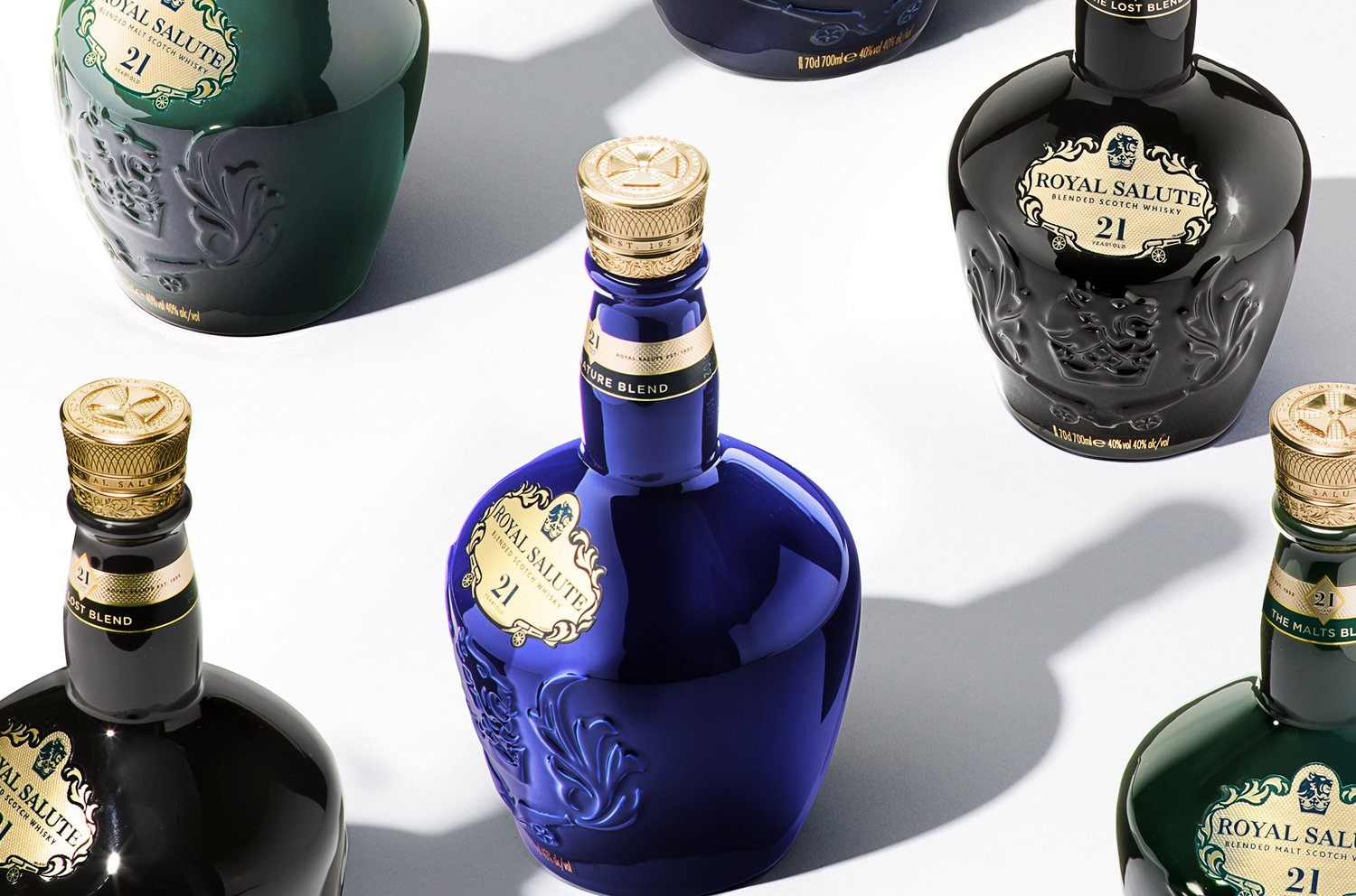
Butterfly Cannon is known for their gorgeous designs, and their work for Royal Salute is no different. Because the brand is so well-loved and so deep in tradition, the rebrand needed to respect its rich history while also propelling it into the future. The new timeless design highlights a gorgeous shaped bottle with an intricate gold label and typography to match. The regal bottle colors help amplify the brand’s decadent ethos yet stay classic enough to remain lavish.

With a brand so steeped in tradition and proud of its royal lineage, it was important that our redesign brought a fresh perspective to the brand and amplified its unique personality, whilst respecting its rich heritage and without alienating the loyalist (or Royalist!) consumers who love the associations this heritage brings.