Vegan Ice Cream Never Looked So Cool With Swirl

Published

Filed under

Editorial photograph

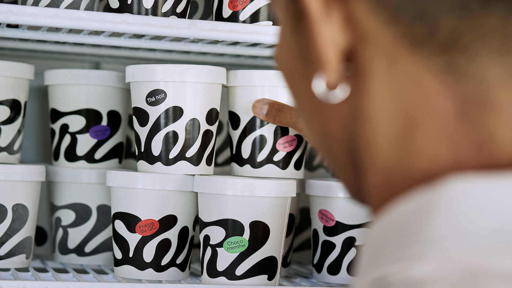
We are loving this project submitted by Wedge. The cooler than ice(cream) font coupled with a stark white label is the epitome of chill. The small stamps that highlight every flavor variant are the perfect touch that allows the brand to stay consistent while injecting a laid back energy that makes you want to pick up a spoon…or two. 


Vegan ice cream never looked so damn cool. Made in Montreal, Swirl is a vegan “cremerie” committed to high standards and a love of design from their impeccable flavors to the packaging. The family-run company seized the opportunity to bring an edge to the category with a pack that doesn’t say “vegan” when you think “vegan.”

Where colour comes from the all-natural product inside the tub, made of ingredients that are ever-changing with the produce of the season. That link to nature, to orchards, to farmers, to producers, is the driving purpose behind the fruit sticker application. Not an arbitrary trend. An ethos, honored. The Swirl logo mark is custom crafted. The logo’s flowy, luscious, curvaceous forms are inspired by the smooth, coconut-based texture of the ice cream and tracks left behind by the scooper. Sitting bold on the pack, a graphic intention sits undeniably and effortlessly cool. Swirls drops new tubs each Wednesday and is sold out faster than you can cop them.

Swirl by Wedge

Editorial photograph

Editorial photograph

Editorial photograph

Editorial photograph

Editorial photograph

Editorial photograph

Editorial photograph

This placeholder is removed when the ad slot is configured.

This placeholder is removed when the ad slot is configured.

This placeholder is removed when the ad slot is configured.

This placeholder is removed when the ad slot is configured.

This placeholder is removed when the ad slot is configured.

This placeholder is removed when the ad slot is configured.