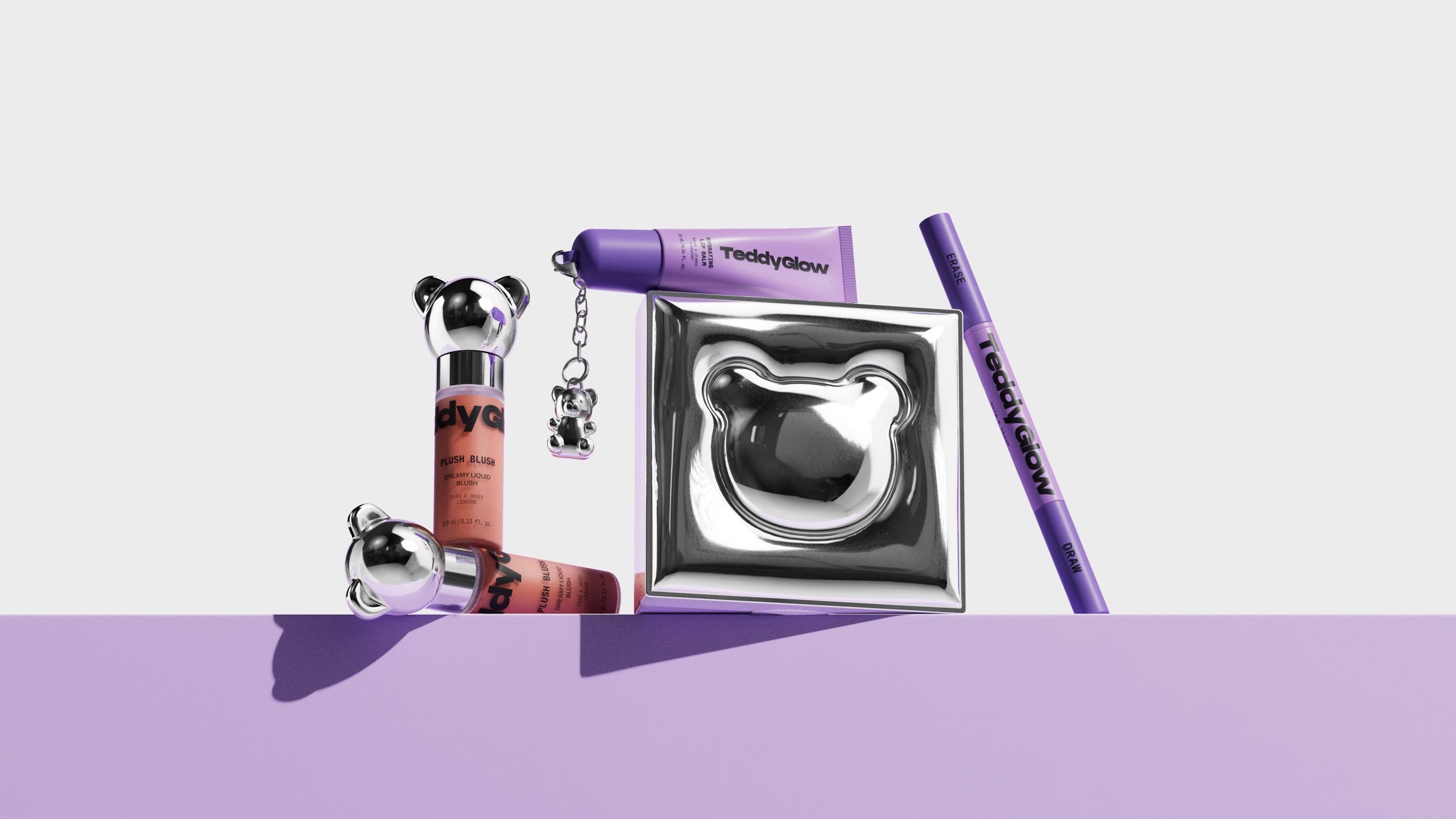
When the beauty industry keeps recycling the same sleek minimalism and muted “clean girl” palettes, it takes something unexpected to make you stop scrolling, and TeddyGlow does just that.
Creative studio Sweety & Co. designed the packaging for TeddyGlow, the debut cosmetics line from streetwear cult favorite Teddy Fresh, resulting in a collection that leans hard into that downtown, street-level energy. But there’s also a juxtaposition between softness and edge that mirrors exactly where youth culture lives right now, somewhere between thrift store grunge and hypebeast luxury.
What makes this line genuinely different from anything else on the Sephora wall is how thoroughly it refuses to separate the product from the brand IP; the iconic teddy bear isn’t a logo slapped on a corner. It’s turned into a sculptural presence rendered in chrome, appearing as a cap, a charm, a debossed silhouette, a compact lid. The reflective silver finishes and holographic surfaces pull from the same visual language as Y2K robotics, Japanese toy design, and the current wave of maximalist collectible culture, making TeddyGlow feel more like a drop.

Teddy Glow is the launch cosmetics line of Teddy Fresh. Built on a legacy of bold color, expressive design, and playful luxury, our challenge was clear: translate the unmistakable Teddy universe into a full makeup line with original, custom-designed packaging shapes. Teddy Glow needed to feel contemporary and street-driven while keeping the charm and character that made the original brand so trending and adored.
To achieve this, we leaned into a visual direction inspired by urban culture: edgy, modern, and intentionally laid-back. We materialized both the teddy and the glow: the iconic bear appears as a charm, a cap, or even as the packaging itself, becoming a sculptural object. The glow emerges through silver finishes, reflective materials, and the energetic acid-neon palette running across the line.


The packaging structure is minimalist yet highly functional. Strong information hierarchy on the front panel, SKU differentiation through strategic color, and product illustrations on the side panel eliminate any guesswork at purchase. It’s clarity without dullness, simplicity without silence.
Our visual language balances vibrant colors with clean geometry and dynamic type. The bold sans-serif typography brings confidence and modernity, grounding the playful hues with a more mature touch. The bear icon sits at the core of the identity, instantly recognizable and deeply tied to the Teddy Fresh ethos.

The palette also reflects the brand’s energetic spirit: expressive, youthful, and designed to inspire self-expression. These colors merge playfulness with sophistication, redefining what a “fun” beauty brand can look like without slipping into childish territory.
All together, the sculptural bears, the silver glow, the acid-neon energy, and the clean graphic structure form a system that feels both collectible and effortless. A packaging solution engineered to be nothing less than unBEARrably cool.