Agua de Madre’s Bold Packaging Turns Gut Health into a Design Statement
By
Published
Filed under
By
Published
Filed under
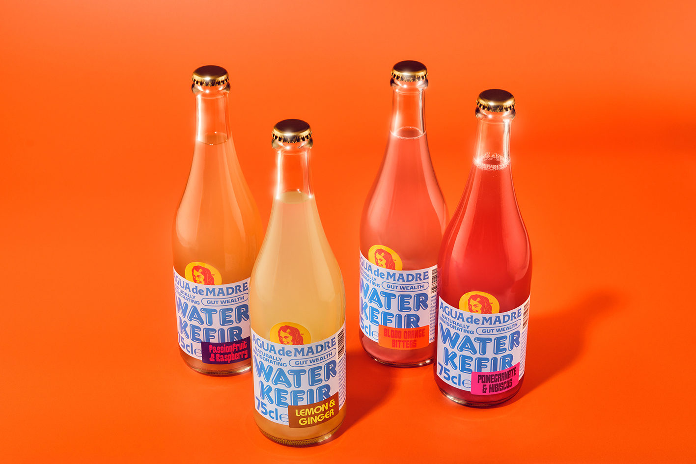
The packaging design for Agua de Madre, designed by Chris Chapman, uses a bold, saturated color palette dominated by electric blue, vibrant red, and energetic pops of yellow and green. The large, blocky typography features strong, retro-inspired lettering with a hand-drawn charm, giving the product a playful yet impactful shelf presence.
Central to the design is an illustrated figure of a woman, framed within a circular badge, which produces a vintage advertising aesthetic reminiscent of mid-century branding with Latin American influences. These stylistic choices, paired with expressive, sticker-like flavor labels, create a lively and nostalgic visual language that feels rooted in tradition while embracing a spirited energy.
Get unlimited access to latest industry news, 27,000+ articles and case studies.
Have an account? Sign in


