Announcing The Dieline Awards 2016 Winners
By
Published
Filed under

By
Published
Filed under


Now in its 7th year, The Dieline Awards 2016 presented by Neenah Packaging is an international design competition recognizing the world’s best consumer product packaging design. It exist as a way for both designers and society at large to more easily recognize the value of innovative packaging in everyday life. We have gathered a highly esteemed jury of structural packaging, design, branding, and consumer product experts to judge submissions based on three vital design components: Creativity, Marketability, and Innovation.
“Packaging design is way more than just selling a product or making something look pretty on a store shelf. Whether we realize it or not, packaging plays an integral role in every life, every day, all around the world. Good packaging contains, preserves, protects, and transports the food and items we need to live. However, great packaging—like The Dieline Awards winners—has the ability to change how we think and completely alter the way we interact with the products we consume.”
– Andrew Gibbs, Founder of The Dieline
This year especially, the awards program highlights the ability the industry has to adapt to the world’s ever-changing needs. Demographics, economics, consumer tastes—these factors quite literally shape the packaging of today and tomorrow. By uncovering these trends, we take the pulse of the general public.
So what do we see? An abundance of information, choice, and messages. A small screen rests between us and the rest of the world, and this has many benefits—but the flip-side is that it is harder than ever to find exactly what we want. People feel divided, distracted, and burdened by endless options. We see incredibly busy people individuals who value both their jobs and social lives, smaller households and more 1-parent families, as well as an increased awareness of health and waste.
The message expressed again and again in this year’s winners is that consumers feel overwhelmed. People today want and need simple, clear, digestible messages—because that is all we have time for and all we can handle. This antidote pushes us toward designs that focus on simplifying. The task of the designer this year was clear: how can you articulate the value of the product in simple, approachable terms and connect with the consumer through the torrent of information?
The answer manifested itself in what we call Essentialism: focus on the essential, eliminate the rest.
We invite you to explore the winners and trends of The Dieline Awards 2016. This year we recognized 41 winners across 12 categories who were awarded a 1st, 2nd, or 3rd place award. Discover the four trends we have identified, each one a different expression of Essentialism.
Our winners prove that packaging today can be designed to cut through the chaos.


Although a traditional springtime drink in Finland and other parts of the world such as Canada, tree waters are a new concept to consumers in the UK. Clarity of product communication was therefore paramount. To create the birch water market in the UK, the brand needed to educate consumers, so innovative attention-grabbing packaging was vital.


Small in size, but big in 3D printing abilities and reliability, the Ultimaker 2 Go is one of the most powerful little printers around. And with a compact design, it’s great for makers on the go. We designed a packaging concept that let the machine fully live up to its name.


Design is an endless exercise in communication. mousegraphics is a creative office that realizes this basic principle since 1984, and in a way that concerns each one of its partners / clients separately. With a creative team consisting today of ten designers, an illustrator, a photographer, a creative strategist and an office manager.


Paper Water Bottle® – the 1st of its kind in the world – meets both consumer demand and brand owner requirements for real eco-friendly solutions. Paper Water Bottle is a pulp packaging and product company integrating best-in-class strategic assessment, consumer insight, creative and technical design and development, material science, technical and engineering design and development through production and distribution.


We were commissioned by Jack Daniel’s to strategically redesign their premium “Single Barrel” product line. The goal of the assignment was to more effectively communicate the handcrafted, meticulous process behind their Single Barrel whiskies through primary and secondary packaging, and to create a design system that anticipates and allows for future product innovations from America’s oldest registered distillery.


Established in 1992, wagamama has become a popular food destination on the British high street by making Japanese-inspired cuisine accessible for the West. Famed for challenging what we ate, how we sat side-by-side and promoting a new casual dining code, wagamama needed to reignite their challenger approach when it came to takeaway.


Domilovo translated from Russian is sweet home. Design concept was inspired by a henroost. It is actually a nest made of rough pressed cardboard — new shape which stirs pleasant emotions and enriches brand communication – a pure fresh farm product.


Ono and Associates Inc. is an architecture and design office by Takeshi Ono and Ayako Ono, globally operating based in Toyota, Japan. By the free idea, we are working broadly in various domains, such as architectural design, graphic design, and product design.


Gino’s garden organic olive oil from the region of Rihaneh in Lebanon.
Each year, a limited quantity of olive oil is handpicked and cold pressed within six hours, making to the finest quality of olive oil one could get from the grove of Gino Haddad.
In order to reflect the organic approach and limited production,
a custom made bottle was specially designed to portray the uniqueness of Gino’s olive oil.


“Andriotis” company is a family business, specializing in the trade and processing of olive oil, for over 50 years. The characteristic quality of our products is created by a solid know-how and authentic, personal care.


Olive oil and vinegar in one! Melies is a new premium gift pack of high quality olive oil and vinegar in two identical bottles that fit perfectly together. The label, which is inspired by the nymphs Melies (mythological female creatures) and was initially designed for the olive oil, now embraces the two bottles in one but is also perforated in the middle to easily separate them in two.


Since the founding of their first store in London’s Piccadilly in 1707, Fortnum & Mason have been delighting customers all over the world with experiences of pleasure that make the everyday special. From the products on their shelves to their five restaurants and world famous tea salon, everything they do is informed by their passion for and knowledge of the spectacular and the distinctive – and their aim to bring something incredible and incredibly different to everyone who encounters Fortnum & Mason.


Maitre Choux is the first and only choux pastry specialist patisserie in the world. It is a modern version of a French patisserie, redesigned to cater to the most discerning of tastebuds. Every day and with a rigorous precision, the Three Michelin star experienced chef Joakim Prat bakes exquisitely decorated premium eclairs, choux and chouquettes at their location in South Kensington – the first of many planned for future expansion.


The coco cookies made by Brown Sugar 1st. are pop and cute tasting like ‘LOCO’ in Hawaii. And these are all organic, so happy sweets! Anyway, good foods should be fashionable and kind for girls with their clutch bag.


The Carry On Cocktail Kit is the result of a collaboration between W&P Design, the Brooklyn-based food and beverage design company, and PUNCH, an online magazine focused on wine, spirits and cocktails. With the goal to elevate the in-flight cocktail experience, each Carry On Cocktail Kit includes the tools and ingredients necessary to mix two cocktails at 30,000 feet. To date, there are four varieties, including the Old Fashioned, Gin & Tonic, Moscow Mule and Champagne Cocktail.


Working in bio mimicry principles the designer repeated one of the main structural parts of the flower and conceptualized the pistil as an optimal shape for a two – liter juice bottle.


Pearlfisher has created the brand for the world’s first distilled non-alcoholic spirit, Seedlip.
In a drinks market saturated by sugary soft drinks and a bevy of alcoholic offerings, Seedlip is the first brand of its kind – a sophisticated and craft-driven spirit that is also non-alcoholic.


Founded in 2013 by the Catalana brothers of Mill Valley Beerworks, Fort Point Beer Company is a craft brewery located in the Presidio of San Francisco. Their mission is to create balanced, thoughtful beers that reference traditional styles, but are by no means bound to them.


Ryan Pitman, a Minneapolis Minnesota based bus driver, had been brewing craft beer on his own for years. A dream came true when he came across the perfect space to create a brewery in the heart of Minneapolis, on Eastlake Ave. Ryan shared with us of his intention to produce a wide and ever-evolving range of eclectic brews with unusual ingredients.


Our aim was to give the Henderson’s range a new identity and packaging that reflected the award winning artisan cider itself.
The previous packaging lacked personality, craft and authenticity but eluded to the ornate Victorian age from which the Spiced Cider recipe originated. This intriguing era became the inspiration for our new design.


LAUDUM is the genitive plural of Laus, the Latin word meaning praise, glory, fame. For such a classic, Latin name, with strong Roman overtones, we have designed this bottle with references to columns of the Lonic or Corinthian period with characteristics from ancient Roman temple architecture. The relationship between viticulture and the temple is age-old. The column is part of the temple, it rises towards the sky, it is history and art, as is wine.


Librottiglia is where great wine and literary pleasure meet. The characteristics of each wine are matched to a narrative genre to create a perfectly balanced eno-literary experience based on the sensory impressions and scenarios imagined in the stories. The evocative name of the product line comes from the union of two Italian words: libro (book) and bottiglia (bottle).


Heemskerk Wines is a super-premium, contemporary brand for which style and design is an integral part of the wine experience. The brand is intent upon capturing the integrity, purity and elegance of Tasmania’s cool climate. Designed by Denomination in 2008, the design aesthetic of Heemskerk is über-contemporary and sleek. Everything about Heemskerk is centered around finding a perfect balance between respecting tradition but reimagining it in a very modern way.


The first offering from the first community distillery on the Isle of Harris – influenced by the people, the place (quite rugged, dramatic), the tweed and reflecting the subtle colours of the landscape. Gin with Harris botanicals!


Smirnoff Ice, the original iced citrus flavoured vodka drink has become one of the world’s leading brands in the pre-mixed market. However, the design had begun to look dated and inconsistent around the world and was seen as a ‘mini me’ of Smirnoff No. 21, using the same constrained symbols of military shields and Russian eagles.


This is not a Luxury Whisky… or is it?


Established has designed a new collection of fun and playful products for Marc Jacobs Beauty line. The line includes Twinkle Pop Eye Stick, Kiss Pop Color Stick and Smart Wand Tinted Face Stick. Taking inspiration from the Marc Jacobs Cosmetics line and with reference to crayons and paint sticks, the line invents new fun ways to put color on your face.


GENOSOPHY (discover yourself) is the name of the genomic predisposing service provided by the EMBIODIAGNOSTIKI company, with headquarters in Greece.
The aim of the company is health improvement through utilization of the most recent knowledge and technological advances in the field of genetic variation and epigenetic modifications.


Our client is a well-known company with a strong brand. We needed to refresh its image through packaging and also unify several products under one smart idea with functional variations.


To respond to our clients request we had to review the new languages of communication-based on emoticons, shortcuts, symbols and condensed messages and imagine an original, codified, contemporary idiom legible by all and adaptable to all national markets, respective cultures and particular religious or social sensitivities.


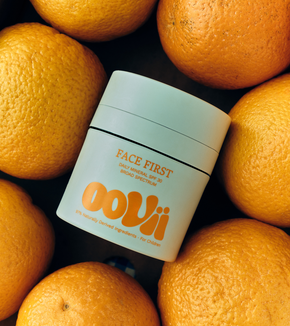
The project was to create a unique range of bespoke botanical facial serums focusing on adding emotional equity and preciousness, communicating the source of origin and delivering a premium positioning. The solution created a strong point of difference and an own-able asset with the iconic bottle form and new delivery system.


EO beauty’s products are all handmade and use only natural ingredients. We designed the packaging of one of their signature product, the beauty soap. As their products contain no artificial colors and preservatives, we decided to create a clean design that can showcase that.


Agrocal powder is a completely natural and environmentally friendly source of calcium and magnesium for a rapid and effective liming. It increases soil fertility thus leading to a long-term increasing yield. After the large packaging intended for crops, Holcim has decided to offer the product to urban gardeners as well, in a small package of 4 kg.


The Precision Mobile is a modular kinetic sculpture, made of solid brass and stainless steel. This piece is purposefully designed for high-lofted residential ceilings, hotels, restaurants, and creative agencies. It brings gentle movement and life to the spaces we live, work, and play.


Argos is the UK’s leading digital retailer
33,000 products
53,000 lines
130 million customers
840 UK stores


Design for a corporate Christmas gift by the chef Akis Petretzikis, aiming to represent the chef’s particular style and personality in terms of both content and design.
In 2015, among all firms invited by NIKE Equipment to pitch and compete, OIA Global in Portland, Oregon, was awarded the challenge to develop and execute the proposed ball packaging concept as well as its supply chain to revamp the existing inflatables packaging program launched since 2007.


Metsä Board Packaging Services created and developed the structural and graphic design for Victorinox, while also assisting their purchasing team in connecting directly with trusted and long-term printing partners for the quotation and pre-production of the approved packaging solution. Victorinox packaging was printed and assembled at the end of May 2015 and sold in the market starting June 2015.


The Turbo Flyer Pattern Series is a collection of historical patterns from around the world reinterpreted in flight. These special edition art planes celebrate and highlight different cultures by reimagining traditional patterns into the wings of our decorative aircraft.


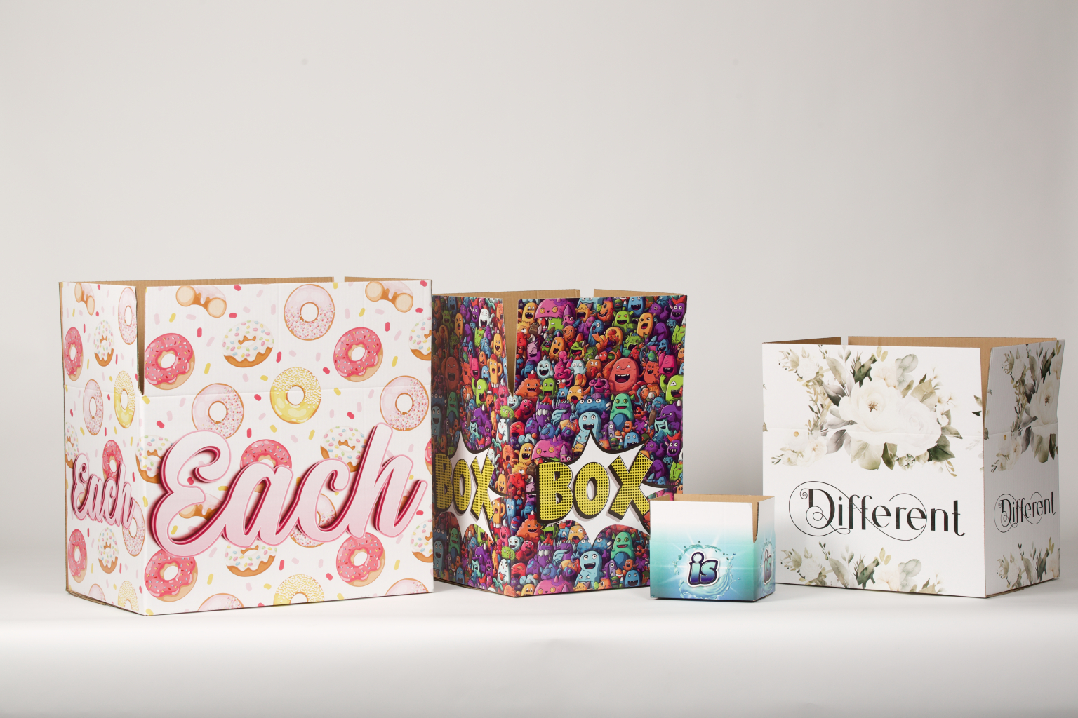
We designed this launch kit for Google’s “Unboxing Event” which was used to promote its new store and products. The boxes, which were designed like a puzzle with each piece carrying a different product, were sent to major influencers who then vlogged and posted videos of the box on YouTube.


Design for a corporate Christmas gift by the chef Akis Petretzikis, aiming to represent the chef’s particular style and personality in terms of both content and design.


Made up of over 30 different types of paper from Fedrigoni’s ranges, the 2016 calendar is designed to encourage a manual assembly of combinations to create individual dates. Every day of the year (366 in 2016) has a unique colour combination that is never repeated. The calendar is perpetual and can be used regardless of the year, creating further new combinations, while variations and paper types are discovered through the daily physical interaction.