The Dieline Awards 2016: Fortnum & Mason – Chocolate Coated Biscuits- Together Design
By
Published
Filed under
By
Published
Filed under


Since the founding of their first store in London’s Piccadilly in 1707, Fortnum & Mason have been delighting customers all over the world with experiences of pleasure that make the everyday special. From the products on their shelves to their five restaurants and world famous tea salon, everything they do is informed by their passion for and knowledge of the spectacular and the distinctive – and their aim to bring something incredible and incredibly different to everyone who encounters Fortnum & Mason. Passionately dedicated to their core value of pleasure, they continue to be experimental and contemporary and have a signature brand feel that reflects their long heritage of using interesting artists and illustrators for their packaging work.


Together Design was commissioned to create the packaging concept for a new range in Fortnum & Mason’s biscuit category – their first ever ‘fully enrobed’ chocolate biscuits. The solution needed to create excitement about the new range via the packaging and its presentation instore, build frequency and levels of purchase among existing customers, and attract new customers. Our work needed to reflect the history, heritage, wit, fun, charm and humour of Fortnum & Mason, and leverage their heritage in a contemporary format. We were challenged to deliver a world-class packaging solution that is decorative, distinctive and beautiful, and that not only enhances the provenance and quality of the product, but also adds to the pleasure of the purchase, whether for gifting or self-purchase.
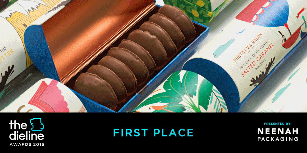
Our solution brings to life the handmade quality, specific ingredients and chocolate covered nature of the biscuits. For inspiration, we delved into the unique Fortnum & Mason artwork archives, to which we were given privileged access, admiring the work of Edward Bawden and other renowned illustrators and artists who have worked for the brand in the past. Drawing on the narrative (as opposed to decorative) style of illustrations that were so predominant in the brand’s archives, we created an illustration for each individual biscuit flavour. Reflecting the wit and humour at the heart of the Fortnum & Mason brand, the charming illustrations were created in-house at Together, with each one revolving around a humorous narrative showing the creation of a chocolate splash, from Alpine cows blowing chocolate out of a horn, to a huge chocolate spouting whale. Furthermore, the flavours and ingredients of the specific biscuits are beautifully represented and clearly differentiated by colourful decorative patterns around the main narrative illustrations.


Our work also had to solve the practical challenge of ensuring that our illustrations worked perfectly with the unusual packaging format, which is a cylindrical barrel that opens from the side like a chest. It was a challenge worth solving, however; the combination of this interesting box shape and our unique designs helped create an intriguing and engaging packaging series.
We created distinct packaging designs for the following five flavours of these delicious chocolate coated biscuits: Dark Chocolate Coated Bountiful Butter, Milk Chocolate Coated Salted Caramel, Dark Chocolate Coated Macadamia Nut, Dark Chocolate Coated Chocolate Pearl and Milk Chocolate Coated Lemon Flavoured Biscuits.
The new range of biscuits launched in January 2016, accompanied by beautiful instore visuals featuring our unique designs. Initial response has been highly positive, and while it’s still too early to know accurate sales figures, reports suggest that the range is selling very well in Fortnum & Mason’s stores and brand outlets around the world. Meanwhile, the client was delighted with our packaging solution, and has commissioned us to develop the packaging for their forthcoming Easter collection.
Illustrator: Kate Larsen
Art Director: Katja Thielen
Designer: Kate Larsen
Creative Team: David Clayton, Creative Artworker
Designed by Together Design
Client: Fortnum & Mason
Country: United Kingdom