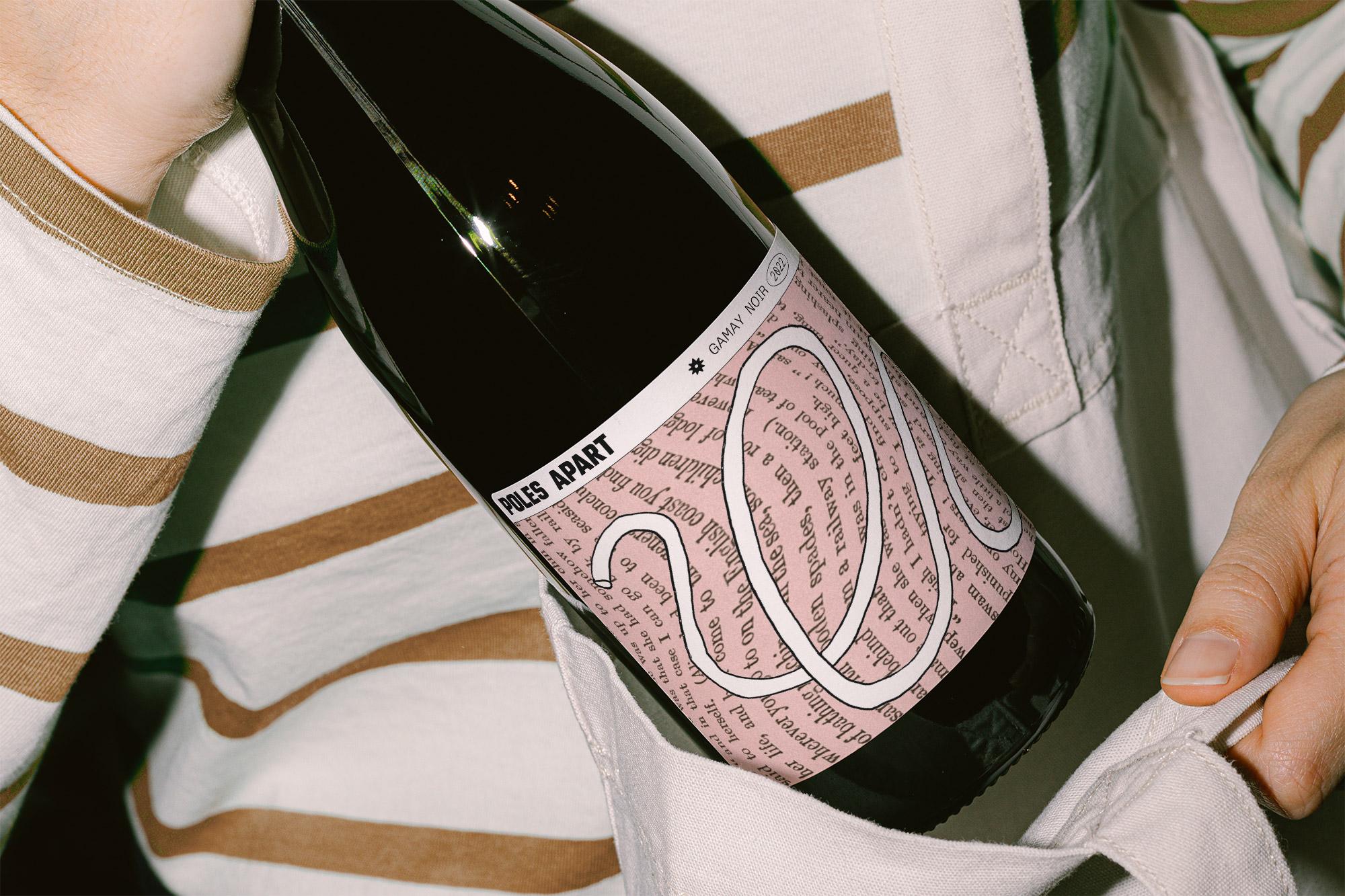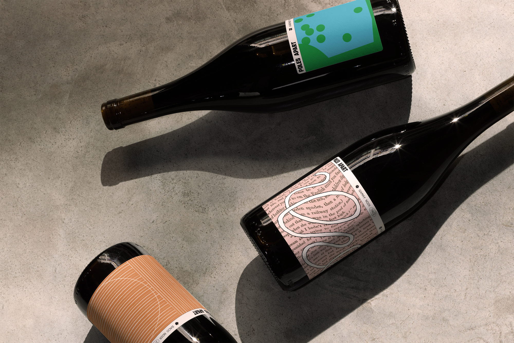
When it comes to the most immediate draw for wine, it’s obviously all about the bottle, and Poles Apart instantly stands out for a sophisticated yet youthful look straight out of a 20th century modern art exhibit. This sleek work comes courtesy of designer Clare Chow, who uses warm, attention-grabbing color palettes and patterns to catch a cultured wine shopper’s eye.
We’re especially into the DaDa-esque pink bottle in which an illustrated curlicue swirls through distorted text. Poles Apart’s general branding keeps it simple and consistent with bold sans serif that doesn’t take too much space, preferring to let the art do the talking.