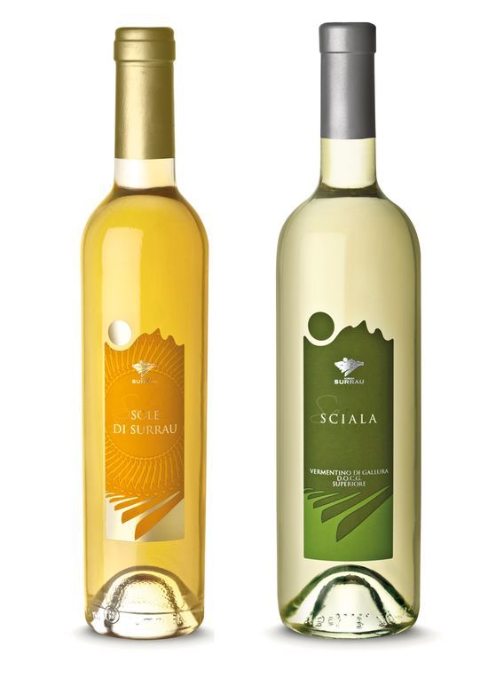
“The labels are designed to convey an individual idea of each wine, but at the same time they can be seen to form part of a broader range of products. Clab Comunicazione has overseen and perfected the entire corporate image of the new Surrau winery, making sure that the style of the labels is consistent with global company communication.
The graphic form of all the labels is based on the concept of the territorial identity of these wines as products of Sardinia. Like the logo, the labels too express the idea of the sea, the earth, and the sun of Gallura. And it is the special characteristics of these territorial elements that gave the wines their unique structure, fragrance, and sensory characteristics.