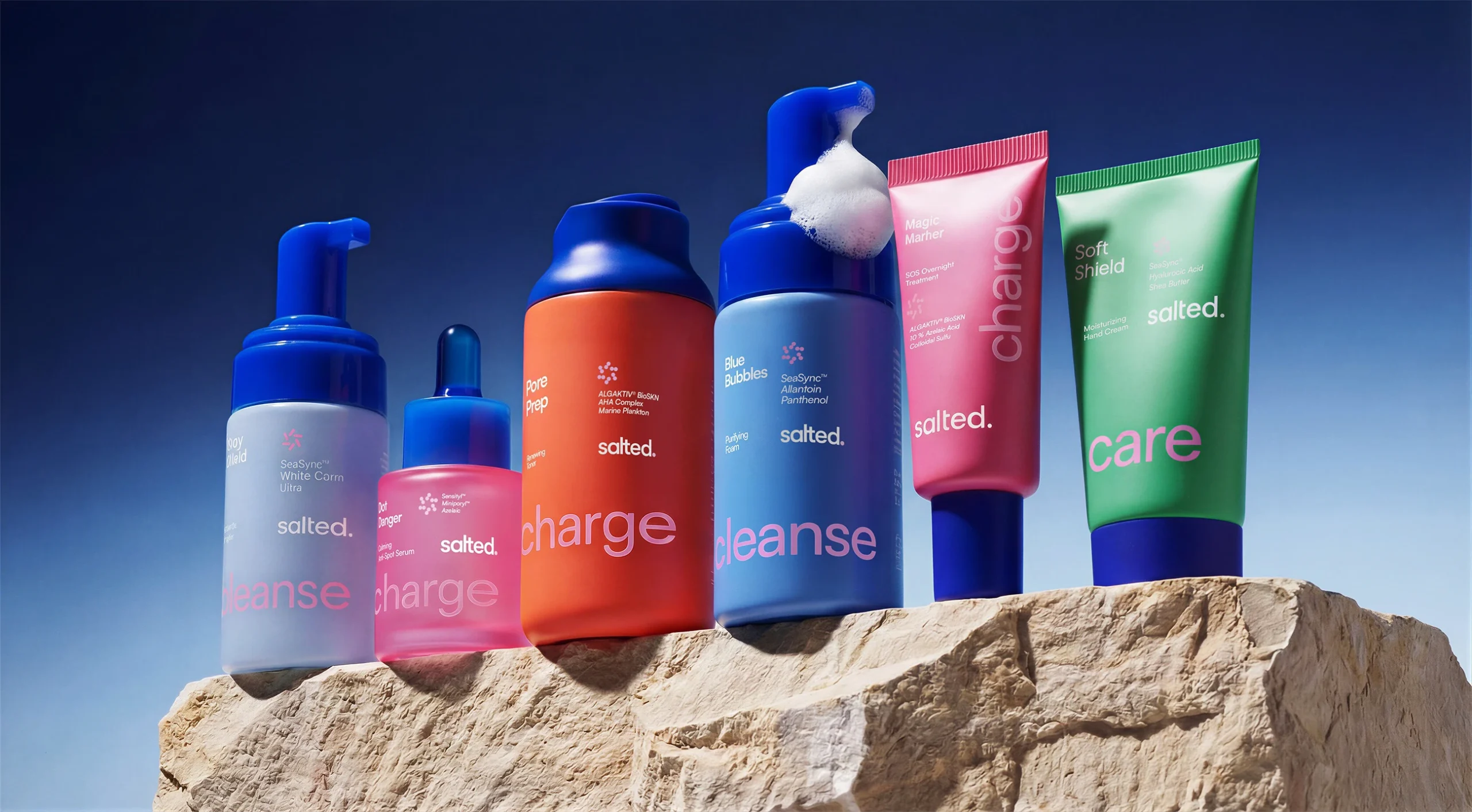
Salted is a skincare brand built around marine ingredients, and its expanded product range needed a packaging system that makes everyday skincare a bit easier to navigate.
Designed by Sweety & Co., the refresh takes color cues from coral reefs, with oversized words like “cleanse,” “charge,” and “care” wrapping around the packaging. The cartons add another layer of ocean inspiration with intricate coral imagery, giving the otherwise pretty straightforward system a little underwater mysticism. Skincare often plays it safe with clinical undertones, but Salted embraces the growing appetite for expressive, color-driven beauty packaging without sacrificing the clarity shoppers actually need.