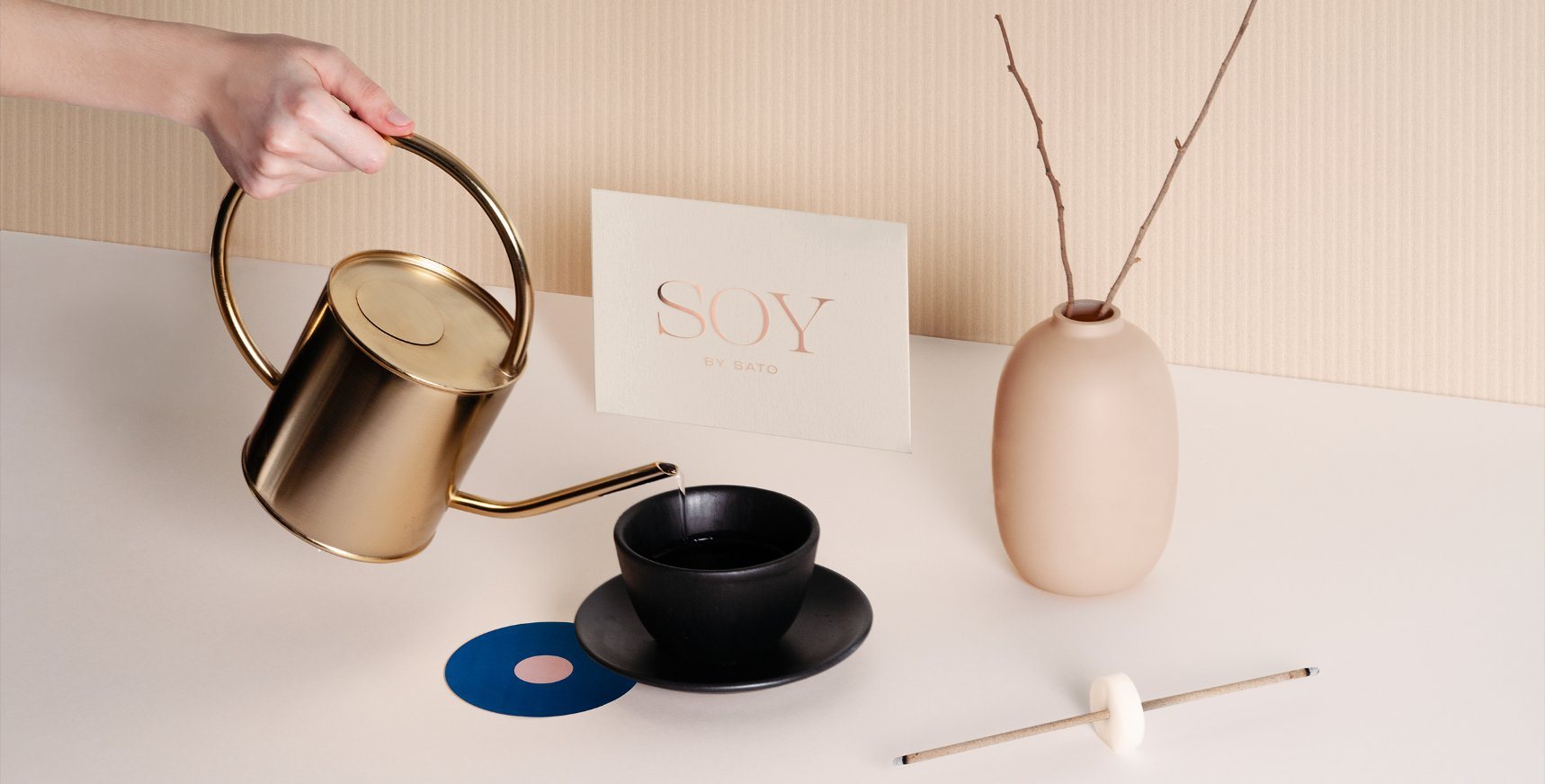
Using clean lines and symmetrical patterns, the design for Soy by Sato (a high-end Asian eatery) is a dish for the eyes. The blues and oranges work in harmony, creating an earthly color palette that is warm and inviting. The gold foiled elements, coupled with the chunky serif font, imagine a brand experience dripping in luxury and intrigue.
The eastern-inspired design is subtle enough for any diner, while giving enough context to entice the most discerning of tastes.
Soy by Sato is a high-end Asian bao restaurant located in Doha, Qatar. Soy is one of the most ancient and traditional staples found in Asian cuisine; it represents more than just an ingredient, but the basis of various Asian civilizations.