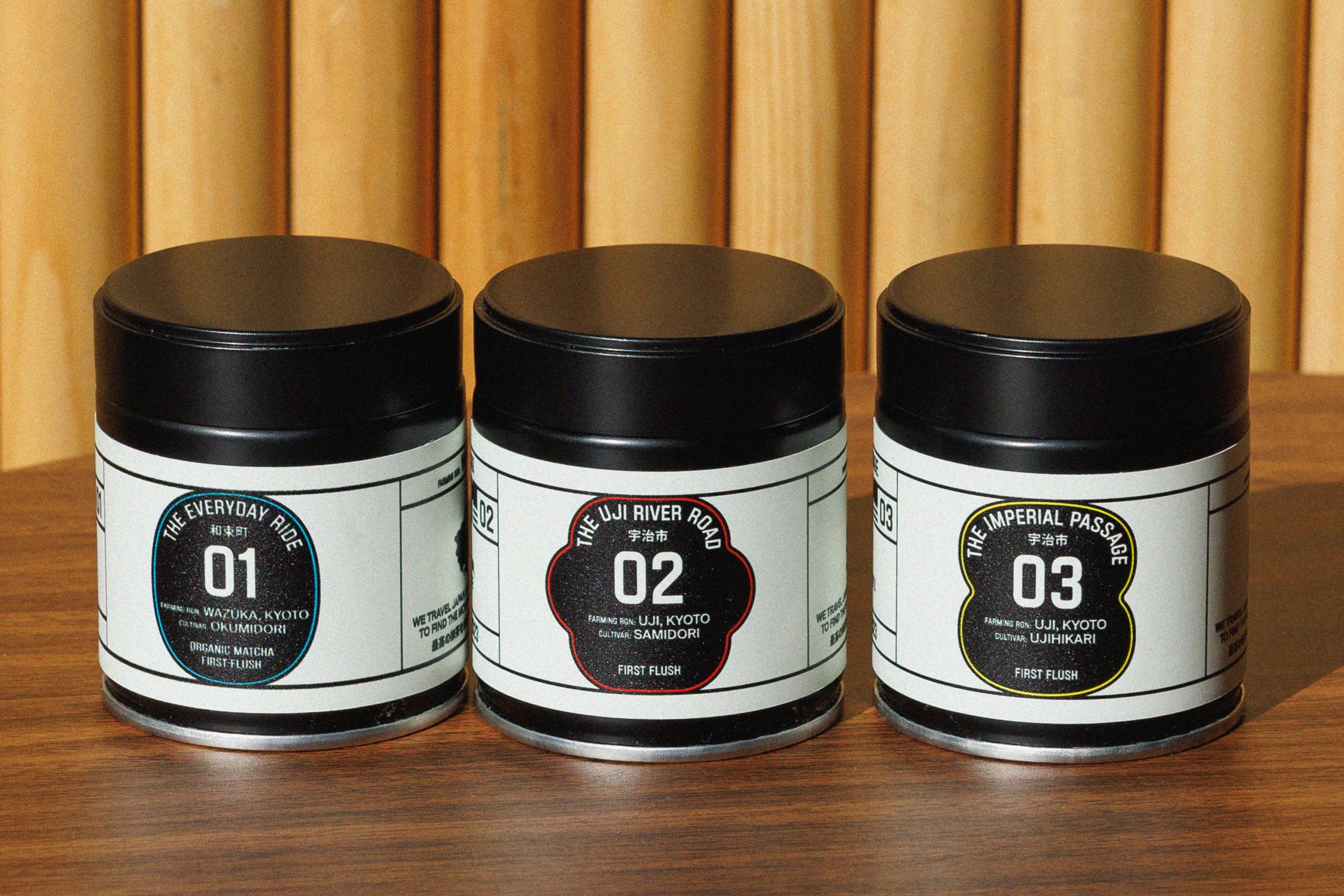
- Motorcycle Matcha has a unique packaging system built around the brand’s singular origin story of it’s founder exploring the tea regions of Japan on his motorcycle
- The brand bucks norms of the matcha category with visuals inspired by retro motorcycle advertisements and printed media
The best brands are those that tell compelling stories. Motorcycle Matcha exemplifies the sort of authenticity and unique POV that can come about when story is central to a brand, and the driving force behind decision-making. In Motorcycle Matcha’s case, that story is its unique origin.
Motorcycle Matcha looks and feels different from other matcha brands because they built a narrative system where the origin story is inseparable from the product itself. Their founder created Motorcycle Matcha around a journey through Japan on his motorcycle, discovering tea regions and matcha farms he now partners with for the product. Thus, the packaging system, designed by Saint-Urbain, reflects this adventure implicitly, nodding to movement, mid-century motorcycle advertising, and classic print media. In a category dominated by on-the-nose leafy motifs and tired wellness tropes, Motorcycle Match authentically breaks the mold. Not just for the sake of being different or bucking convention to stand out, but because the singular way the brand was founded is the foundation of everything else they created.

Motorcycle Matcha is a premium tea brand born from an unusual origin story: a motorcycle expedition across Japan in search of the country’s most exceptional matcha. Founder Gaston Becherano traveled through winding mountain passes and remote rural roads, visiting small tea-growing regions and meeting the artisan families responsible for producing some of Japan’s finest matcha. The journey ultimately led to partnerships with three multi-generational tea farms that continue to cultivate matcha through traditional methods focused on quality, patience, and craft rather than large-scale production.
We were brought in to create a brand identity and packaging system that could translate this story into a distinctive visual language. The challenge was to communicate both the deep heritage of Japanese tea culture and the adventurous spirit of the journey that inspired the brand. Rather than relying on familiar matcha tropes—green leaves, ceremonial bowls, or tranquil tea imagery—the design system instead draws from the unexpected intersection of tea culture and vintage motorcycle advertising.
The result is a brand that feels rooted in tradition yet energized by discovery: a visual identity that captures both the quiet discipline of tea cultivation and the thrill of the open road.

The Brief: Honor Tradition Without Falling Into Cliché
Matcha has become one of the fastest-growing beverage categories worldwide, but the visual language surrounding it has quickly become predictable. Many brands rely on calming wellness imagery or heavily stylized Japanese references that flatten the cultural depth of the product. The founders of Motorcycle Matcha wanted something different.
The brief called for a brand that felt authentic to Japanese tea culture without leaning on overused symbols or decorative motifs. At the same time, the identity needed to capture the adventurous spirit of the founder’s motorcycle journey through Japan’s countryside.
The goal was not simply to design attractive packaging, but to build a narrative system that would make the origin story inseparable from the product itself. Every design element needed to communicate craft, discovery, and respect for the traditions behind the tea.
Strategy: The Journey as the Brand
The central idea behind the identity was movement.
Motorcycle Matcha exists because of a journey. The founder did not discover these tea farms through distributors or industry contacts. He found them by physically traveling through Japan’s tea-growing regions, navigating narrow roads and rural landscapes on a motorcycle. That sense of exploration became the strategic foundation for the entire brand.

Rather than focusing solely on tea culture, the design embraces the tension between two worlds: the quiet precision of matcha production and the mechanical, adventurous energy of motorcycle travel. This contrast gives the brand a distinctive personality that feels both disciplined and dynamic.
The visual system therefore draws from two reference points: traditional Japanese design principles and the bold graphic language of vintage motorcycle advertisements.
The Wordmark: Speed and Precision
At the center of the identity is a custom wordmark that reflects both movement and clarity.
The lettering combines clean, modern forms with subtle references to vintage motorsport typography. The slightly elongated letterforms suggest forward motion while maintaining the calm restraint associated with Japanese design. This balance ensures the brand feels energetic without becoming loud or aggressive.
The wordmark is designed to perform across packaging, merchandise, and editorial layouts, maintaining legibility while also acting as a visual anchor for the broader identity system.

Graphic Language: Motorcycles Meet Matcha
The broader visual system draws heavily from the graphic composition of mid-century motorcycle advertising.
Vintage motorcycle ads often relied on strong typographic hierarchies, bold framing devices, and editorial layouts that balanced information with striking imagery. We adapted this approach to create a packaging and brand system that feels both nostalgic and contemporary.
Motorcycle iconography appears throughout the design, including subtle references to speed, travel, and mechanical components. These elements are integrated carefully so that they complement the product rather than overshadow it.
At the same time, the layouts retain the restraint and clarity associated with Japanese visual culture. Generous white space, controlled color palettes, and precise typographic alignment help maintain a sense of calm and balance.

Color and Materiality
Color plays a restrained but strategic role in the identity.
Rather than relying on the saturated greens often associated with matcha packaging, the system introduces a more understated palette inspired by vintage print materials and motorcycle ephemera. Neutral backgrounds allow the vibrant green of the matcha itself to become the visual focal point.
This approach reinforces the product’s authenticity. The tea is not competing with the packaging. Instead, the design frames the product as the hero.
Material choices and print finishes further emphasize craftsmanship. Clean surfaces, minimal ornamentation, and strong typographic composition allow the packaging to feel premium and deliberate while remaining accessible.
Editorial System
An editorial design approach ties the entire brand together.
The packaging, website, and printed materials share a typographic structure inspired by vintage advertisements and travel ephemera. Headlines, captions, and supporting text are arranged in clear hierarchies that echo the layout logic of classic print media.

This editorial system reinforces the brand’s storytelling. It allows Motorcycle Matcha to present not only the product but also the narrative behind it: the landscapes traveled, the farmers met along the way, and the traditions that shape the tea itself.
By structuring the identity around typography and composition rather than decorative motifs, the design remains flexible as the brand expands into new products and formats.
A New Perspective on Matcha Branding
Motorcycle Matcha ultimately offers a different perspective on how tea can be presented in a modern market.

Instead of relying on familiar wellness aesthetics, the brand tells a story of exploration, craftsmanship, and cultural exchange. The identity respects the traditions of Japanese matcha while introducing a bold and unexpected visual voice inspired by the founder’s journey.
By combining the quiet discipline of tea culture with the adventurous energy of motorcycle travel, the brand creates a visual world that feels distinctive, authentic, and memorable.
Motorcycle Matcha demonstrates how thoughtful design can transform a simple product into a narrative experience—one that connects the precision of Japanese tea farming with the thrill of discovering it firsthand.