Contact lens packaging often tends to lean into a cold, medicinal space. Yet, designer LYN G. noticed a gaping hole in the industry and designed a packaging system for moody, a monthly disposable contact lens, that feels delightfully welcoming and inspiring. Being able to see clearly is worth celebrating, and moody’s light visual aesthetic leans into a sense of playfulness that’s often left behind in this industry. Plus, the floating type wonderfully visualizes the art of the contact lens floating on the eye. At the same time, the circular nature of the chosen typefaces creates a holistic approach to the round nature of the product and its purpose.
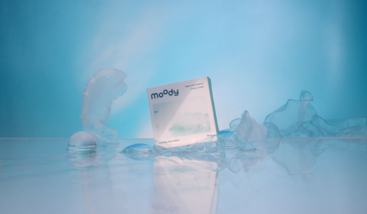
With the theme of a dreamy and wonderful aquarium night, and the illusionary colors that take away from the real senses, the unintentional wandering state of the ocean and creatures are captured on the carton through the Polaroid perspective, while the graphics use the dotted color spots on the contact lenses splashed in the frame to form a more imaginative visual image that leads consumers to unconsciously associate with the color of the contact lenses and the romantic atmosphere they may create.