Invade design is the mastermind behind the packaging design for Juniper’s ready-to-drink brand. The packaging design is focused on beautifully executed typography and charming color combinations. Plus, each bottle creatively contains two servings, so pour one for yourself and one for a friend while you sit in awe of the lovable packaging before you.
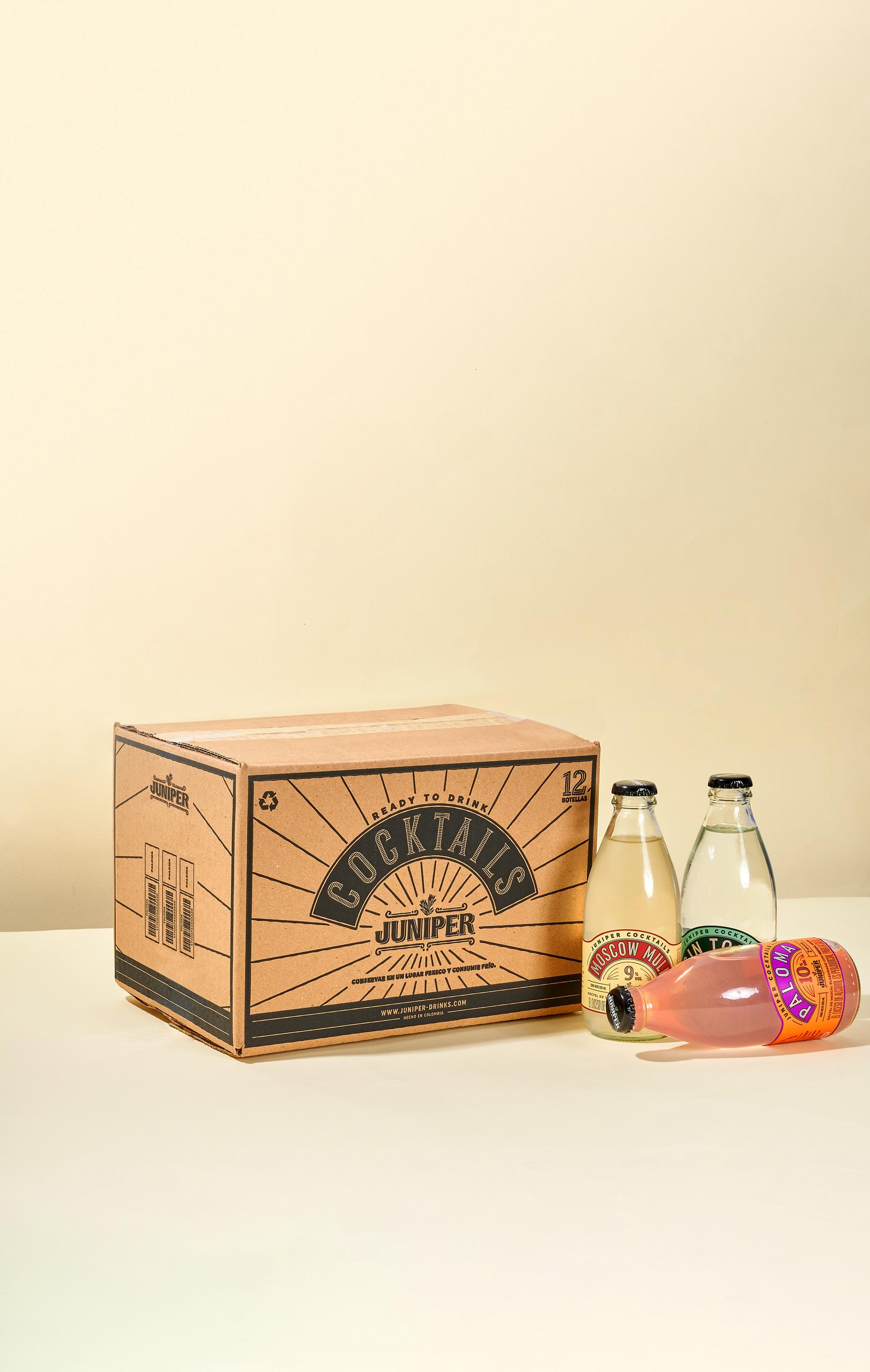
Ready to read or ready to drink? You call the shots and we follow! Two years ago, during quarantine, people wanted to spend their regular time with friends and family (and cheer up with a few drinks, obviously!). Unfortunately, as we already know, that wasn’t possible. So, people started to look for ways to improve the fun at home and so did Juniper with their latest release: ready to drink cocktails. We designed three different labels for three different cocktails: gin tonic, moscow mule and paloma. They keep some similarities to the collection of tonic waters we made a while ago to maintain the brand consistency.