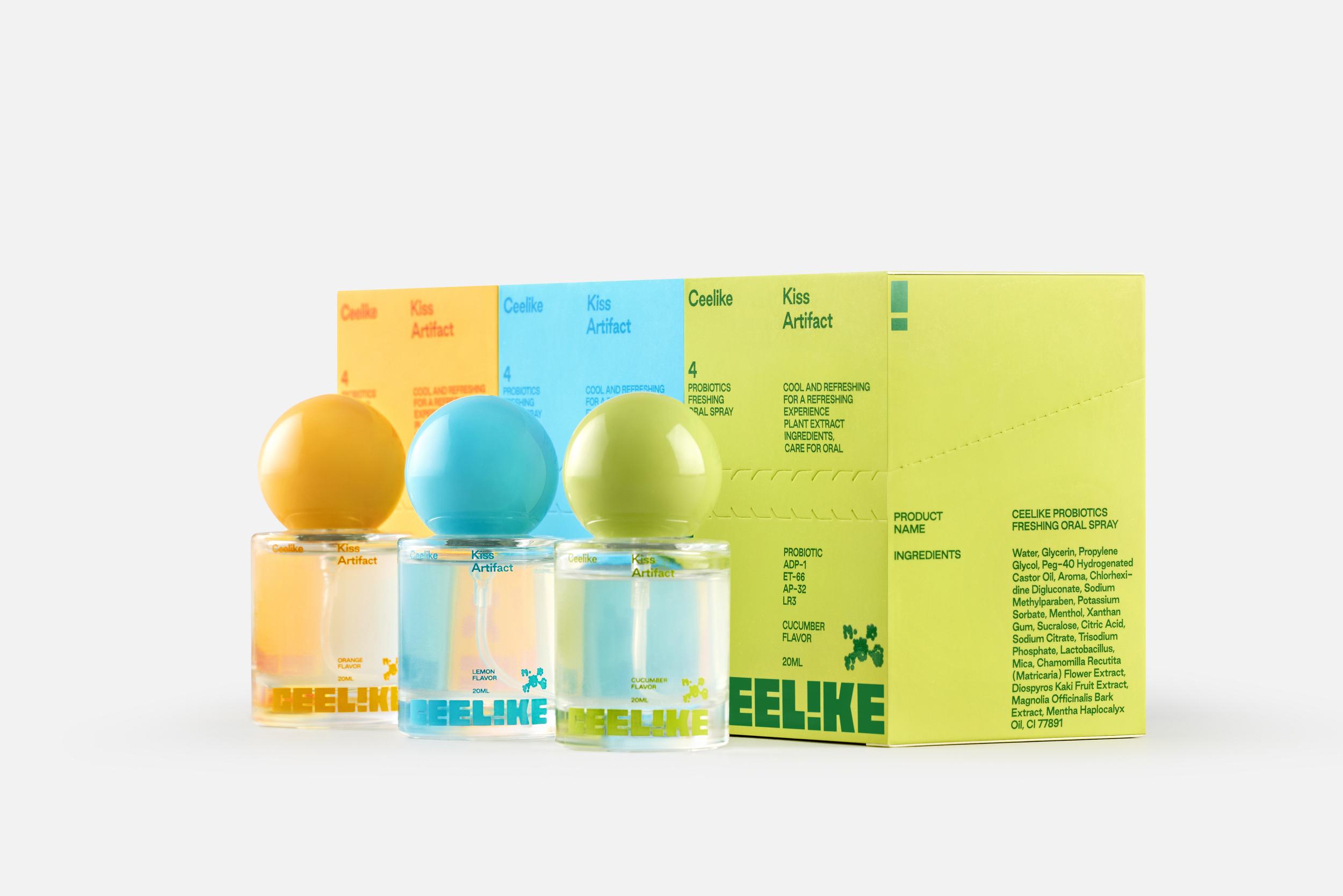
Ceelike Gives Dental Care Something to Smile About
By
Published
Filed under

Published
Filed under

There’s a rumor that dental care is going to be the newly designed hot item, and Ceelike is making a case for it. Ceelike’s packaging by Studioenok treats oral care like a contemporary wellness object rather than a medical obligation.
Rounded bottles topped with glossy spheres reference cosmetic perfume flacons, while the typography is clean, modular, and quietly assertive. Bright citrus greens, aqua blues, and soft yellows map directly to flavor cues without cartoon shorthand. Minimal pixel-like icons add a tech note. I’d brush my teeth six times a day if I were using products that looked like this.

Add project credits with Dieline PRO | Log in
Get unlimited access to latest industry news, 27,000+ articles and case studies.
Have an account? Sign in
To provide the best experiences, we and our partners use technologies like cookies to store and/or access device information. Consenting to these technologies will allow us and our partners to process personal data such as browsing behavior or unique IDs on this site and show (non-) personalized ads. Not consenting or withdrawing consent, may adversely affect certain features and functions.
Click below to consent to the above or make granular choices. Your choices will be applied to this site only. You can change your settings at any time, including withdrawing your consent, by using the toggles on the Cookie Policy, or by clicking on the manage consent button at the bottom of the screen.















