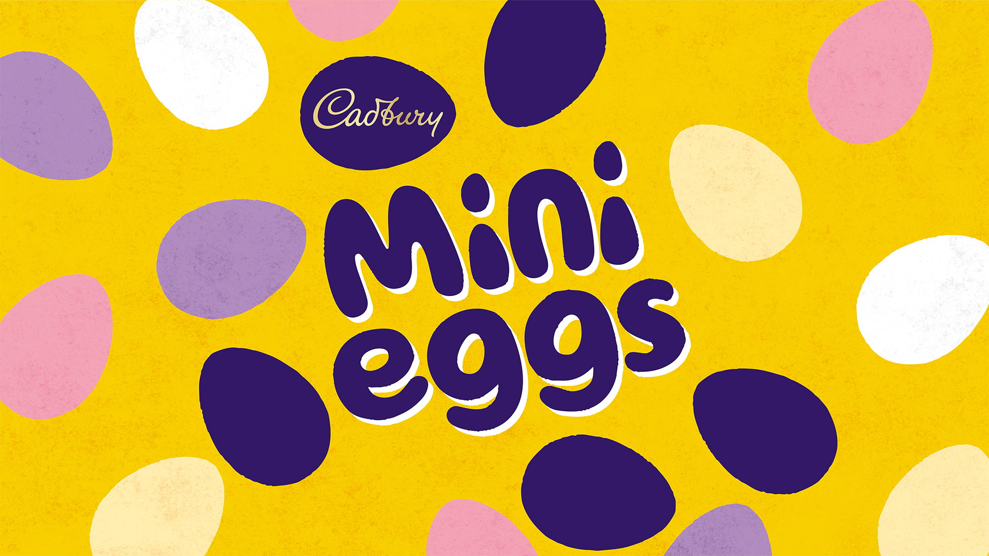
Easter has a particular way every year of coming out of absolutely nowhere. One day it’s winter, and the next day you’re in the backyard wearing pastel colors watching kids scramble for eggs. Wild how it happens like that. Thanks to this Cadbury Mini Egg rebrand designed by the brand and design agency Bulletproof, I feel more on top of the holiday this year.
This rebrand is everything you could hope for. The colors are wildly recognizable from the Cadbury branding, but it’s still fresh and new. The new look and feel is clean and joyful, with the new identity boosting a year-round appeal as one of Cadbury’s core personality brands. The rebrand’s whole goal was to capture a sense of nostalgia, and between the perfectly imperfect typeface, the multi-colored graphical eggs, and a bright yellow bag, I’d say this packaging is bringing back a longing for my childhood in the best possible way.