Herz Uber Kopf Was Designed For The Youthful Explorer

Published

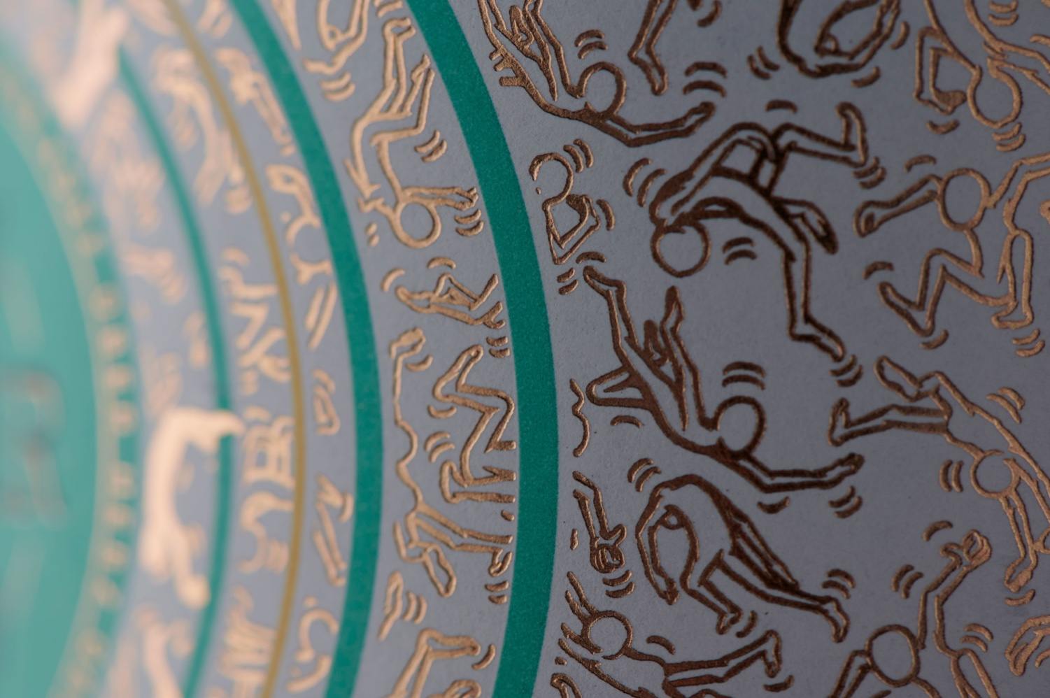
Herz über Kopf is a wine that celebrates the idea of youth. With a bottle that’s intricate and gorgeous yet completely unpretentious, it’s accessible for all, even those that might not be established themselves. The design system is contemporary through its classic design system and color hues that are fun and hip. Designed by Bravo Design, the consumer in mind behind the design is friendly and unafraid of new experiences that shines through beautifully.


Editorial photograph

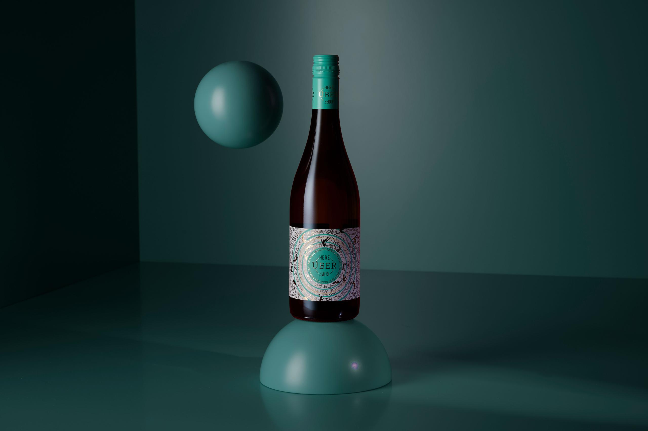
In a lesson of brand authenticity, Germany-based wine brand, Herz über Kopf, recently acquired the services of our South African design company, Bravo Design in Cape Town, to assist it with its label designs. Instead of only telling its customers to make choices inspired by their hearts, Andreas Ambs, winemaker and owner of Herz über Kopf led by example when he decided not to be encumbered by language or boundaries when it came to choosing a design agency – selecting one situated at the tip of Africa, because this is where he found the atmosphere, the creativity and the personalities of a design team to suit his brand.

Herz über Kopf is the ‘young, uncomplicated and fun-loving brand’ of established winery, Josef Ambs in Kaiserstuhl. The brand launched in 2019 with a white wine (Müller Thurgau) and shortly thereafter, a Rosé.

Intended to represent a new and inspiring wine concept, the brand opted to not necessarily focus on the wine varieties, but rather what the wine represents: freedom and those special moments in which the heart wins! The emotive element was to become the determining factor for a wine label design that had to capture the attention of consumers who are sociable and seeking new experiences. Being a fun market segment, these consumers are also notoriously difficult to design for; they buy on impulse, which means a wine label has to entice enough to elicit an impulse buy, while being engaging enough to also convert them into loyal fans.

Editorial photograph

Our response was to design a packaging concept that creates interest in the German middle-segment market, with an attractive label that is powerful – but not overpowering. We achieved this with a design that is super funky and contemporary, supported with classic design values of colour and shape to assist brand recall and recognition – with the very strong circle and teal colour – creating recall from five metres away. The brand story comes to life with the decorative detail – the crowd of tiny outlines of people caught in ‘heart-driven’ moments – that you engage with once you have the brand in hand. The circles seem to represent ripples of energy, pulsating from the center of the label which also depicts the brand name, with ‘Kopf’ cleverly inverted as a literal interpretation of the brand’s ethos.

Editorial photograph

Once the design was signed off, Vollherbst Labels in Germany provided the print and finishing concept: a classy embossed label with copper foil that elevated the label, while also being a budget appropriate option.

Creativity certainly does not happen in isolation. The best results are achieved when the studio and client work together in solving creative challenges – as a team. This symbiotic synergy is where the young and innovative team of Herz über Kopf really shined. This ‘co-creation’ attitude – across 13 000kms – resulted in a design that can claim its unique spot in the hearts of consumers. Job done!

Editorial photograph

This placeholder is removed when the ad slot is configured.

This placeholder is removed when the ad slot is configured.

This placeholder is removed when the ad slot is configured.

This placeholder is removed when the ad slot is configured.

This placeholder is removed when the ad slot is configured.

This placeholder is removed when the ad slot is configured.