By looking at the best packaging of the past year, one gets a picture of the world today. And if the design trends are an anecdote, the diagnosis is that the patient is overwhelmed. In economics there is an old idea that “every abundance creates a new scarcity.” When one thing becomes popular, there is always a corresponding part that becomes more valuable because it has become rare. A few trendsetters will realize this shift, and start exploiting the scarcity, which grows in popularity until it becomes the new norm, and the cycle repeats. This is “fashion is fickle” read through an economic lens. This is the cycle we are all familiar with: trends coming and going—then coming back. Design is the catalyst driving this cycle. The role of design is to address the woes of the consumer, creating solutions and refreshing ideas. So by reading the design trends we take the pulse of the general public. This is the value in studying trends—and all history: we study the past so we may predict the future.
So what can we see? The message expressed again and again in this year’s packaging is that consumers are overwhelmed. This year’s designs are all about boiling down and simplifying. Today we have an abundance of information, choice, and messages. We have everything at our fingertips and the ability to be instantly connected to millions of people. This has many benefits—but the flip-side is that it is harder than ever to find what we want. We are divided, distracted, and overwhelmed. Therefore, we place a very high value on those who sift through the madness and abundance to filter out the signal in the noise. We pay a high price for those who curate, clarify, simplify, and discover the few meaningful, quality things that are buried deep in the haystack of the internet. We want simple, clear, digestible messages—because that is all we have time for and all we can handle. This is the antidote this year’s designs push us towards.
This is not just minimalism. One might call it new minimalism—but a more apt name is essentialism. Where minimalism says “less is more,” essentialism says “enough is enough.” Minimalism strips away, essentialism focuses on the essential. There is a richness to essentialism that differentiates it from the philosophy of minimalism, which often comes off as stark and cold. Essentialism focuses on clarity of message and on creating an emotional state in the viewer that is fulfilled and satisfied. Happiness is an essential element.
Today, design’s role is as much about discovering and articulating what is important as it is about shape and structure. Packaging designers must now be experience designers, directing the customer through the storm to a singular experience—because experiences are what today’s customers are after. Packaging designers are now in charge of directing the experience, which leads to a connection with the product and a brand.
The designs of this year focus on shareability. Packaging is no longer simply about packaging the object—it is about the unboxing experience and art directing. This is where the process starts for designers today: you work backward from the Instagram image to the unboxing moment to the design that serves it. This too explains the shift towards basic design: large text spelling simple and straightforward messages, basic shapes making patterns in primary colors. Designers realize that packages are now billboard-like advertisements to be featured in photos and shared across social platforms. Thus, the benefit of a simple clear message stated in large bold letters gets repeated with every new viewer.
The task of the designer this year was clear: how can you articulate the value of the product in simple, approachable terms and connect with the consumer through the torrent of information? The answer manifested itself in a number of ways but ultimately remained the same: focus on the essential, eliminate the rest.
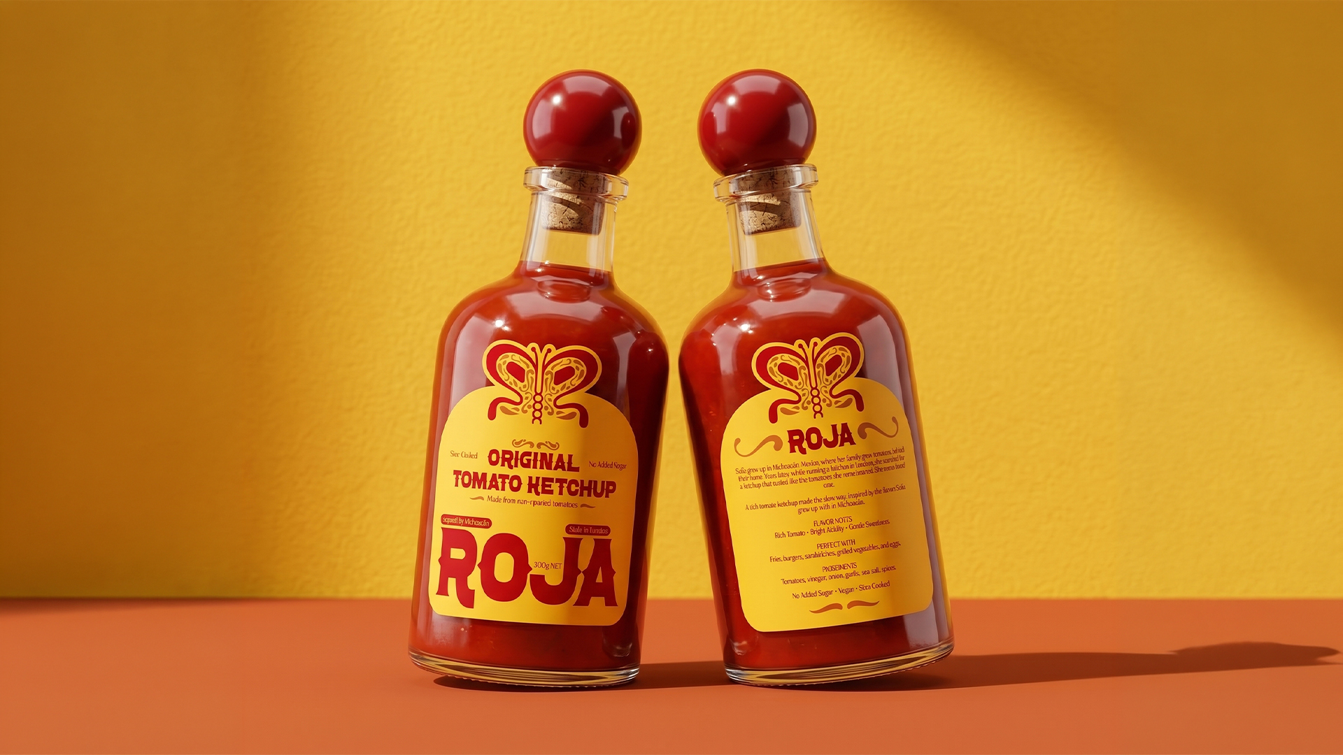
In much of the best packaging of the year, there was clarity of purpose. The designers understood the purpose of the object and the thought process of their audience. In service of this, they simplified the message and stated it clearly and boldly across the face of the packaging. These designs are text-based and say what they are in no uncertain terms. They realize the value of a simple message in today’s crowded world. The simplicity does not come off as lazy or incomplete but refreshing and honest. This is the manifestation of the idea: clarify not simplify. These designs identified exactly what the customer was searching for and expressed it simply. It comes off as powerful and trustworthy. As you walk the aisles or sift through your mail—here you see one shining beacon that speaks to you in words you can understand and connect with.
A great example of clear design is Tylenol’s Care+ packaging. The face of the package simply proclaims: “I have a Cough,’ or ‘I have a Fever.” They understood the mindset of the customer: stumbling down the aisle, not feeling well, just wanting to get back in bed, repeating to themselves over and over in their head as they search through the undifferentiated products stuffed in the shelves: “Cough medicine… I have a cough… cough.” Then they read the label on this simple package and it is as if it read their mind. The shape of the bottle is simplified to look like a giant pill. This too furthers the goal of articulating the essential: pill = medicine, the label explains what kind. This design is particularly refreshing in an industry whose packaging is known for being covered in words no one can pronounce. This jumps off the shelf as the one thing that can diagnose and cure you in terms you can understand. And simple does not mean low-tech. Tylenol Care+ is enhanced with smart technology, such as NFC, E-ink, Flexible OLED, and Bluetooth technology, to provide convenience and assurance to the safety of the user. For products which mean the difference between sickness and health, the stakes are high, and the value of a clear message with only essential elements is of the utmost importance.