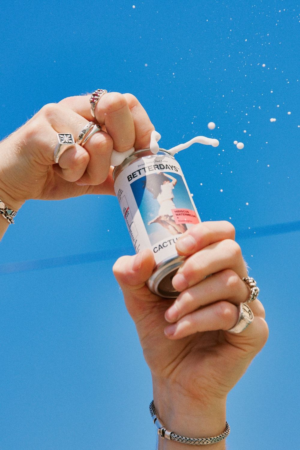
Fusing the CPG world and an editorial aesthetic, designer James Hill created Betterdays’ packaging with a keen eye. Each of the products in the range features an optimistic, upbeat connotation. While the photography is quick to make an impact, the bright hues balanced with excessive white space add a harmonious sense of proportion to the can.
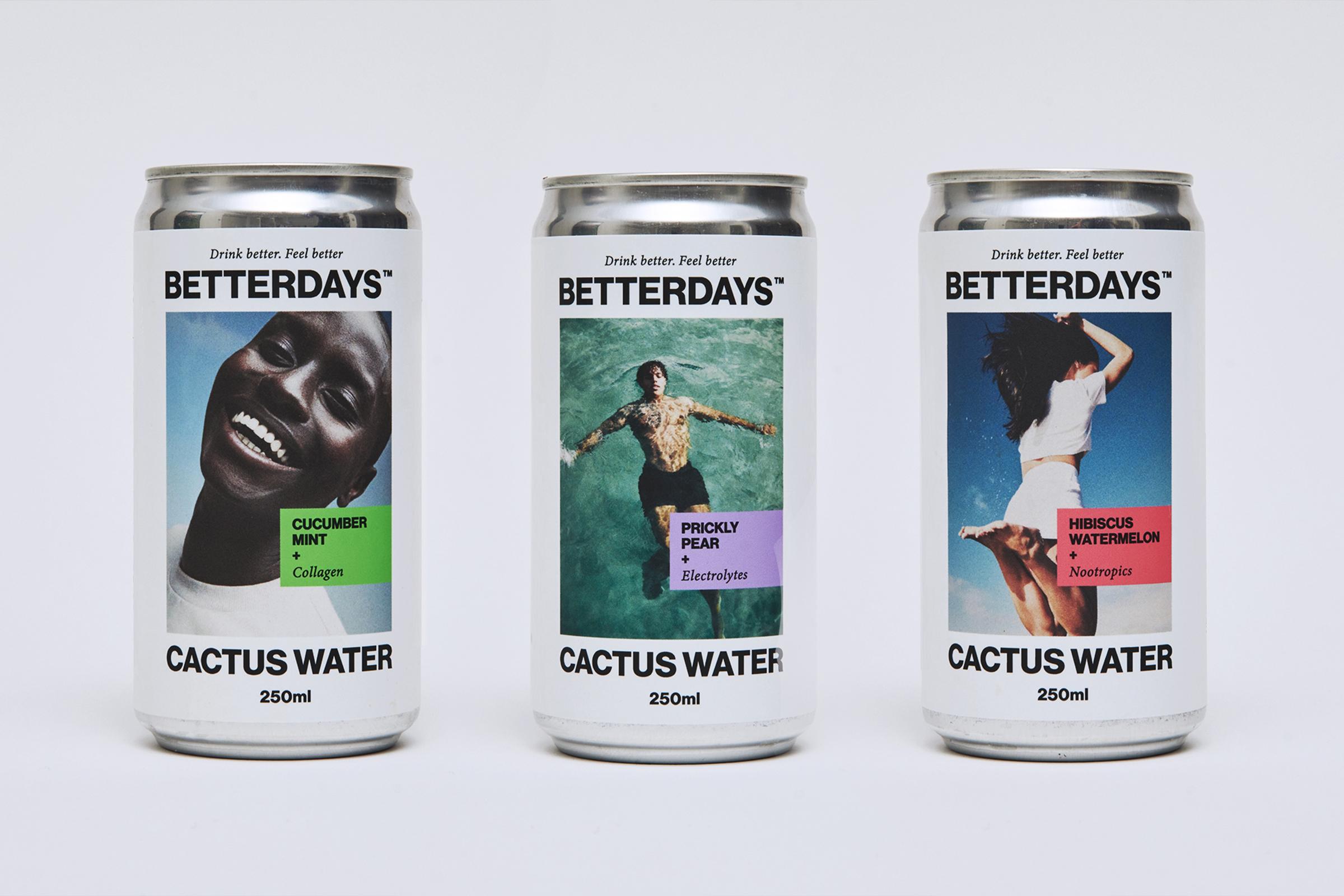
BetterDays Cactus Water is Australia’s first cactus water brand. A healthy beverage made using the fruit from the prickly pear cactus. Prickly pears are rich in electrolytes and antioxidants and most importantly have a delicious flavour profile. Cactus water comes in three flavours with three functional benefits targeting hydration, mental clarity and beauty. The designs of the cans aim to encapsulate the feeling of the functional ingredients, while also representing the hope and optimism behind the names BetterDays. The design also gives scope to photographer and artists collaboration as well as easy rollout of future flavours