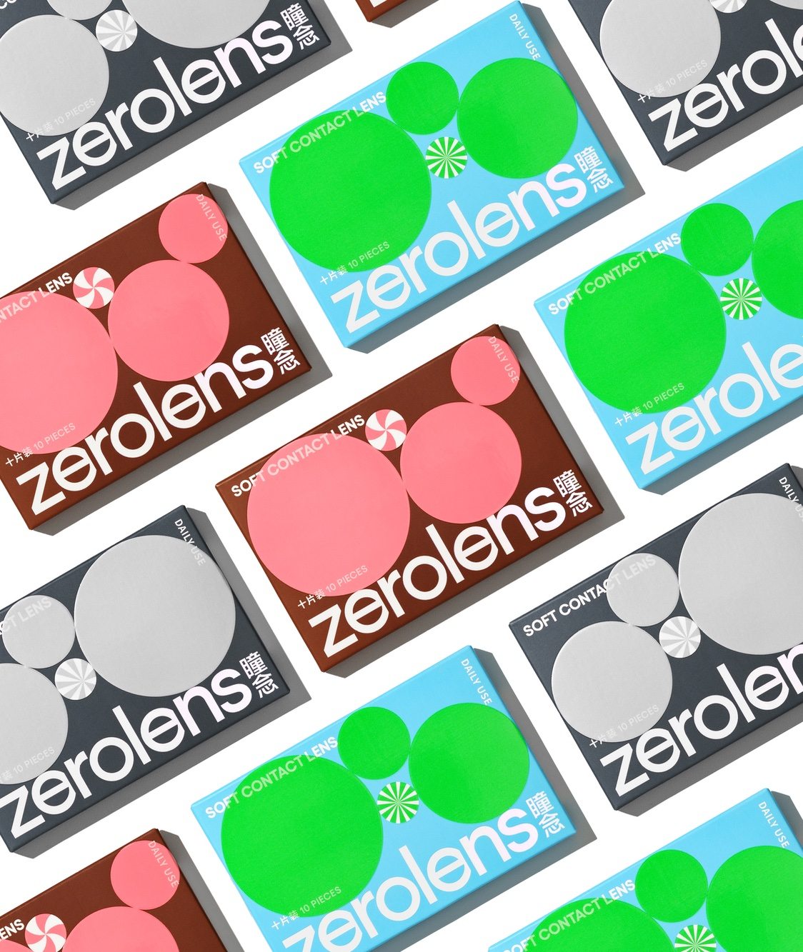
Contact lens packaging almost always leans into a highly medicinal, overly scientific approach. Zerolens’, however, is much more playful than the traditional. Through unexpected color combinations, using the circular shape as a pattern play, and soft, sans-serif typography, the packaging becomes much more fun and makes the chore of putting in contacts become at least mildly satisfying.