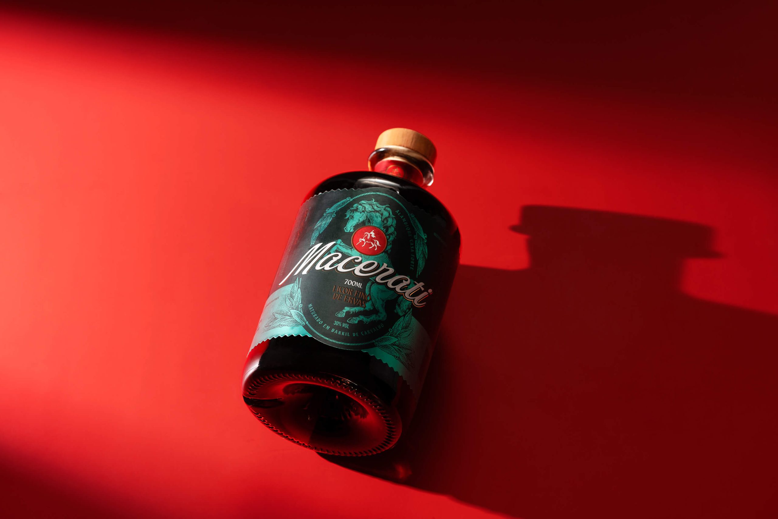
JKR Helps Schweppes Reclaim Its OG Soft Drink Status
By
Published
Filed under

By
Published
Filed under
When legacy brands stop apologizing for their age and start leaning into it, the packaging design becomes stronger, and Schweppes just pulled it off beautifully.
The redesign, designed by Jones Knowles Ritchie, which transforms a familiar but flat can into something that will stop you mid-aisle, trades the old design’s flatness for a yellow band that radiates warmth. The diagonal stripe across the can adds a sense of movement and luxury without a single illustration.
The reimagined 1851 Great Exhibition fountain rendered in tonal gold on the packaging is the kind of detail that rewards a second look, rooted in real architectural history but abstracted just enough to feel like a contemporary design. There’s a commitment to warmth over coolness in this redesign, proving that almost 250 years of history is not a burden but the most compelling story on the shelf.

First things first, what was the challenge?
Schweppes is the world’s original soft drink, an almost 250-year-old constant in an industry of fleeting trends. But a recent flood of artisanal newcomers was now threatening the brand’s dominance. It was clear that Schweppes needed to reassert its status, and what better way to do so than with packaging as crisp, crafted and effervescent as its drinks?

What about the objective?
To help Schweppes remind both consumers and competitors that it’s the 1783 original, and that taste only develops over time.
Challenger brands could talk of “craft”, but it was Schweppes’ story to tell. So, our strategy was to reclaim rather than reinvent. We pored over the archives, pooling references from Schweppes’ past that could inspire new twists.
Okay, now to the important stuff. What did the packaging look like?
In a word, gleaming. We doused Schweppes’ packaging in a warm, saffron yellow shade that’s reminiscent of golden hour, the perfect time to socialise with an open bottle of fizz. Then, we got to work bridging 18th century heritage with modern luxury. We reintroduced serifs to Schweppes’ logo and infused it with effervescent bubbles. Finally, we reimagined the legendary 1851 Great Exhibition fountain for new audiences, distilling its architectural elegance.

By blending heritage cues with a bold palette, we helped Schweppes stand out again in the category it invented, across markets, ranges, and flavours.
Any results yet?
As the first market to debut the new packaging, South Africa served as a high-stakes proving ground. The impact was immediate. Glamour magazine heralded the launch as “a cultural reset for how we socialise,” but the true victory was commercial.

In a market where Schweppes’ sales had been in decline, the new identity triggered a reversal of fortunes, delivering +12.6% growth in January compared to the previous year and +15.4% new shopper recruitment, providing a powerful blueprint for the brand’s global resurgence.