The meal kit and ready-to-eat category is already very crowded, so when BroHouse took on the challenge of making Pizzeta stand out within it, they stripped away every tired food packaging cliché and replaced it all with the expressive, joyful, and instantly human language of Italian hand gestures.
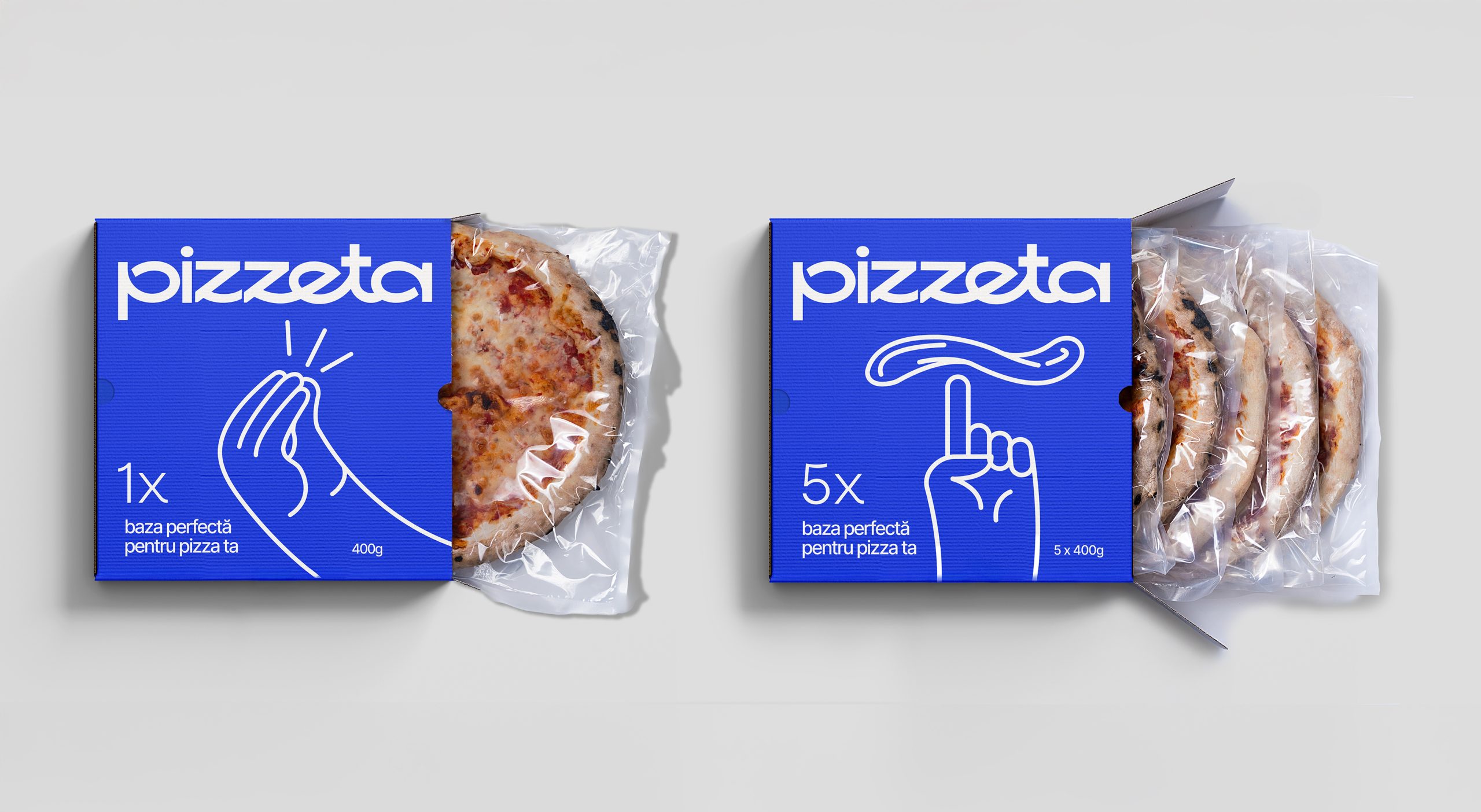
Pizzeta, designed by BroHouse for this artisanal pizza base brand, roots its packaging in one of Italy’s most universally recognized cultural signatures, using expressive line-drawn hand gestures as the hero illustration. The gestures draw from a centuries-old tradition of nonverbal communication that carries warmth, humor, and immediacy across language barriers. The Pizzeta wordmark sits in a rounded, slightly quirky sans serif with a warm Mediterranean looseness, comfortably set against the cobalt blue. The checkerboard pattern that runs along the base of the box is a fun finishing detail that never feels overly cliché, keeping the whole system grounded in culture while staying completely fresh.

Pizzeta | Packaging That Gestures Italian
Pizzeta is an artisanal pizza base that brings families together to make their own pizza at home
At the Heart of the Design
• Pizzeta stands on a simple truth: great pizza begins long before toppings. It begins with a base crafted slowly, with natural ingredients, and without shortcuts. The product is an artisanal pizza crust made through long fermentation, delivering the quintessential Italian contrast – crisp edges, airy interior, and the unmistakable aroma of an authentic “forno” experience, recreated at home.
• The challenge for BroHouse was to translate this purity and emotional richness into a packaging concept capable of standing out in a saturated ready-to-eat and meal-kit category. The result needed to feel contemporary, warm, and intuitive – a design that communicates ease, naturalness, and the joy of making something simple yet meaningful.
Design Approach – Italy, Told Through Gestures
• Instead of leaning on the typical visual codes of the category – overflowing toppings, flames, rustic textures – Pizzeta takes a radical step in another direction. We chose to anchor the brand in one of Italy’s most universal cultural signatures: hand gestures.
• These gestures are more than expressions; they are a language. They carry warmth, spontaneity, humour, and an instantly recognisable rhythm. By focusing on the expressive power of hands, the packaging becomes a visual dialogue – a nod to the lively, human charm of Italian cooking.

• Each illustration is crafted as a fluid, minimalist line drawing. The intention is not to depict pizza, but to express it. To convey the feeling of a shared meal, the joy of improvisation, the ease of everyday cooking. The illustrations capture iconic signs: delight, approval, playfulness – transforming each pack into a small emotional performance.
• The colour palette revolves around a calm yet modern blue, chosen to contrast category expectations and elevate the brand into a more premium, contemporary space. The negative space and clean structure ensure the line drawings breathe effortlessly, giving the product a sense of quiet confidence and everyday sophistication.

Why It Works
• The packaging reflects the brand’s core values: natural, human, honest, joyful. It avoids theatrical Italian clichés and instead distills the culture down to something intimate and timeless – the gesture.
• This approach allows the product to communicate on two levels:
a) Functional clarity – Pizzeta is easy, natural, and perfect for home pizza moments.
b) Emotional authenticity – the packaging “speaks” the way Italians do, creating a subtle yet powerful connection.
• The design is intentionally simple, but not simplistic. It is expressive without noise, sophisticated without pretense, warm without kitsch. Every element from the line weight to the composition contributes to a brand that feels both handcrafted and contemporary.

The Result
• Pizzeta’s packaging becomes more than a protective wrapper; it becomes a storyteller. It invites consumers into the world of Italian cooking rituals, not through photographs or copy, but through an unmistakably human visual language.
• By letting gestures do the talking, the brand achieves a rare balance: bold differentiation, emotional resonance, and a timeless aesthetic that elevates the routine act of making dinner into a small, joyful ritual.
• The final identity is expressive, modern, and deeply rooted in the cultural spirit that inspired the product itself. Pizzeta doesn’t describe Italy. It gestures it with charm, warmth, and a refreshing sense of ease.