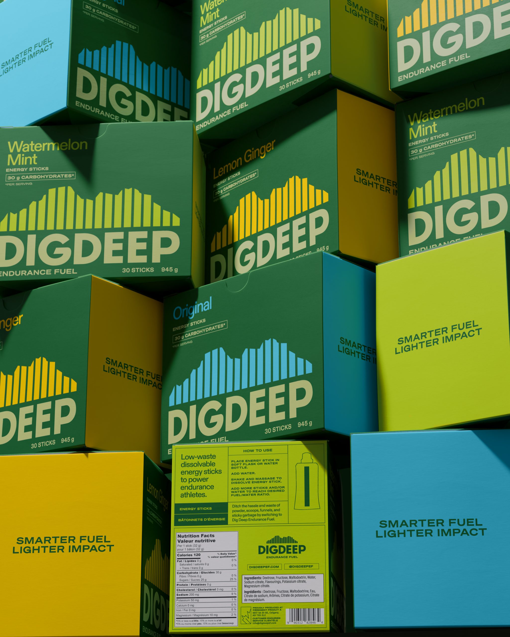
The sports nutrition category is often shouting at athletes with aggressive graphics, but Dig Deep Endurance Fuel, designed by Public House Studio, builds its entire visual system around the landscape of Canmore, Alberta, using the repeated vertical bars of the dissolvable energy sticks themselves to form an abstracted mountain range silhouette that doubles as a heart rate monitor, making the central graphic element a simultaneous nod to the terrain where the product was born and the physical effort it is designed to support.
The deep pine green is doing serious work here, grounding the brand in the natural world and sustainability without ever feeling dull. Meanwhile, the flavor accent colors inject just enough energy and differentiation to make the range feel alive and dynamic on the shelf. What makes this one of the most interesting packaging systems in the sports nutrition space right now is that it earns its simplicity completely. Every design choice from the layout to the color choices builds on a genuine founder story, and that integrity is something you can actually feel when you pick it up.

Low-waste dissolvable energy sticks for endurance athletes
—
This project was born from lifelong marathoner Alison McPherson, based in Canmore, Alberta in Canada. Raised in a family of runners and immersed in the outdoors, she developed a deep respect for both endurance sport and the natural environment.
After years of high-level training and competition, Alison became increasingly frustrated with the waste generated by the sports nutrition industry.
The category is dominated by single-use endurance gels. These products are essential for performance athletes, which means during a typical training session or race, an athlete may use 4–8 individually packaged gels.

Powdered alternatives exist but they lack the convenience of single-serve gels. They can be messy, difficult to transport during races, and require scoops, funnels, and additional containers. Smaller single-use powder sachets replicate the same waste problem.
Introducing:
Dig Deep Endurance Fuel transforms traditional carb powders into dissolvable energy sticks — eliminating single-use packaging while delivering high-performance nutrition. The sticks remove the need for wrappers, scoops, funnels, and waste.


Design:
With the design it was important to stick Alison’s ethos: Keep it simple, reduce excess, and respect the purity and simplicity of running and nature. We kept the box intentionally un-cluttered to reflect these values and cut through in a crowded market. We wanted the brand to feel strong, calm and confident.
Vibrant flavour accents pop against deep pine greens inspired by the mountain landscape surrounding her home in Canmore. The palette balances high energy with grounded natural tones as performance meets sustainability.
The logo is designed off the shape of the sticks, but incorporates custom curves through the G, to highlight the softer human quality behind the brand.
The sticks are abstractly used to build out the shape of mountain range where Alison trains in Canmore (see photo), and loosely convey a heart rate pattern as they repeat and rise and fall — a visual metaphor for effort and endurance. The name Dig Deep comes from the perseverance at the heart of all athletes and what Alison had written on her hand when she won her previous Half Marathon.
This is an exciting new development in the sports nutrition market thanks to a founder with true love for the sport and our environment.