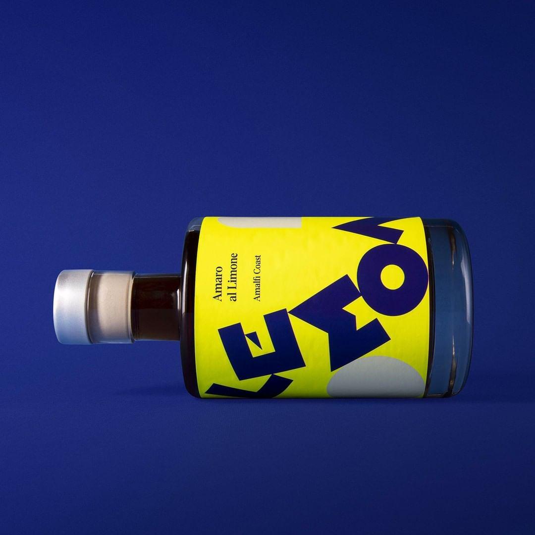
The movement and color combinations of this Amaro al Limone packaging design are striking and robust. The deep blue offsets the yellow in a way that makes the paring feel as though it is meant to be. The bold sans serif type creates a lasting impact that will most definitely stand out on any shelf in any city.

Scacciaventi is the oldest village in Cava De ‘Tirreni.