Coffee culture has got us all hooked, living from one cup to the next. Angel & Anchor’s redesign of Triple Co Roast has given the brand a new vibrant personality sure to make waves among coffee-lovers. While honoring and centering the core elements of the brand’s original identity, like hand-drawn and gritty characteristics, the new design is down to earth and confident in its central fluid pattern with striking black accents that connect to the grease and gumption of their hands-on mission. The focus on the coexistence of personality and professionalism gets reflected in the hand-drawn serif and illustrations, grounding the brand in its humanity.
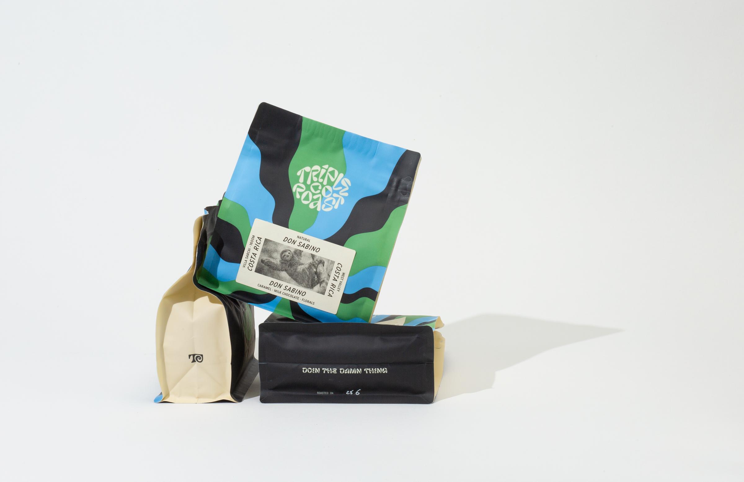
Triple Co is a Bristol-based speciality coffee roaster that began in 2016. Six years after opening, they tasked Angel & Anchor with taking to the drawing board to create a rebrand with a significant shift in personality from their original brand. Founder Jo Thompson started in speciality coffee through the inspiration of Copenhagen laboratory-style brewing. Down the line, he found himself in Flordia with King State Coffee, connecting with a more personable and vibrant approach to the coffee industry. Triple Co came to evolve through Jo’s mixed influences and experiences, resulting in a collection of design elements that lacked connection. The original branding was, at its core, reflective of the minimalist style of brewing that sparked the beginning of the roastery. Brand elements were a mix of clean lines, a sans serif logo, a monotone colour palette, gritty illustrations and hand-drawn lettering. As a mismatched collection of elements, their personality felt compromised rather than unified.