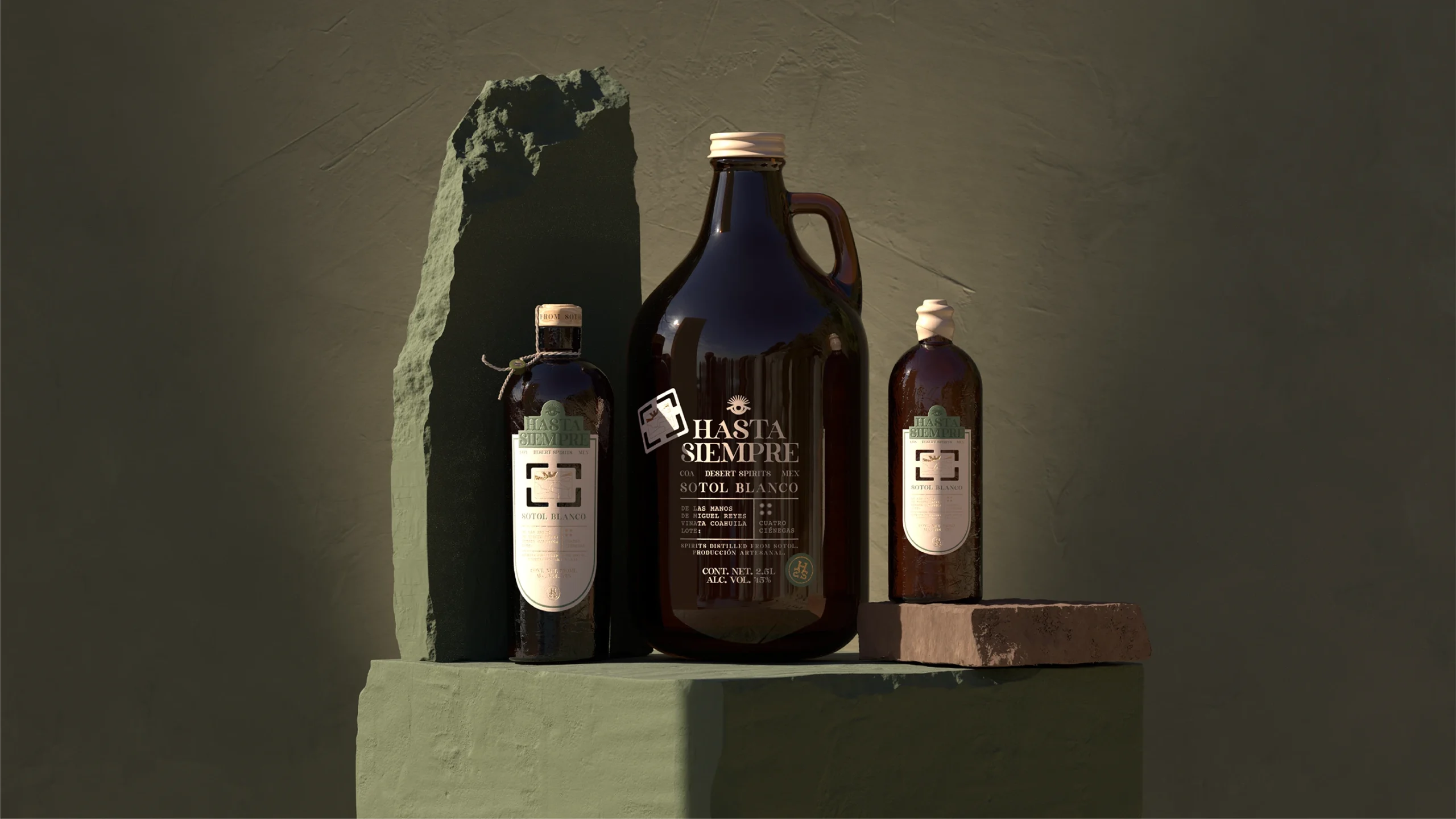
Spirits packaging is embracing a more tactile, place-driven kind of storytelling, and Hasta Siempre by HI! ESTUDIO takes that movement deep into the Mexican desert.
With amber glass, dusty olive green, and a warm cream, the palette creates an earthy feel. The serif typography brings a romantic, almost archival character, balanced by an orderly label that never feels overly rustic. Details like a cord made from sotol leaves, locally produced wax, and a wooden closure make craftsmanship integral to the design, connecting it directly to the traditions behind the spirit. Where many drinks brands chase polished minimalism or decorative maximalism, Hasta Siempre finds a smart middle ground, tapping into consumers’ growing interests in provenance, natural materials, and design that lets imperfection and history become part of the experience.
Gabriel Cuevas Franco, Co-Founder of HI! ESTUDIO, dives into more of the strategy behind the design below.