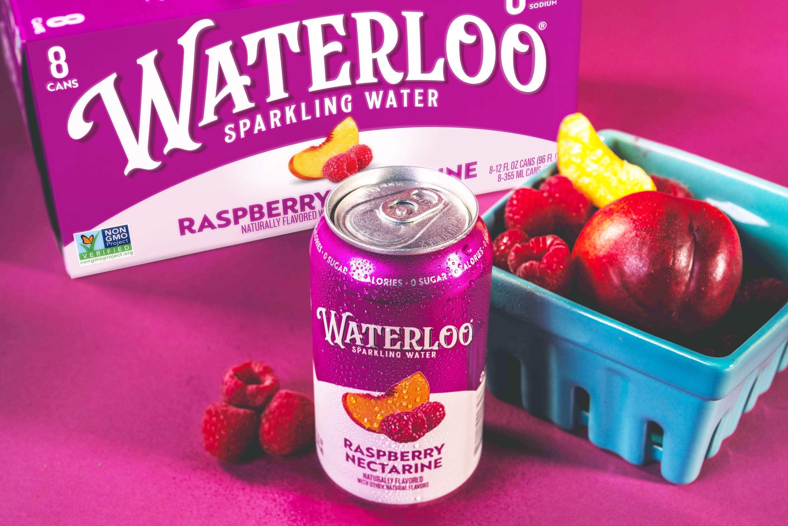
Sparkling water packaging is getting juicier and more flavor-forward, and CBX gives Waterloo plenty of room to play in that world. With bright pinks, electric blues, citrus greens, deep purples, and tropical teals, each flavor becomes its own colorful world, while the crisp white logo keeps the lineup connected.
The fruit imagery is refreshingly direct, designed to remind consumers of classic grocery packaging where ripe ingredients did the selling, but here it lands with the polished clarity consumers expect from contemporary CPG design. Waterloo’s expressive lettering brings personality and a slightly theatrical charm, standing apart from the restrained minimalism. It’s a clear sign that beverage packaging is moving away from quiet sameness and toward joyful color and appetite appeal.