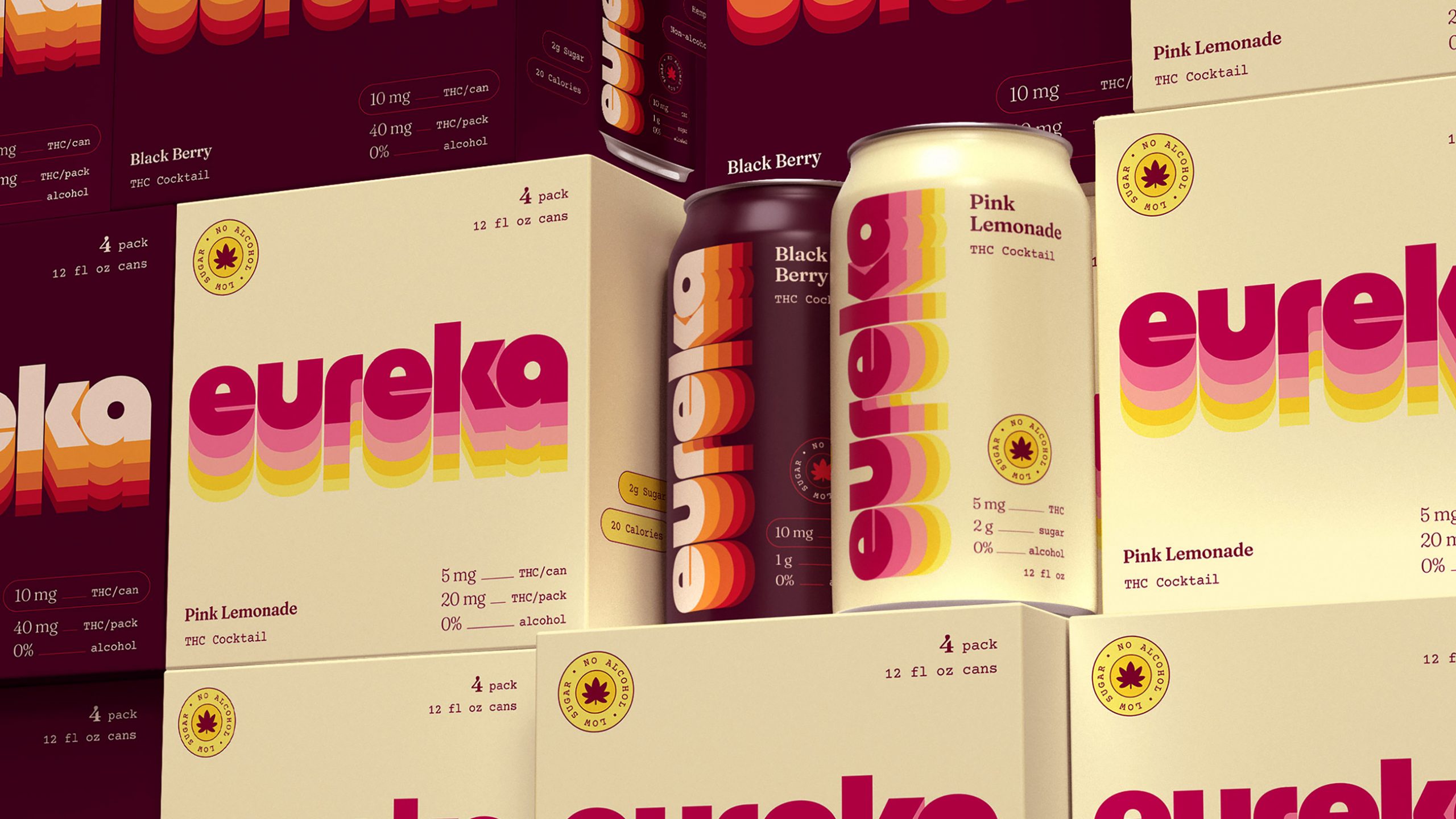
THC drinks are increasingly borrowing from the wider beverage world, and Eureka pushes that shift through a playful 1970s-inspired identity that feels closer to a traditional soda brand.
Design agency Condensed turned the oversized Eureka wordmark into the main graphic, repeating its rounded letterforms in stacked bands of pink, yellow, orange, green, and burgundy. Each flavor has its own palette, while softer pastels signal 5mg and richer colors signal 10mg, making dosage part of the visual system. The friendly lowercase typography has plenty of personality, especially in the customized “e,” while the typewriter-inspired details add an elevated counterpoint to the color. It skips the predictable cannabis imagery and joins a larger CPG trend toward nostalgic graphics and expressive typography.