Wonderkind Co’s packaging for The Real Cereal draws inspiration from the iconic Beverly Hills Hotel. The design features a beautifully scripted font against a backdrop of subtle blue and white stripes and pastel colors, creating a sense of luxury and elegance. The clever fusion of a loopy, cursive typeface with a casual sans-serif font lends a unique and playful character to the packaging. Moreover, including macro photography on the spoon adds a delightful touch, engaging the consumer’s taste buds. This casual and playful design, combined with a pouch instead of the typical cereal box, effectively sets The Real Cereal apart.
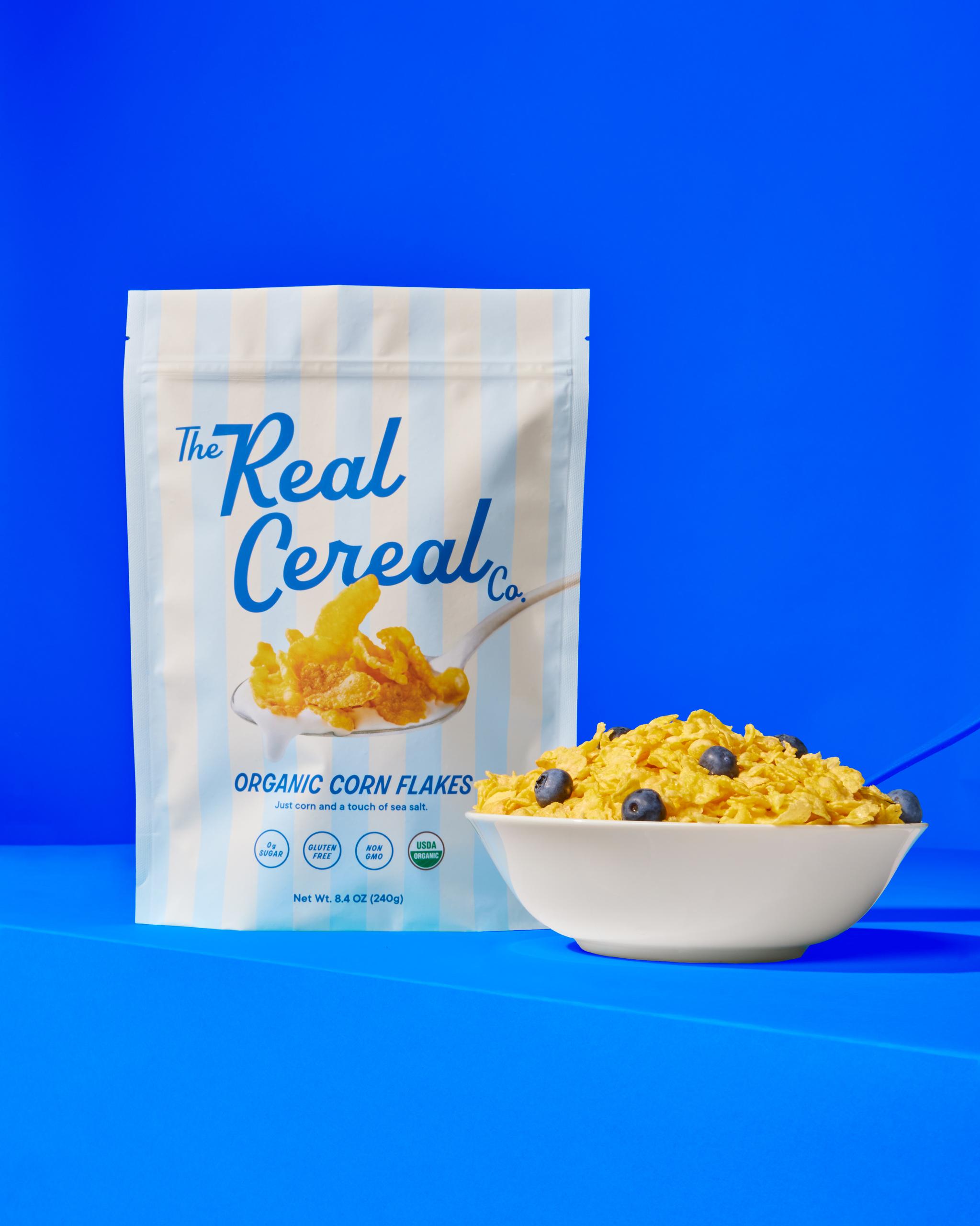
Crafted in California, we pulled inspo from the Beverly Hills Hotel and landed on a scripted font paired with a striped background and pastel colors. We incorporated real life studio photography of the cereal to give consumers a peek into what’s in each bag.