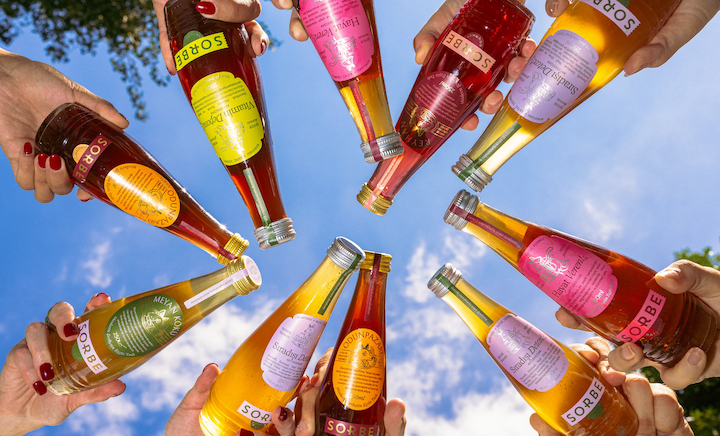
Sorbe lands squarely in the current shift in beverage aesthetics, where wellness minimalism meets something a bit richer in identity and character. That makes traditional sherbet, a sweet, fragrant Middle Eastern and South Asian syrup-based beverage, look wonderfully current.
A fox sits at the center of the system, drawn with the charm of an old storybook illustration, while stamps, seals, and layered label shapes nod to the visual history of family recipes and hospitality. The typography mixes elegant lettering with a straightforward Sorbe wordmark, creating something that feels cultured but never overly precious. Instead of choosing between old-world tradition and modern functional drinks, Cansu Merdamert gives Sorbe its own playful middle ground, where centuries of sherbet culture can happily live in the contemporary drinks fridge.
Cansu Merdamert, Creative Director and Founder of Cansu Merdamert Design Studio, shares more about the process below.