Penfolds has been making wine since 1844, but somehow its gift boxes have never looked this confident.
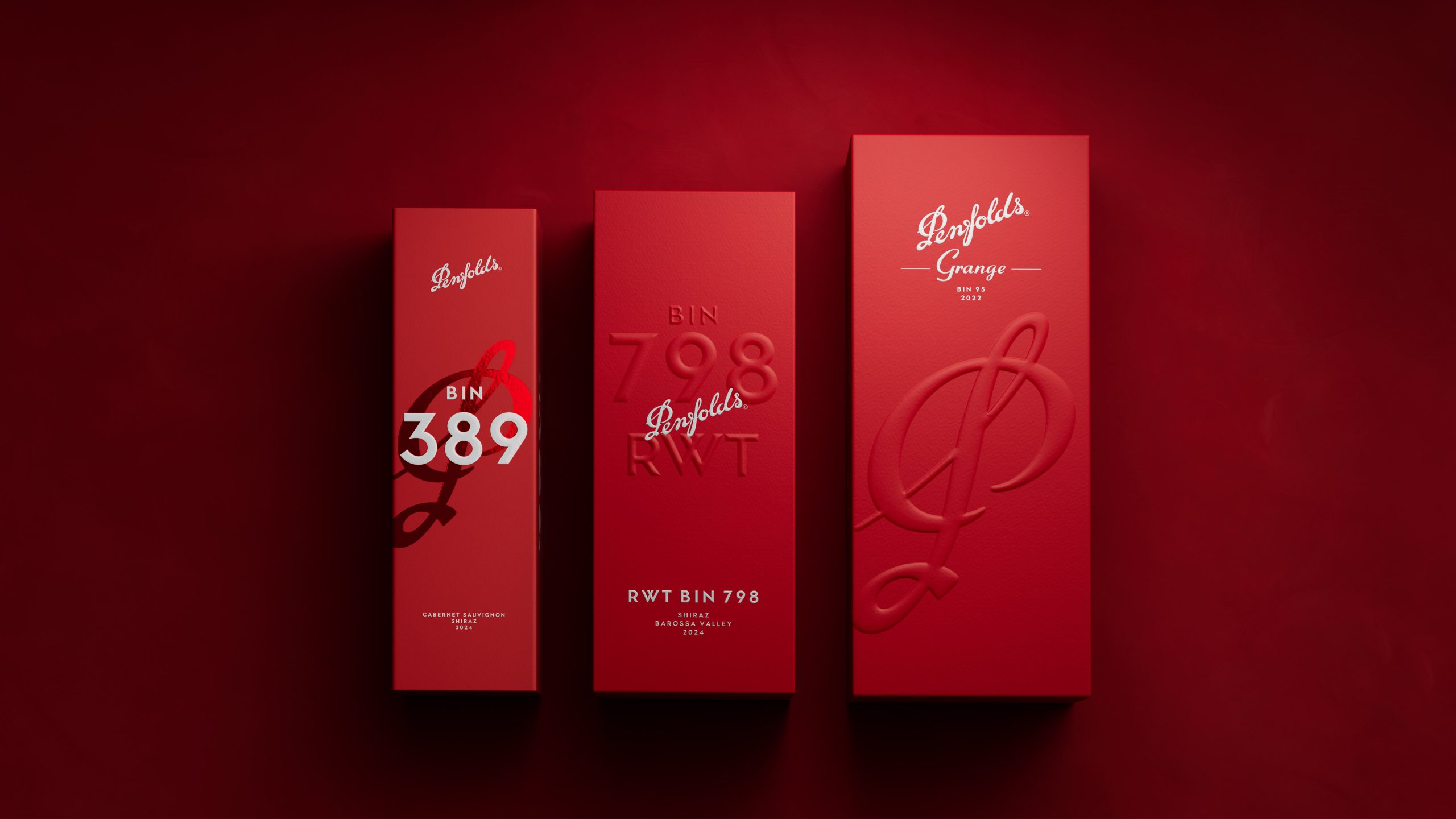
For the 2026 Collection, its longtime design partner Denomination redesigned every box across fifteen wines and dropped the silver entirely. Everything is now red on red, and the swooping script wordmark and the P monogram are blown up and cropped across the edges. The higher you go in the range, the more you can feel it in the packaging, starting with a glossy foil monogram on the entry boxes and ending with a deep blind-embossed P on textured stock for Grange.
The most luxurious move here was stripping it all back. Luxury wine boxes usually compete with flashy gold, patterns, or illustrations, so a simple red box becomes the loudest thing on the shelf. It’s the same trick that lets you spot Hermès orange or Tiffany blue from across a room, and Penfolds’ red wants to play in the same league. Not to mention, every box is also fully recyclable or compostable, with no magnets, foam, or plastic inners. It’s proof that sustainability and luxury can absolutely live in the same box, and I’m absolutely here for that move.