Hershey paid $1.6 billion for SkinnyPop maker Amplify Snack Brands in 2018, and I’d argue that healthy snacks have been chasing that clean, quiet look ever since.
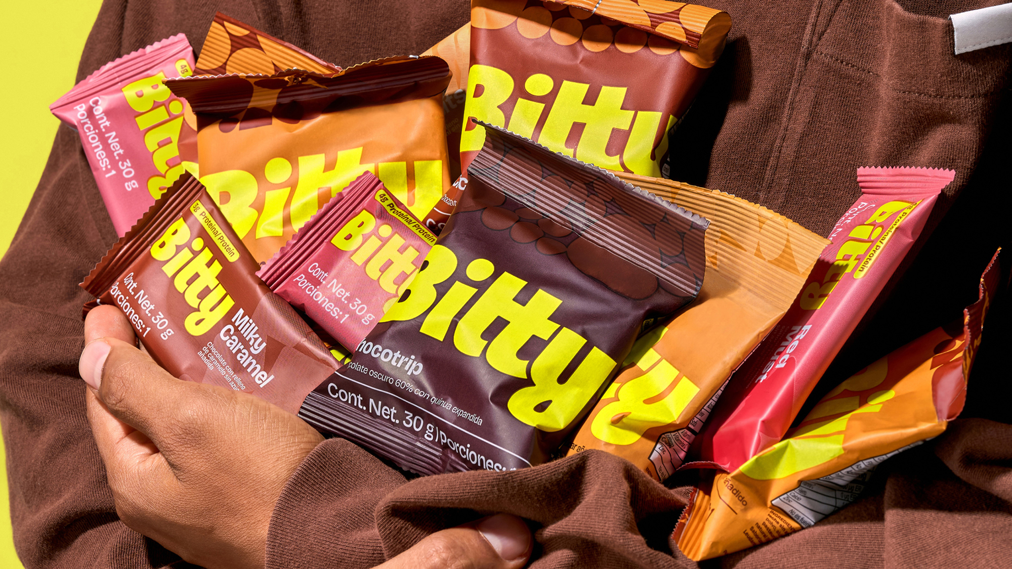
Bitty, a better-for-you chocolate snack brand, just got a refresh from Centtral Design Studio that doesn’t follow those same quiet cues. The chunky, neon-yellow wordmark sits on rich, flavor-coded wrappers. Behind the logo, abstract patterns of circles and shards mimic the bites and fillings inside, and the campaign stretches “WOW bites” so big the letters barely fit on the page.
I love that this treats a healthy snack like delicious candy, without hiding the good stuff. That neon yellow is impossible to miss in an aisle full of beige, and it’s just as fun for a kid as it is for the parent reading the label. “Good for you” and “exciting” can live in the same wrapper, which is where I think snacking is headed.