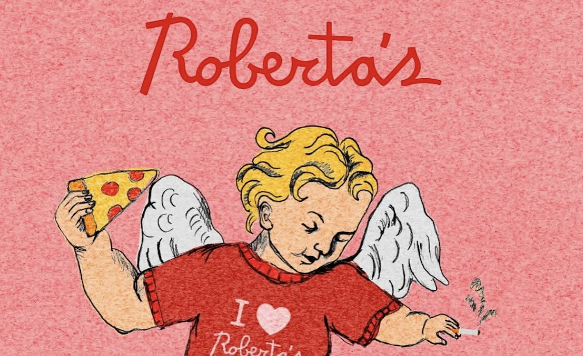
- Roberta’s Pizza has a brand identity built upon strong type choices that feel chaotic and loose, yet are keenly considered and controlled.
- Co-founder Brandon Hoy and designer Drew Price use bold typography to keep the rebellious, punk spirit the brand was founded upon alive
I’m always on the prowl for striking typography, whether on signs around LA where I live, in grocery store aisles, and, of course, in projects that come across my DIELINE desk. And now, I have a place to archive and file these typography findings in my two-issue-strong Tour de Type column.
In August, I highlighted the eye-catching type that adorns Roberta’s “Famous Original” frozen pizza packaging, singing the praises of its character-filled script wordmark and the chunky, retro display typeface that the “Famous Original” is set in. The more I thought about it, the more I realized I needed to take a deeper dive into what the Roberta’s team is doing with their type system.