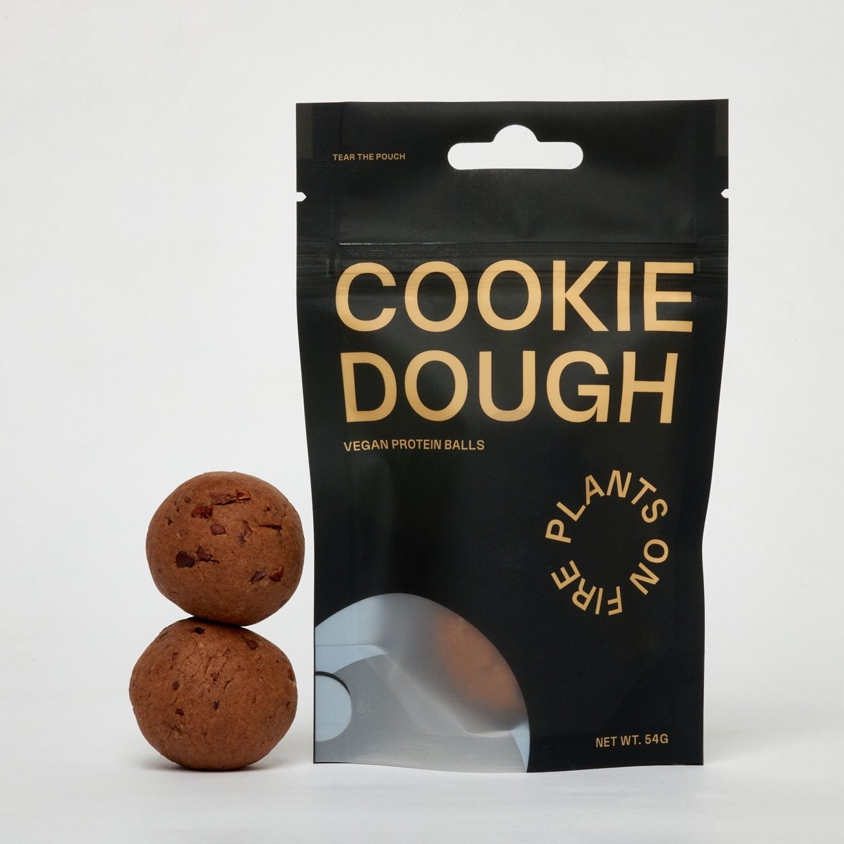
Instead of taking inspiration from protein bars and other protein-based CPG brands, designer Jeff Kardos created packaging for Plants On Fire inspired by show flyers. The outcome is a packaging system full of joy; it creates an engaging experience, reframing consumers’ way of interacting with packaging. Switching the traditional hierarchy and creating an innovative approach proves that this brand knows how to have fun while also building value for its consumers.
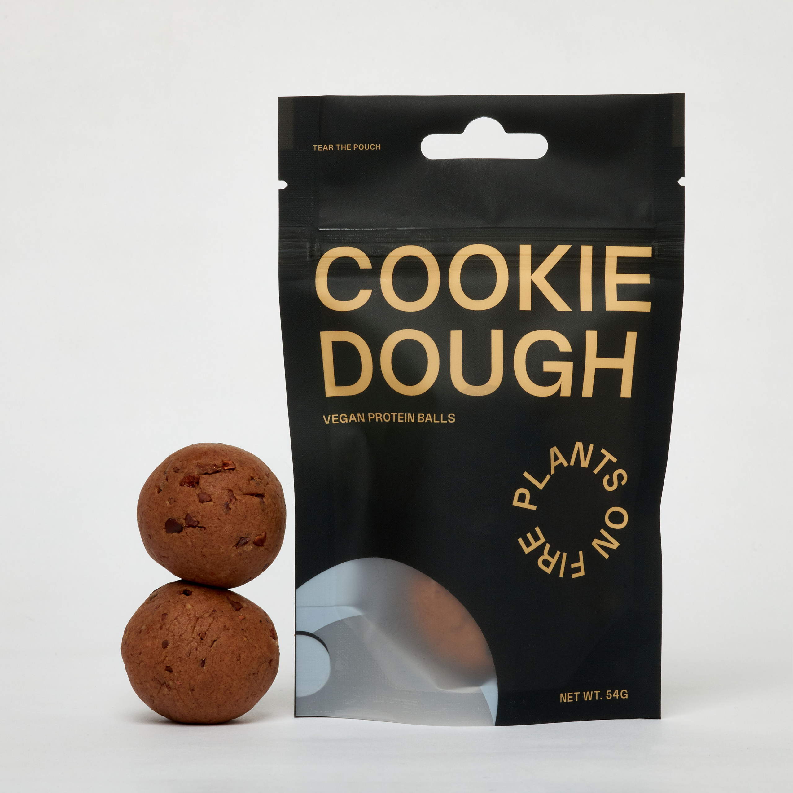
Plants On Fire is simple, plant-based nutrition for active people in the form of…balls. The packaging and overall brand messaging was a collaboration between myself and Danielle (founder, POF) based on a shared interest of punk flyers, album covers and t-shirts. Keeping the overall look and feel clean, we treated the hierarchy like a show flyer and each color combination referential of the colored paper you’d find at the nearest office supply store. The window was added to the packaging so people can see that it’s real food, no chemicals, oils or general bullshit. Naked and on display, like GG Allin.
















