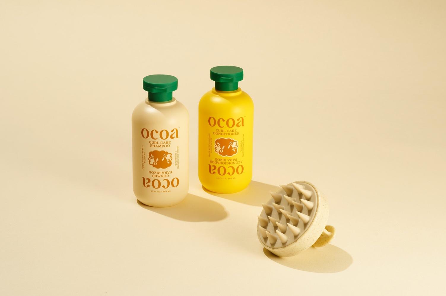
Inspired by the founder’s story Abby Haddican Studio designed Ocoa’s packaging with the founder’s heritage in mind. The word “ocoa” translates to “a place between two mountains” in the indigenous Taino language and is a region that celebrates the natural magnificence of the landscape. As a result, the brand’s colors take inspiration from the sea, the sand, the sky, and the rainforests of this lush, lovely place. And while the color palette does the heavy lifting, the minimal design aesthetic visually showcases the brand’s clean ingredients, while simultaneously proving that there’s beauty in simplicity.

Ocoa is a new line of clean haircare products founded by sisters Cory & Nicol Varona. The sisters grew up in the Dominican Republic, a place (like many others) where centuries of racism and colonialism have contributed to a widely held view that curly hair is a problem—something to be straightened and tamed, rather than cared for and celebrated. It was only in adulthood that the two sisters stopped fighting their curls and learned how to nurture what nature gave them.