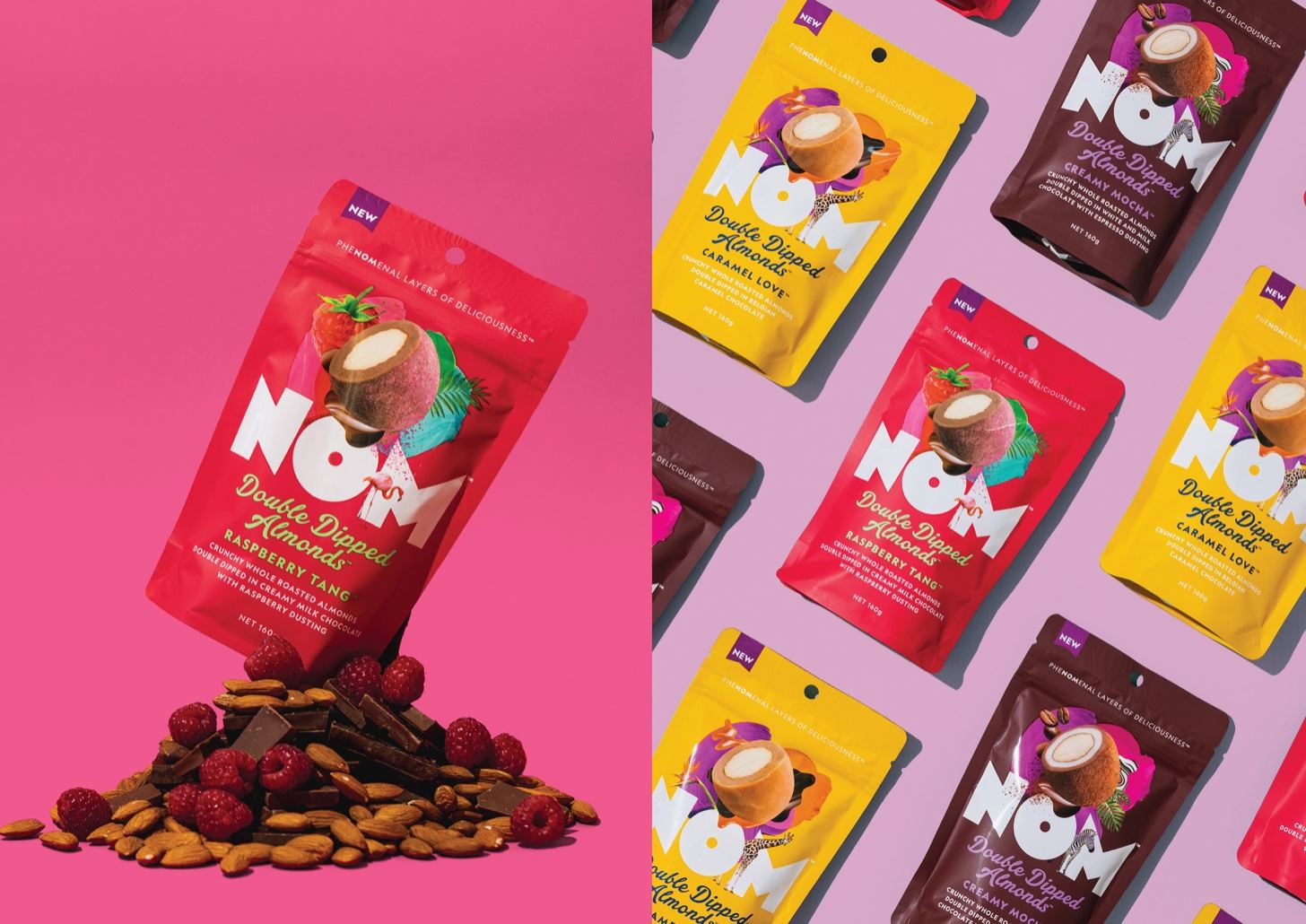
NOM is a brand spreading a mission to inspire consumers to indulge on a whole new level. Because the brand’s products take its consumers to a sweeter space, it makes sense that the packaging does the same thing. Designed by Unified Brands, NOM’s packaging system is whimsical and bright reflective of the fabulous treats within. The chunky typography and playful colors are sweet and animated, ideal for a dessert brand.
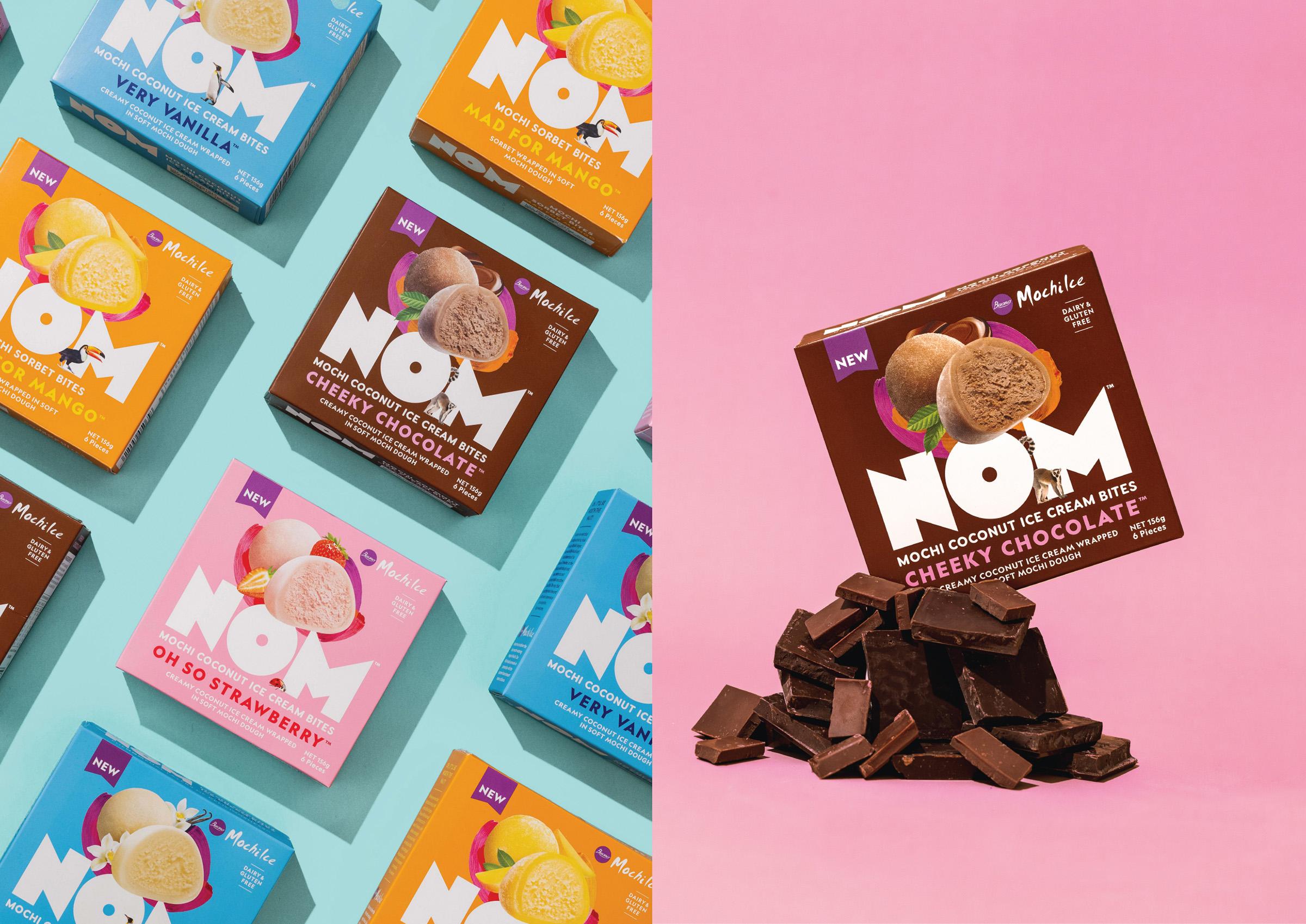
From the get go, we wanted NOM to be different to anything else in the busy mainstream confectionery and frozen snacking aisles. As a result, our brand platform revolved around the idea of creating magical bite-sized moments. Of course, magic can conjure up thoughts around fairy tales, the supernatural, and whimsical fantasies – the traditional stuff that can come across pastiche and same-old.
















