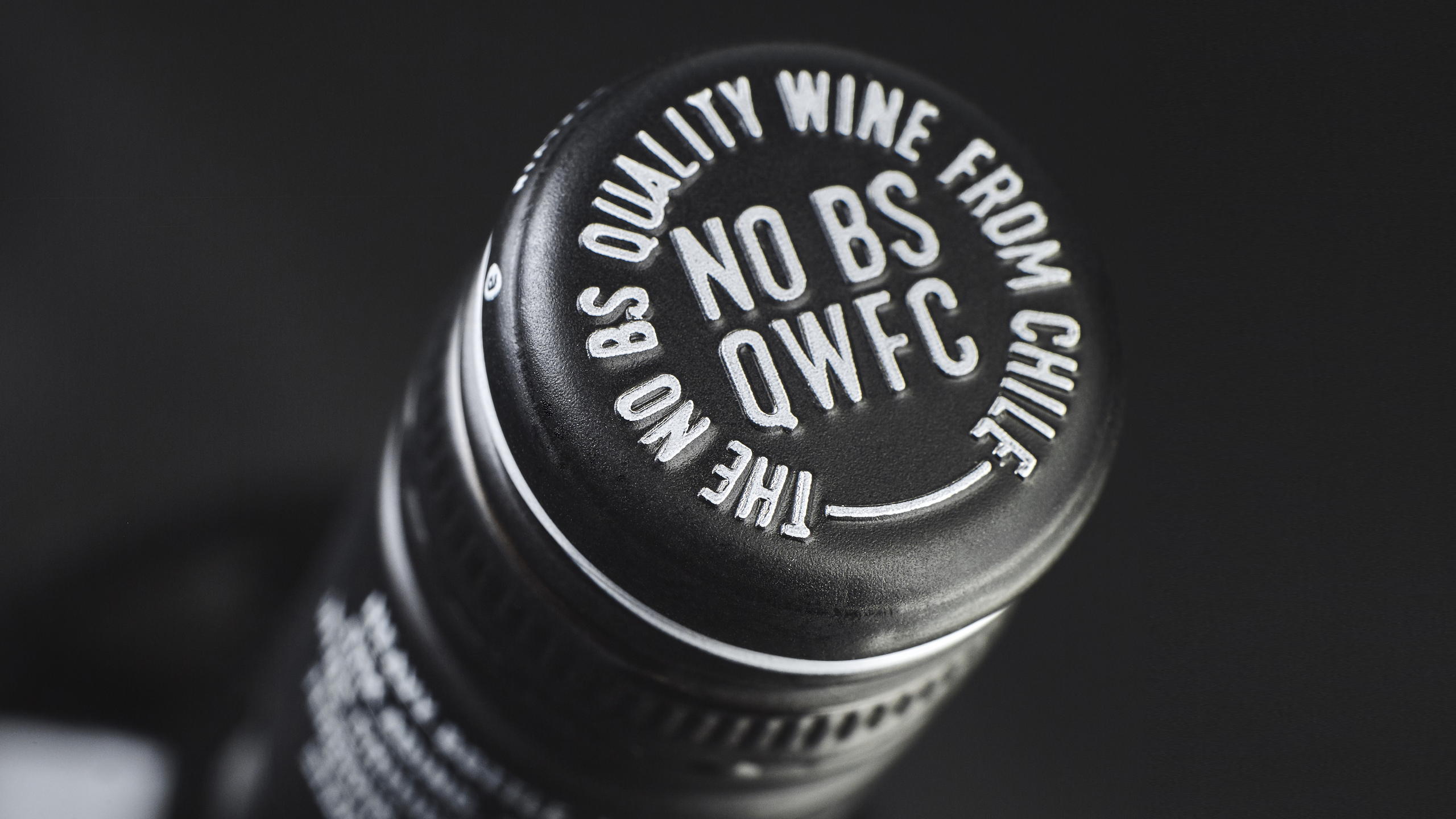
NO BS wine means nothing but quality. This is a design that relies on texture and typeface to pack a punch. The diamond patterned label paper gives the bottle a tactile feel that’s luxurious and captivating. Meanwhile, the elongated silver typeface dishes out details about the brand’s ethos is stunning sans-serif fashion.Sometimes a bottle of wine is about what you don’t put in it, and that’s the messaging NO BS provides.
Design concept created for an inexpensive Chilean wine. In a world that has become full of BS we considered it a good thing to get it out of the wine. We did it by just putting QWFC (QUALITY WINE FROM CHILE) in the bottle, the next thing to happen would be to drink it.