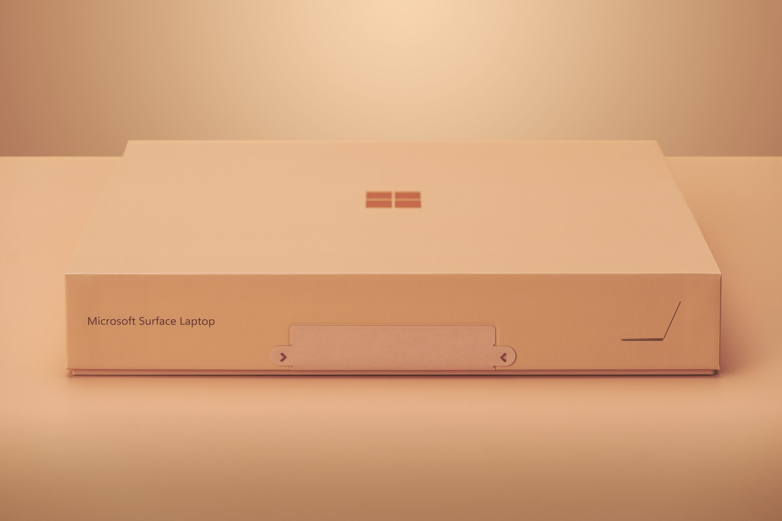
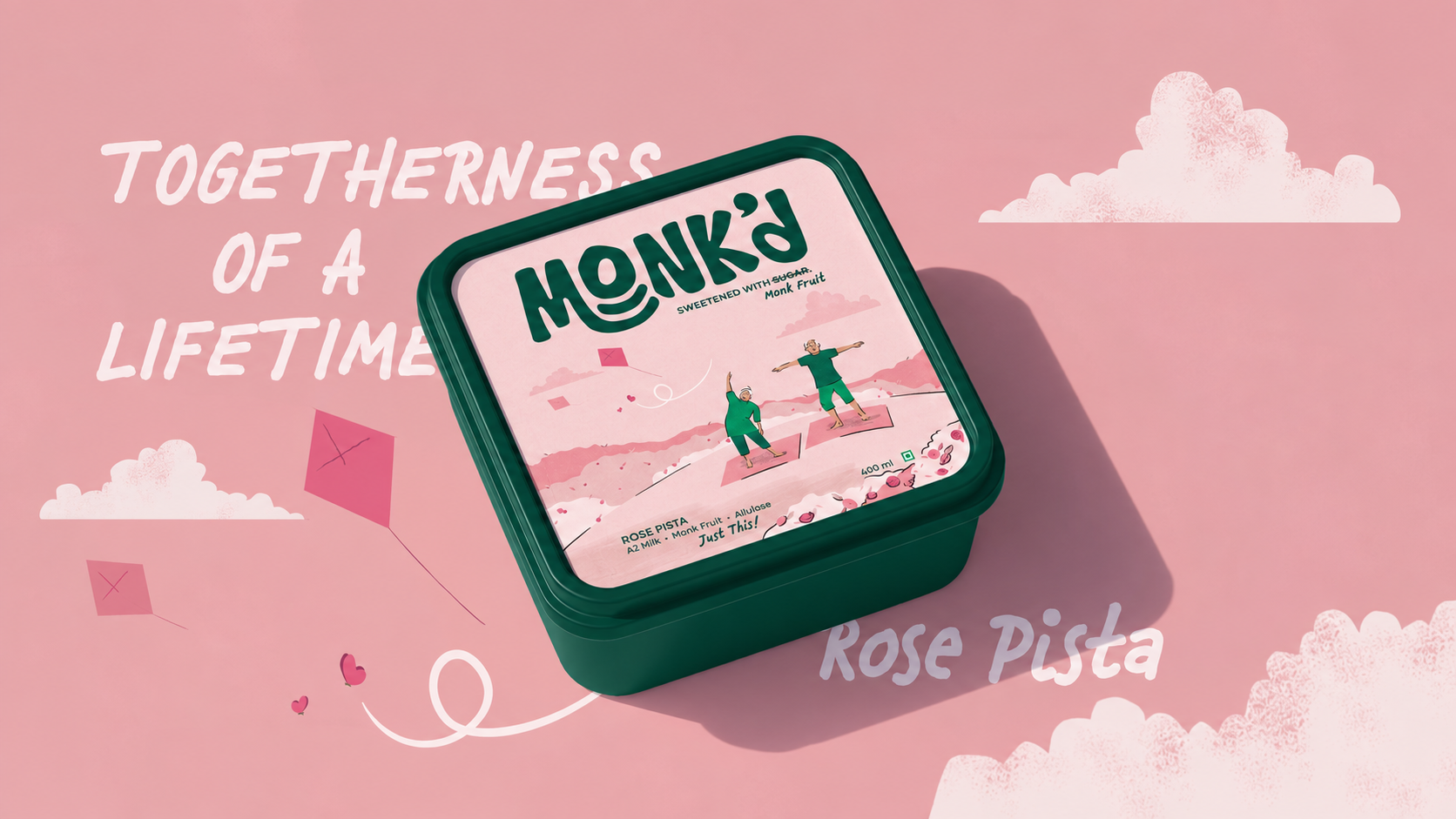
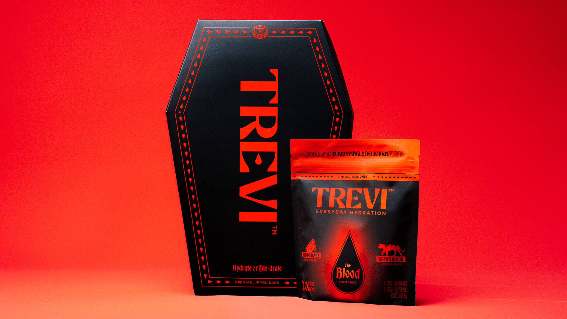
Project M+ captured the essence of Dote’s wellness meets beauty meets performance products through cleverly designed packaging. The decadent, dark hues paired with thin yet dramatic typography create an unexpected pop of charming and decisive personality. The packaging works for both retail and e-commerce because of its surprising shelf appeal, and the attention-grabbing design will entice those searching for wellness, beauty, and performance-based products.
![[M+]Dote_Overview.jpg](https://thedieline.com/wp-content/uploads/2023/02/af0ff4b4-779e-41f7-902d-49d69e68758b_MDote_Overview.jpg)
When the founders of Dote approached us to help them conceive their line of CBD wellness-meets-beauty-meets-performance products, we began with a deep dive into naming and brand development, using the design queues of female-led fitness culture as our North Star.