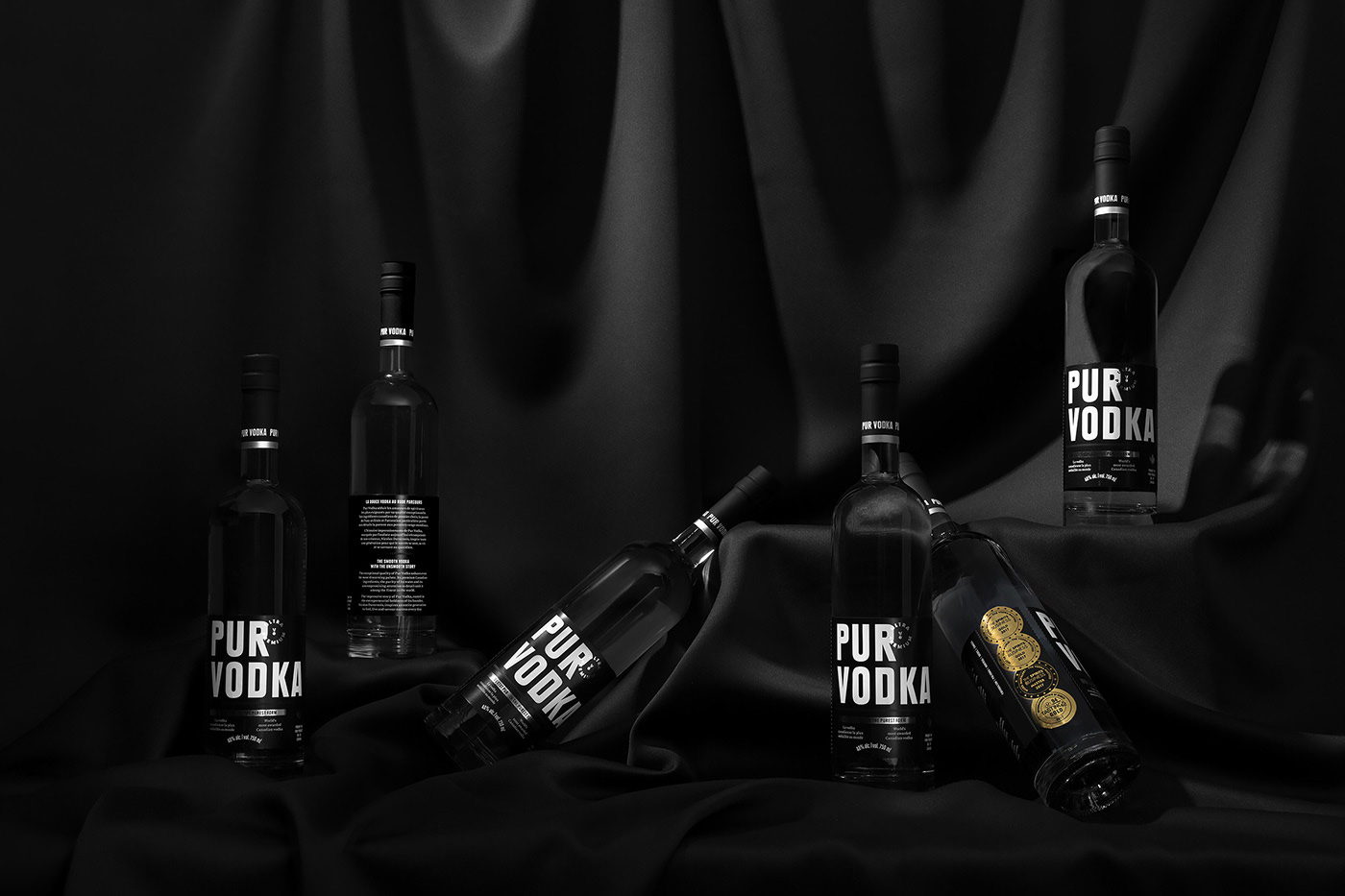
Apparently healthcare, maple syrup, and handling COVID-19 isn’t the only thing that Canadians do well. Doing a 180 on traditional vodka packaging that is clear or primarily white, to highlight the purity of the product, Pur Vodka chooses a jet black color pallate with white typeface. The redesign removes the diamond pattern and more antiquated design styles from the original bottle, and brings this spirit brand into modern times.??This clean design allows the gold foil medals that the spirit has garnered to be in focus. This is a vodka that is not only sleek and cool, but revels in how understated it’s design is.
Revamp of Pur Vodka’s brand identity and packaging, the world’s most awarded Canadian vodka.
The inspiring entrepreneurial story of Pur Vodka drove the evolution of its brand image. With its elegant and understated new branding, Pur Vodka emerges as the symbol of fierce determination and the fulfillment of dreams. The black background and the subtlety of metallic grey emphasize the embossed metallic medals on the same label. The maple leaf is a nod to the brand’s Canadian provenance. True to the name, the cleaner design of the logo and packaging will evolve more readily in markets outside of Quebec.