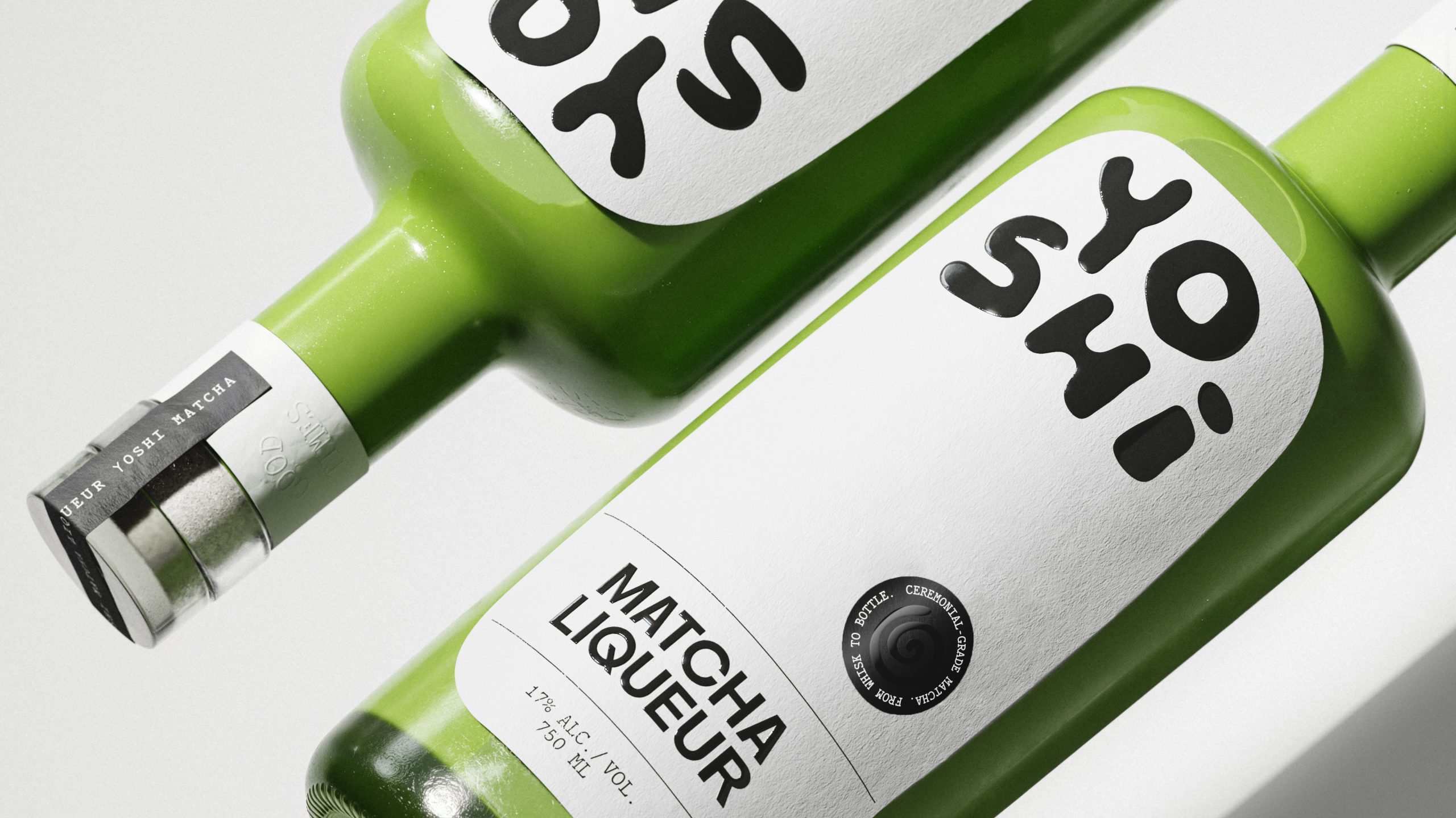
Yoshi’s packaging leans into an irreverent visual language that feels pulled from early streetwear graphics and 2000s import snack culture rather than the usual craft-liqueur cues.
Saint Urbain builds the whole system around chunky, off-kilter letterforms that read like they were piped onto the label with icing, matcha-flavored, of course. When paired with ultra-minimal layouts and a bottle that allows the unmistakable green to shine through, it’s a smart detour from the category’s premium-heavy playbook, trading ornate detailing for something closer to a zine cover.

Saint-Urbain unveils Yoshi, the first premium matcha liqueur and a bold new entry in the global spirits landscape. At a time when matcha has become a billion-dollar cultural force—and the liqueur aisle has remained rooted in decades-old formulas—Yoshi introduces something entirely new: a liqueur that merges ritual, nightlife, and cultural curiosity.
Where most legacy liqueur brands rely on nostalgia, Yoshi looks forward—drawing inspiration from matcha’s centuries-old precision and the expressive energy of contemporary bar culture. Saint-Urbain was tasked with developing a brand world that could honor Japanese heritage without leaning on cliché, while still feeling modern, playful, and unmistakably alive.


That began with the strategic foundation: a brand built around ritual, intention, and a cross-cultural rhythm that connects Tokyo and New York. From this idea came the entire identity—name exploration, brand strategy, visual and verbal systems, packaging, and motion—anchored by the concept of “a new kind of tradition.”
At the heart of the identity is Yoshi’s hand-drawn wordmark, whose soft, irregular forms bring human warmth and approachability to the spirits category. Complementing it is a ceremonial spiral symbol, inspired by the circular motion of the chasen whisk used in matcha preparation. “We wanted a mark that felt both energetic and meditative—a visual bridge between ritual and nightlife,” says Alex Ostroff, founder and creative director of Saint-Urbain.

The packaging system centers on a striking green bottle—opaque, modern, and instantly recognizable on a backbar or retail shelf. A bold white label interrupts the silhouette with confident simplicity, while precise typographic structure and a circular authenticity seal reinforce Yoshi’s craft-driven sensibility. In motion, the brand comes alive through spiraling typography, jazz-influenced rhythm, and a kinetic visual language that reflects matcha’s whisk-to-glass transformation.

Art direction blends the intimacy of Japanese tea culture with the pulse of nightlife photography: direct flash, real hands, real pours, and the unmistakable vibrancy of matcha’s color. The visual world feels premium yet playful; familiar yet entirely new.
Through color, form, storytelling, and cultural sensitivity, Saint-Urbain shaped a liqueur brand that doesn’t imitate tradition—it reimagines it. Yoshi introduces a fresh ritual for the modern drinker, proving that the future of spirits lies not in nostalgia, but in innovation rooted in respect.