Forget Classically White Cans, Arrow Town’s Vodka Sodas Lean Into Color
By
Published
Filed under

Published
Filed under

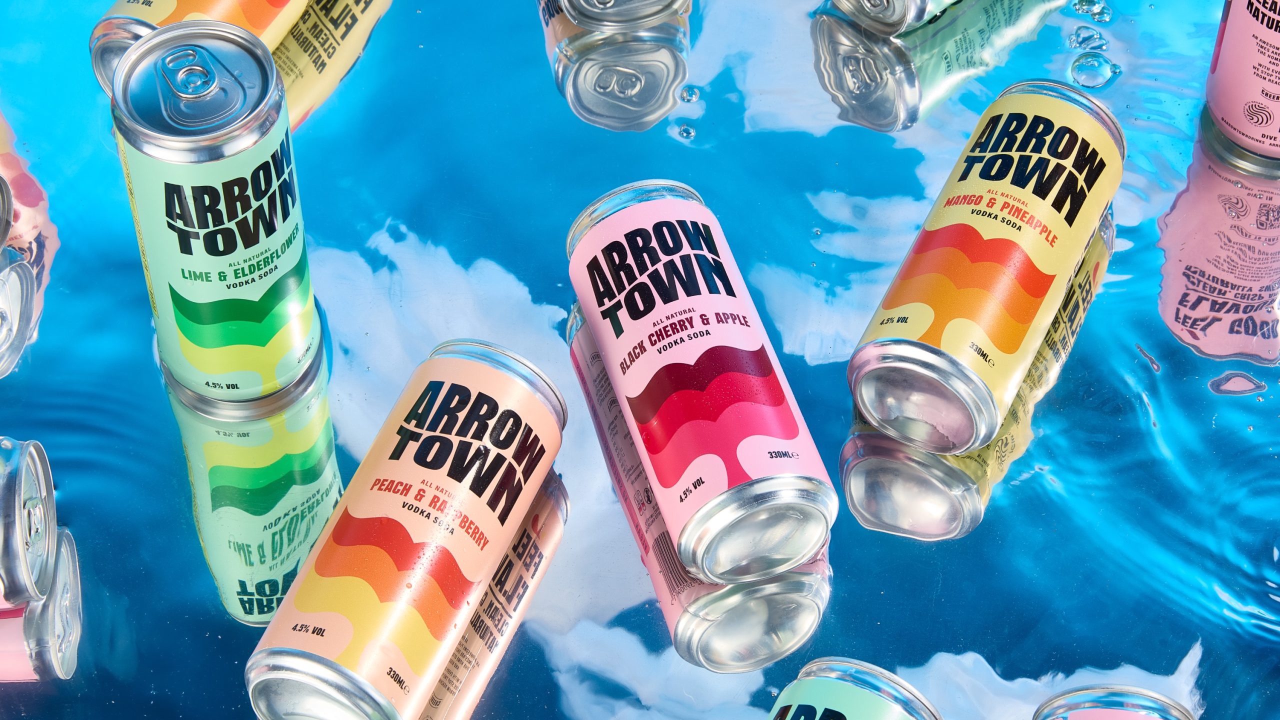
The packaging for Arrowtown, designed by Brandon Consultants, combines a dynamic aesthetic with a dedication to ocean conservation.
Inspired by the ocean’s waves as well as marine life, the design uses bold, fluid patterns and colors representative of the ocean, making the brand’s effort to help protect the oceans recognizable. Plus, the bright color palettes and bold typography create an aesthetic that’s upbeat and inviting, something everyone craves when drinking a fruity sparkling beverage.

Add project credits with Dieline PRO | Log in
Get unlimited access to latest industry news, 27,000+ articles and case studies.
Have an account? Sign in
To provide the best experiences, we and our partners use technologies like cookies to store and/or access device information. Consenting to these technologies will allow us and our partners to process personal data such as browsing behavior or unique IDs on this site and show (non-) personalized ads. Not consenting or withdrawing consent, may adversely affect certain features and functions.
Click below to consent to the above or make granular choices. Your choices will be applied to this site only. You can change your settings at any time, including withdrawing your consent, by using the toggles on the Cookie Policy, or by clicking on the manage consent button at the bottom of the screen.