Instead of using color to distinguish the brand’s products, Mousegraphics lets the product visually speak for itself. The natural hues and bold typography create a strong brand presence, while the simplicity of the design feels genuine. It’s direct yet effective, which is what influential packaging design is about.
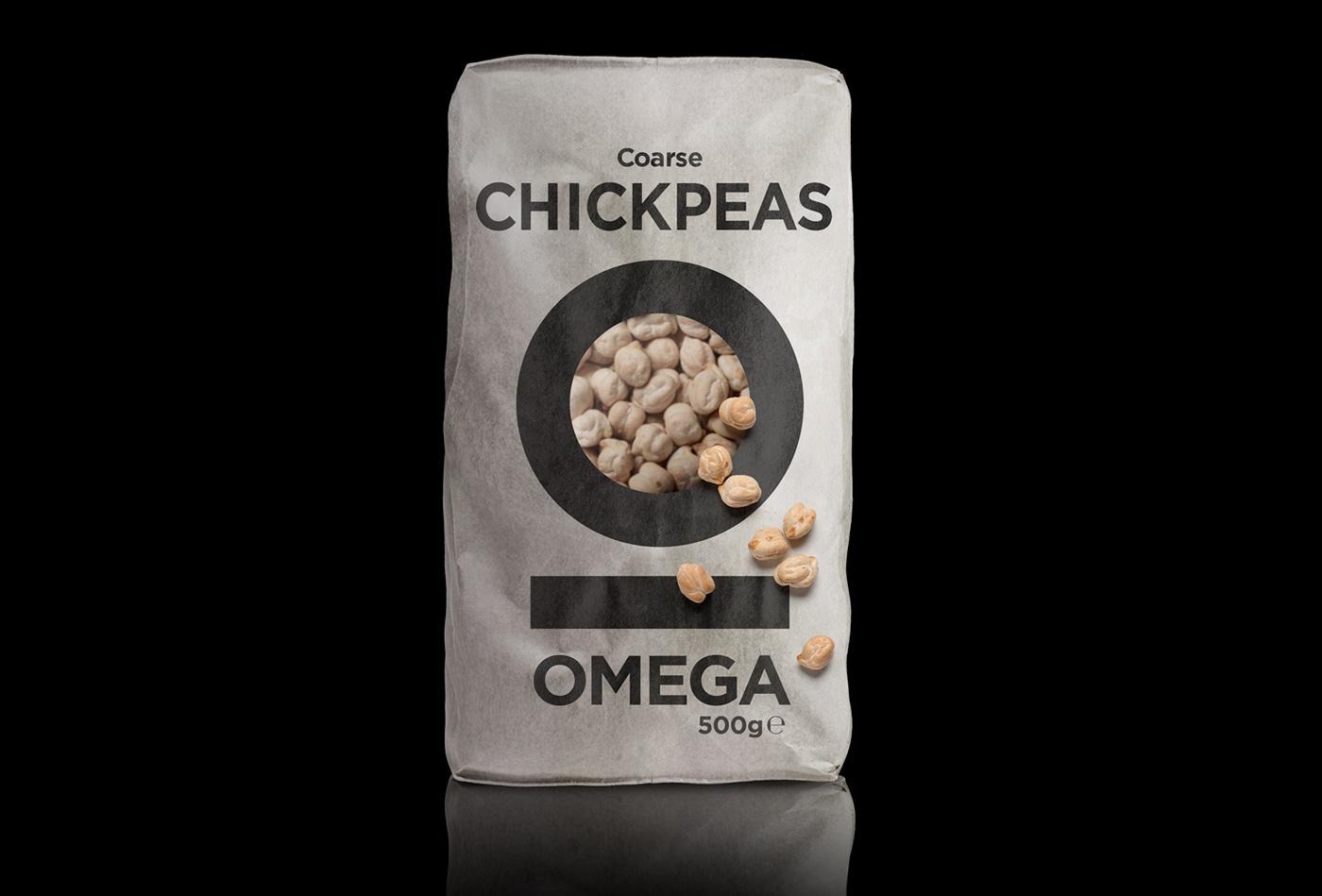
We designed the new identity and related packaging for this Greek company that produces and markets various types of rice and legumes. We used the Greek initial letter Omega of the brand-name to shape the paper surface. This was a key choice: it allows the product to be visible through the letter outline and, most importantly gives us the chance to avoid color-coding on the packaging.