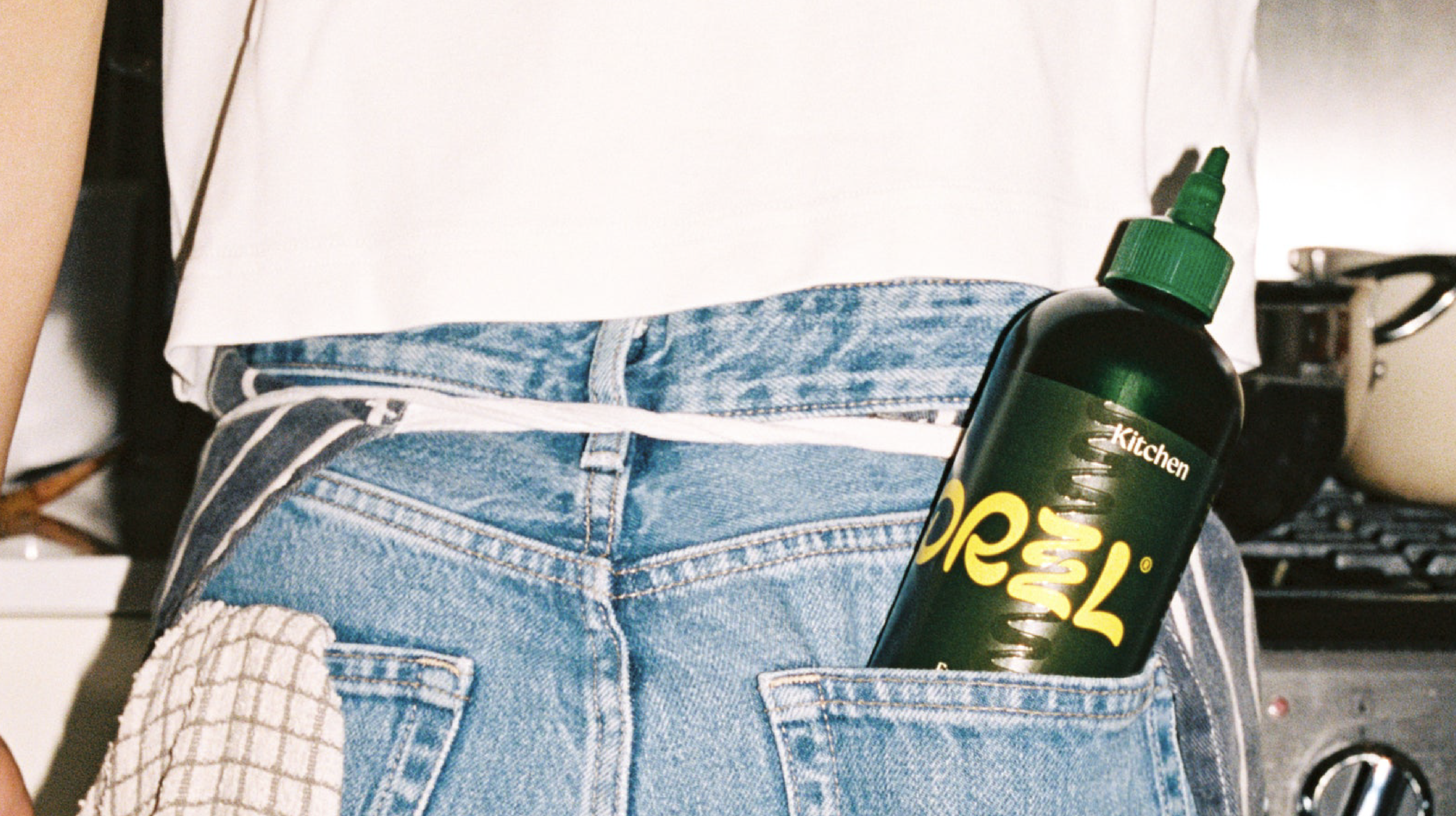
When Derek&Eric first started working on DRZZL’s new identity, they set out to break the rustic tradition, health, and Mediterranean escapism cues in the crowded oil market.
The dark green squeeze bottle sticks to the familiar olive oil cues, but you’ll also find juicy orange and yellow lettering and a playful wordmark designed by Studio Drama with a stacked double Z that expands like oil being squeezed across a plate. That same squiggling drizzle becomes a graphic device across the label and shipping packaging, giving the system movement without reaching for cliched imagery. Classical typography provides a small nod to the oil’s Italian origins, but the overall design taps into the appetite for pantry products that behave more like lifestyle objects.
With its countertop-ready identity, you won’t find DRZZL squeezed between the flour and sugar in the back of your cupboard.