Coco’s Packaging Design Brings ‘The Art of Chocolate’ To Life
By
Published
Filed under

By
Published
Filed under

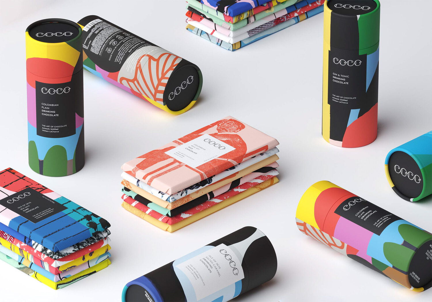
This Edinburgh-based chocolate company was very skilled at creating incredible sweets, but lacked a clear brand positioning. The resulting solution was a beautiful brand design that utilizes bright colors, unique illustrations, and fascinating artistic perspectives.
“Initially, COCO was using striking geometric stock designs to wrap its chocolate bars. We felt that the relationship between art and chocolate could be built upon as a real point of difference at the heart of the brand. From this idea we developed the brand line ‘The Art of Chocolate’.
To strengthen this positioning we created a visual language based on a gallery concept. Each COCO product is wrapped in specially commissioned original artwork, displayed like installations, in a ‘white cube’ setting. Minimal labels become gallery captions framed within the artwork with artists credited front and centre.

By
Add project credits with Dieline PRO | Log in
Get unlimited access to latest industry news, 27,000+ articles and case studies.
Have an account? Sign in
To provide the best experiences, we and our partners use technologies like cookies to store and/or access device information. Consenting to these technologies will allow us and our partners to process personal data such as browsing behavior or unique IDs on this site and show (non-) personalized ads. Not consenting or withdrawing consent, may adversely affect certain features and functions.
Click below to consent to the above or make granular choices. Your choices will be applied to this site only. You can change your settings at any time, including withdrawing your consent, by using the toggles on the Cookie Policy, or by clicking on the manage consent button at the bottom of the screen.