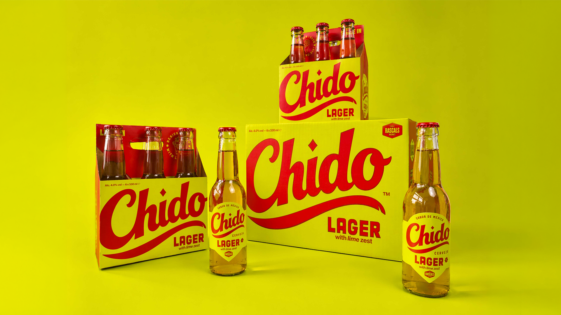
Lager is one of the world’s most consumed beer styles, originating in Bavaria in the 15th century, and yet its design language doesn’t often look as joyful and alive as Chido does.
Chido’s identity, designed by Triona O’Donoghue, draws directly from Mexican hand-painted sign lettering that covers storefronts, market stalls, and cantina walls across Mexico, refined here into a flowing red script wordmark with a deliberate small chip in the swoosh tail, a tiny imperfection that keeps the whole thing feeling handmade and human rather than digitally perfect. The color system is bright in the best way, with a saturated lime yellow ground paired with fire engine red lettering, the same high-contrast duo you’d expect from street food carts and vintage Mexican bottle label art, colors that communicate warmth, celebration, and immediate visual confidence all at once.
In a craft beer space that has largely defaulted to either illustrated woodland scenes or sterile modernist sans serifs, Chido features the energy of a street party and the typographic craft to back it up.