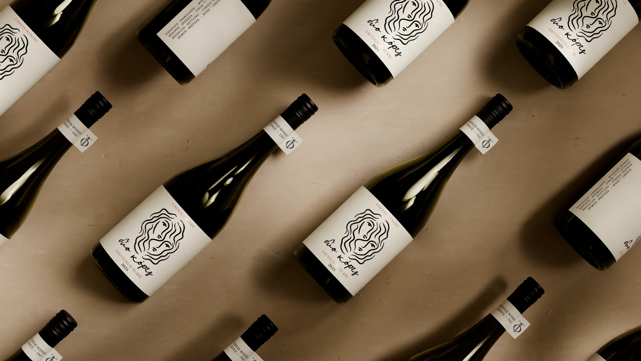
Illustrated wine labels aren’t new, but most happen to feel a little inauthentic. Dio Kores, on the other hand, feels intimate.
iFRAME DESIGN STUDIO built the label design around two overlapping faces, a direct visual representation of the wine’s name, which translates to two daughters. Every curve carries a small imperfection, giving the artwork a handmade quality. Stone-toned paper and foil-stamped detailing add texture, while a simple monogram on the neck keeps the system understated.
This kind of illustration-first minimalism feels personal. Dio Kores’ packaging demonstrates that illustrations, drawn with real intention, can carry emotional weight.


















