DIELINE Awards 2024 – EARLY BIRD ENDS THURSDAY
Featured image for Why Back Labels Can Make Or Break a Wine Brand

Why Back Labels Can Make Or Break a Wine Brand

by Margaret Nolan on 09/22/2023 | 6 Minute Read

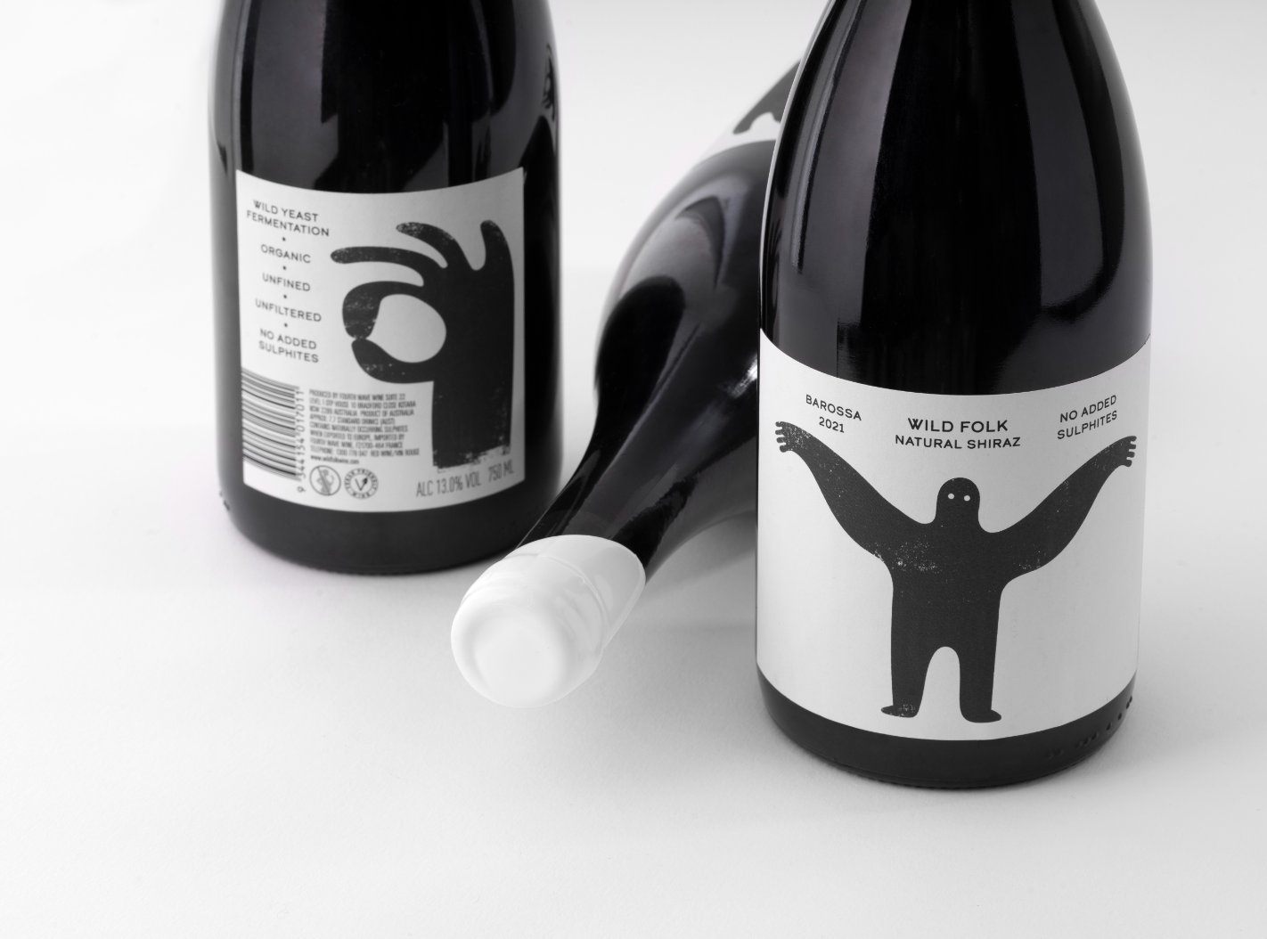
When I tell people I design wine labels, most folks respond sheepishly and tell me they “buy wines because I like the label”. 

But they’re not alone.

Eighty-five percent of consumers say that the design of a wine label influences their purchase. Because of this, wine label design has evolved dramatically, especially in the last decade. With ever more innovation in printing technology, we have seen a boom in creativity concerning the category. 

However, one part of wine packaging hasn’t benefited as much from this: the oft-neglected back label. Many brands are happy to leave this critical piece of design as a simple label with text and mandatories. But by not treating the back label with the attention it deserves, they miss out on a crucial opportunity.

1. Bumblebee Cabernet Sauvignon Duo.jpg

In a Penn State University study, 57% of respondents reported they read the back label to help inform their decision when buying a bottle of wine. When asked to rate the importance of the front and back labels in their decision from 1 (very little) to 7 (very great), the front and back rated 4.79 and 4.60, respectively—nearly identical in importance. That’s why the design of the back label shouldn't be treated as the poor cousin to the front.

Much to my colleagues' bemusement, I really love designing and writing back labels. As a designer, I love the practical challenge: how do you make a label look great with mandatories and barcodes or the increasing requirement of QR codes? What about the multi-language content statements and ever-larger health warnings? For me, it’s like a jigsaw puzzle, and there’s something therapeutic about putting so many disparate elements together. Secondly—and more importantly—the back label is where you can build on what the front label has begun. It’s where you can tell the brand story or even create a smile. Either way, it’s a great way to connect with the consumer.

3. TITTG Duo.jpg

In wine packaging, many brands resort to a simple rectangular back label with basic text and legal mandatories. Often, this is cost-driven—so they can utilize a single label across other tiers—or to simplify the process for their internal artwork team or printer. Whatever the reason, they’re missing a trick. A good back label doesn’t have to be expensive, but it has to have more than just a bland paragraph of text and “legals.” 

12. Cowpunk Front and Back Duo.jpg

One of the simplest and most cost-effective back labels we designed was on Cowpunk, a natural wine brand that aims to make the complex category less intimidating. Cowpunk’s refillable bottle had a small back panel area, restricting the label size we could use. The small dimensions led to the idea of telling the brand story through icons that explain the characteristics of natural winemaking. Ultimately, they became powerful off-pack brand elements for merchandising.

13. Cowpunk Closeup 1.jpg
14. Cowpunk Carton T-Shirt Side 1.jpg

This leads me to another question—why does the back label have to be rectangular? Back labels can be all sorts of shapes and sizes.

4. TITTG Closeup.jpg

Take it to the Grave elicits a smile when you turn the bottle to find a skull-shaped back label. On Bumblebee, an organic wine, the back label utilizes a die-cut of the honeycomb motif of the brand to hold essential information. The dotted path of the bumblebee encircles the organic certification logos, highlighting the brand’s organic credibility. The final touch is the copy, which comes as a poem explaining the meaning behind the brand. There are a lot of legal elements on the label, but the playfulness of the brand personality still shines through—and vital information is clear and easy to read.

15. Wild Folk Shiraz Front and Back.jpg

Clear and easy was the inspiration for another organic wine brand, Wildfolk. The back label is dominated by a fairly massive “wild” hand, forming the international hand sign for OK. That communicates that these wines are “alright,” i.e., organic and natural, in the simplest way possible while adding humor and playfulness. On in-store displays, the bottle can be alternated front and back to create instant visual messaging for the brand. 

10. Mania Duo.jpg
11. Mania Beauty Close Up Back.jpg

Being unorthodox is an attractive trait on back labels, and brands in the craft beer category generally do a better job than wine—probably because they are more inclined to be adventurous. The back label legals on Prince & Pauper lager by Mikkel Borg Bjergsø and Henok Fentie are entirely hand-written—I’m sure they would have hand-drawn the barcode as well if they could have. This treatment of the back label ties into the drawings on the front, creating a hand-made and slightly anarchical feel for the brand—and it’s brilliant.

8. One Good Turn Duo.jpg

When space on a label is at a premium and barcodes take up so much of it, they can also express the brand's essence. On the environmentally responsible brand One Good Turn, the barcode turns into a spade, extending the image from the front label into a much larger vignette. On House of Cards' The Joker, the cards juggled by a joker on the front gets echoed by the barcode getting cheekily juggled on the back. On boutique Tasmanian brand Mania, the barcode lines extend to become a frenzied scribble. Each label uses the barcode to visually express the brand's personality in distinctive ways and displays the thought and effort consumers respond to.

9. One Good Turn Closeup.jpg

Exemplary back labels don’t have to be limited to more adventurous brands. Consumers appreciate wit or humor, but they also love detail. In the case of The Caley, the luxury flagship for Yalumba Wines, the back label tells a detailed story of Fred Caley Smith, as well as the wine. By dividing the label design into different sections, brand information and embellishments such as signatures could also be included. The barcode is offset by a watermark of the Yalumba winery, a bold red vintage overstamp diminishing the prominence of the barcode by drawing the eye away. The ornate label at the top of the back label found inspiration in memorial plaques and helped to create a piece of real estate as sumptuous and beautiful as the front. Again, going outside the wine category, the level of information detail on Here Design’s packaging for LA Brewery Kombucha makes the back labels a fascinating read and a visual treat and is a thoroughly convincing way to communicate the beverage's handmade quality. Who knew there was so much detail in making kombucha?

17. The Caley Beauty Duo.jpg

So, it’s time to banish the boring back label. Great back labels are not only a joy to design but are often the thing that clinches the deal with the consumer. So do brands a favor, devote the same level of thought and detail to the back label, and bring the brand to life front and back. Let’s start thinking back to front and give back labels the attention they deserve.

19. The Caley Back Label Clock Tower 3.jpg