
The classic, monocle-wearing wine connoisseurs choose wine on its history and tradition. I believe, however, that your typical, casual wine consumer chooses their wine based on its packaging. Personally speaking, if it looks good on the outside, it probably tastes good, and if it doesn’t, at least it’s beautiful to look at. While I have yet to taste Matchbook Distilling Co.’s Amaro line, the packaging, designed by Watermark Design, definitely makes me want to. The screen-printed inspired texture, fluid, sweeping typography, and blob-shaped label make my heart swoon.
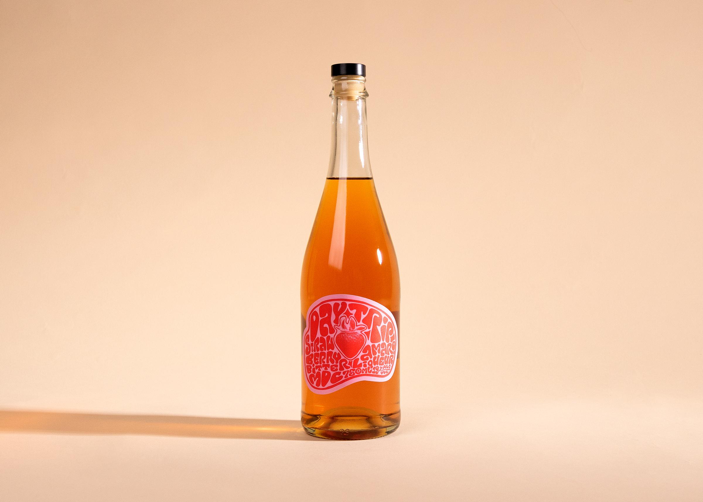
Matchbook Distilling Co. wanted to lean into the light-hearted, funky vibes of their growing Amaro line. The designs are meant to evoke a carefree moment in time, a season, a feeling, true to the origins of this line of spirits. Inspired by the fluid typography of Wes Wilson, these hand-lettered labels center around the locally sourced ingredients of each release that produce these bright flavors.

















