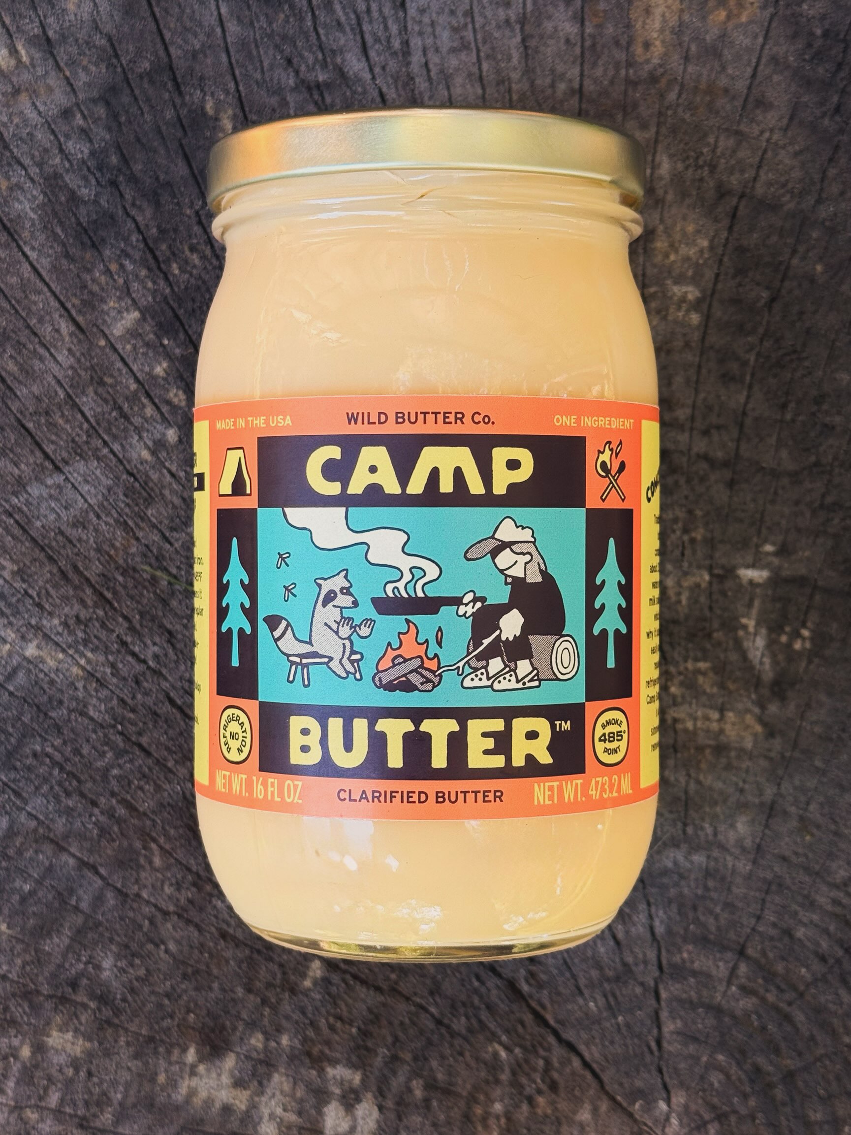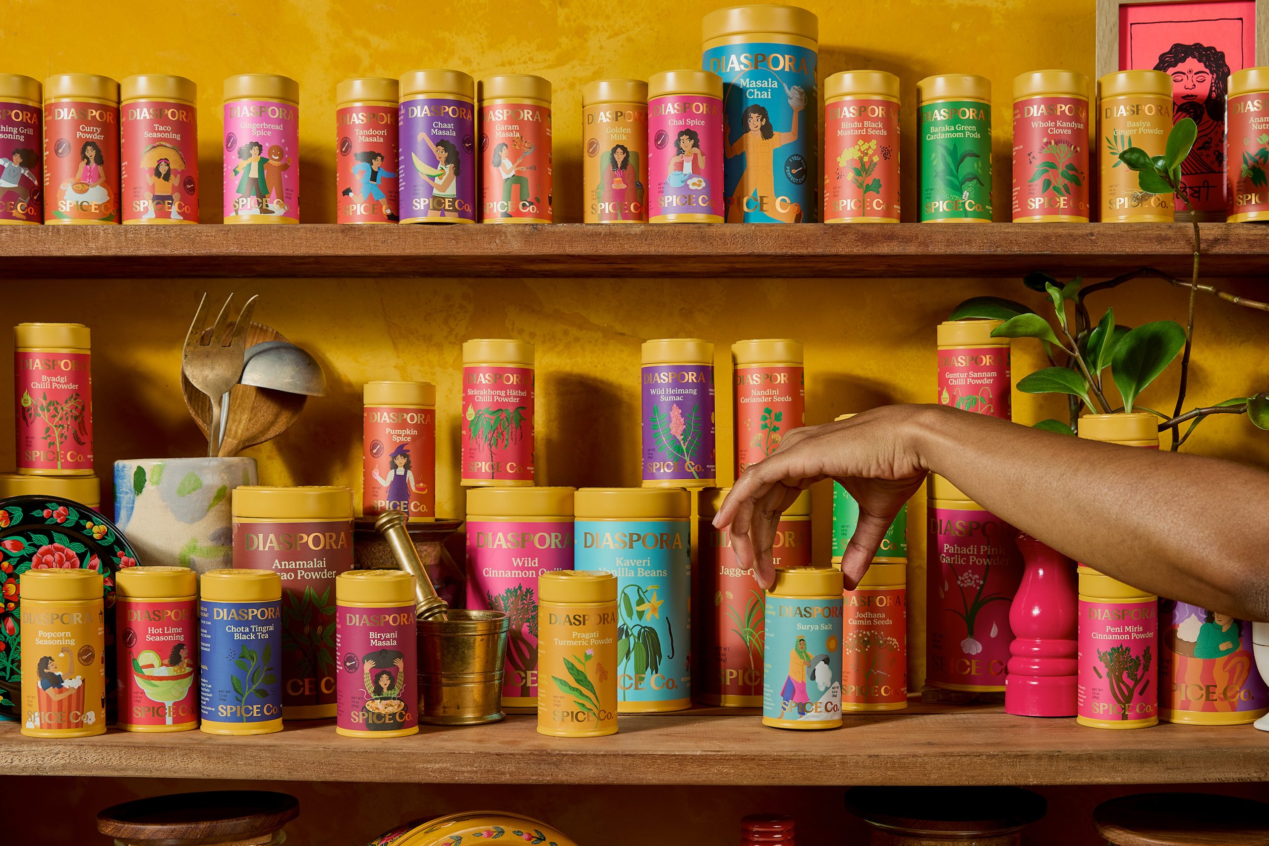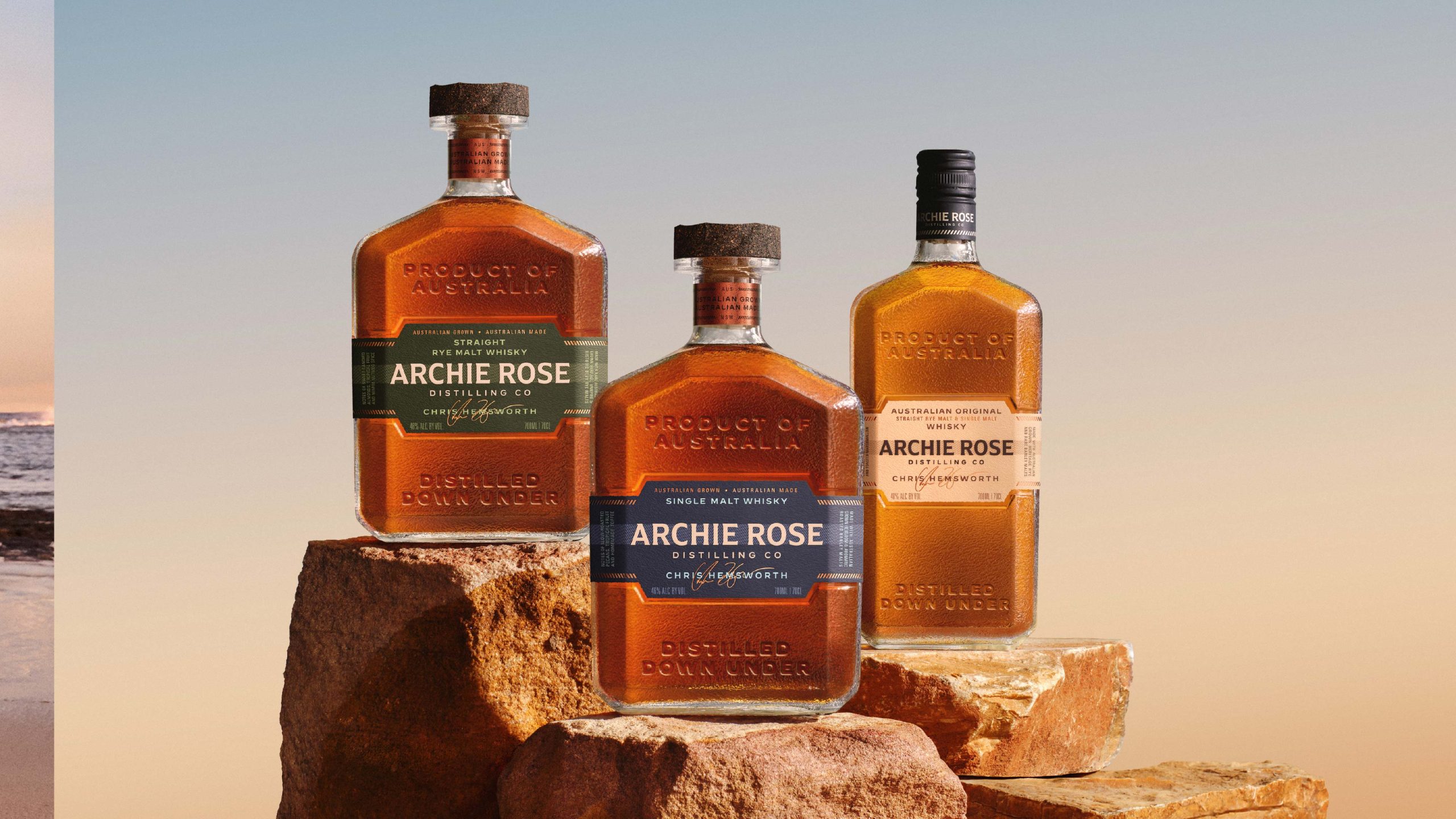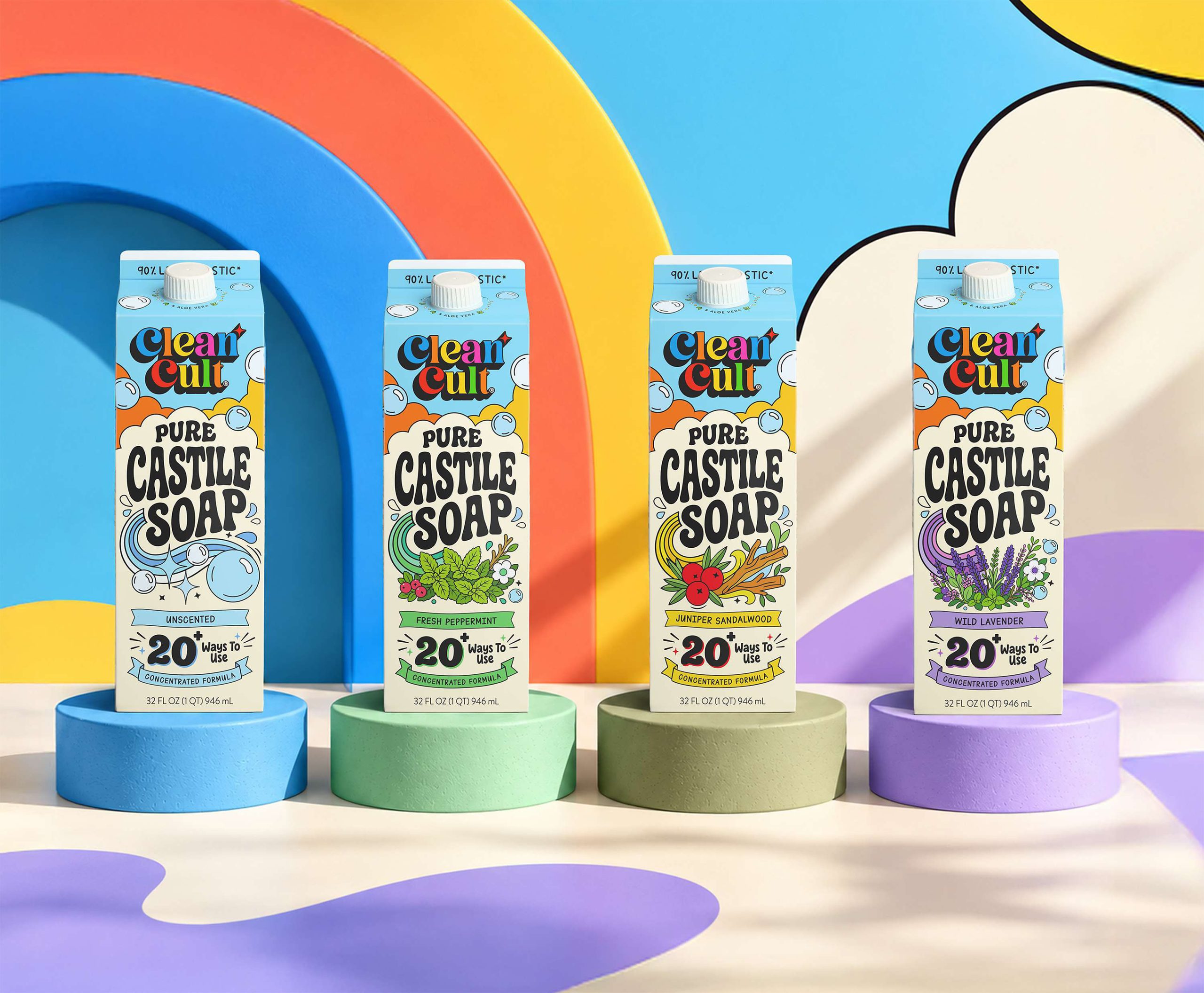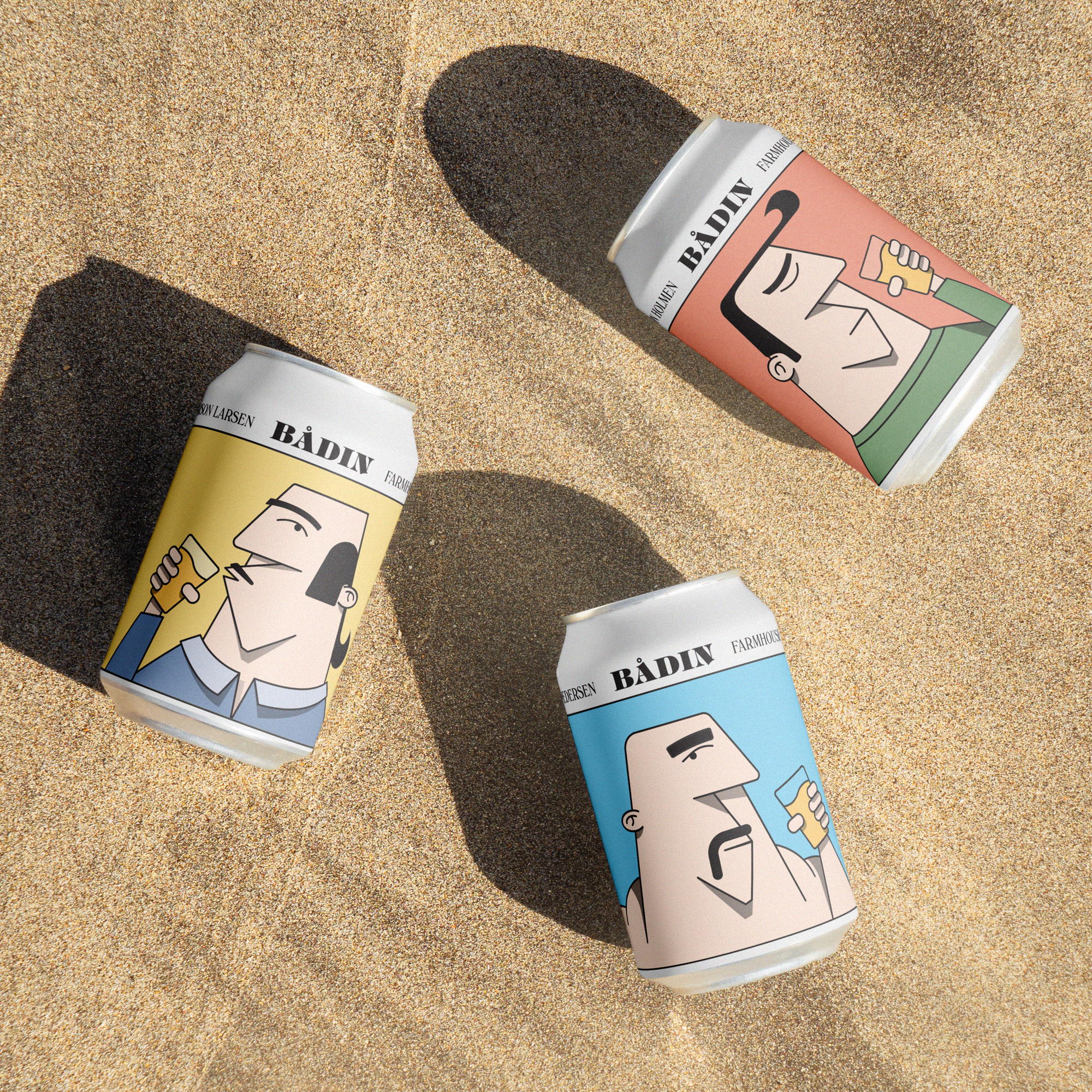
By North’s packaging design for Bådin’s Saison series is a delightful blend of quirkiness and charm. The aluminum cans are adorned with playful illustrative characters that exude personality, and a soft color palette adds to their inviting appeal. This whimsical label design harmoniously complements the beer’s character, with its highly carbonated, fruity, and spicy notes. The choice of a serif typeface at the top of the can further enhances the same aesthetic as the illustrations, creating a cohesive and visually pleasing package that captures the beer’s spirit and draws consumers in with its unique and endearing design.