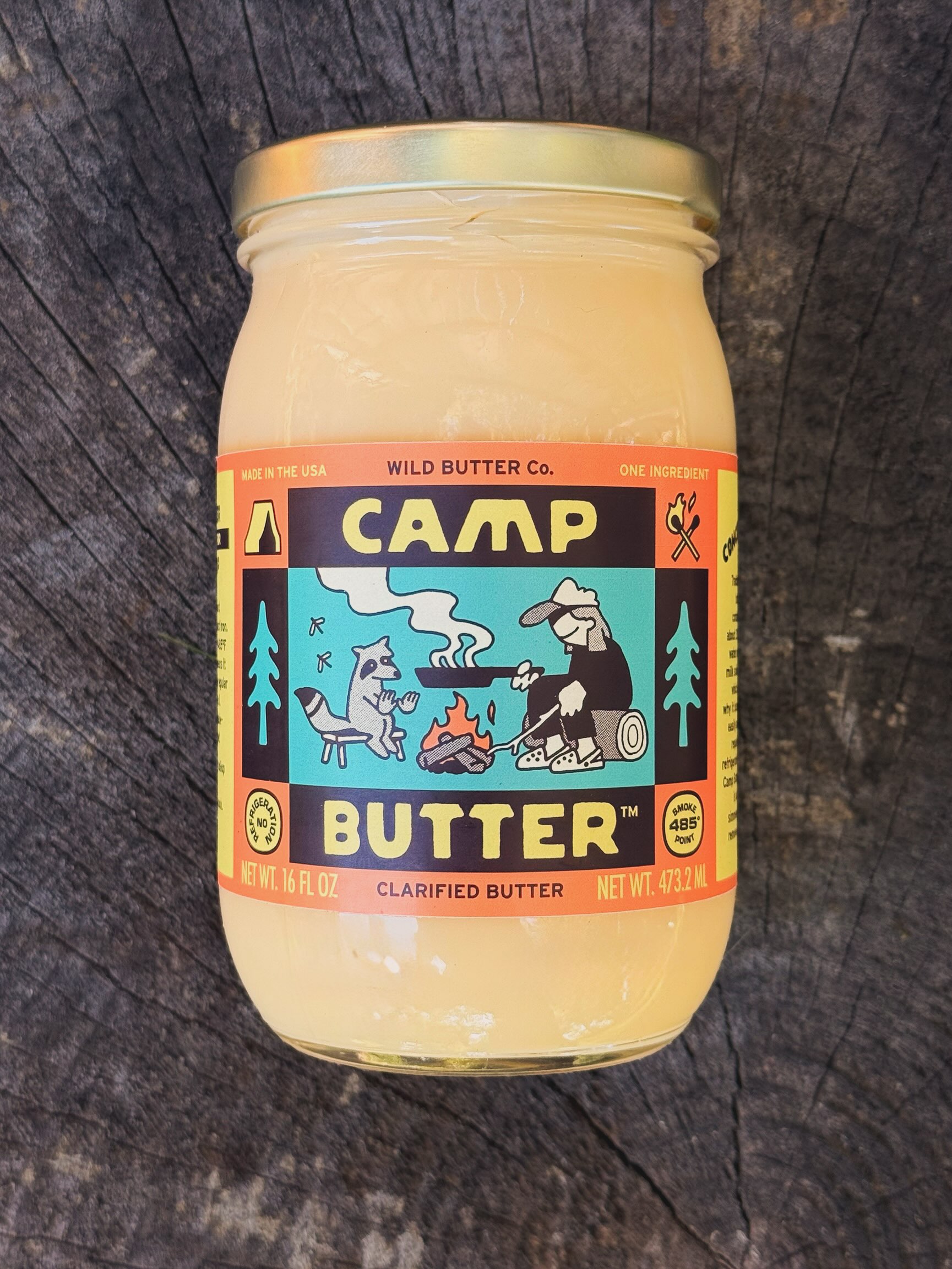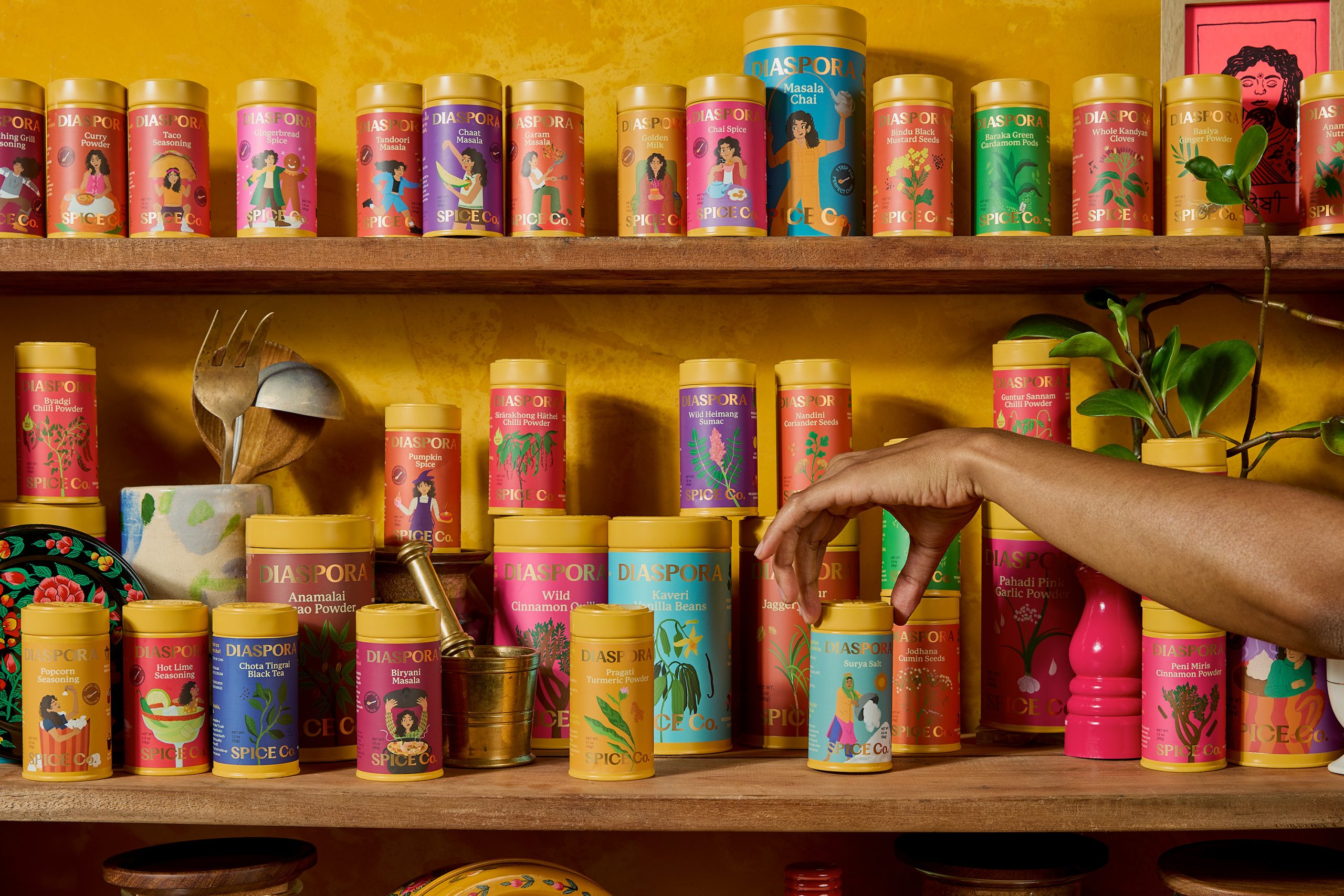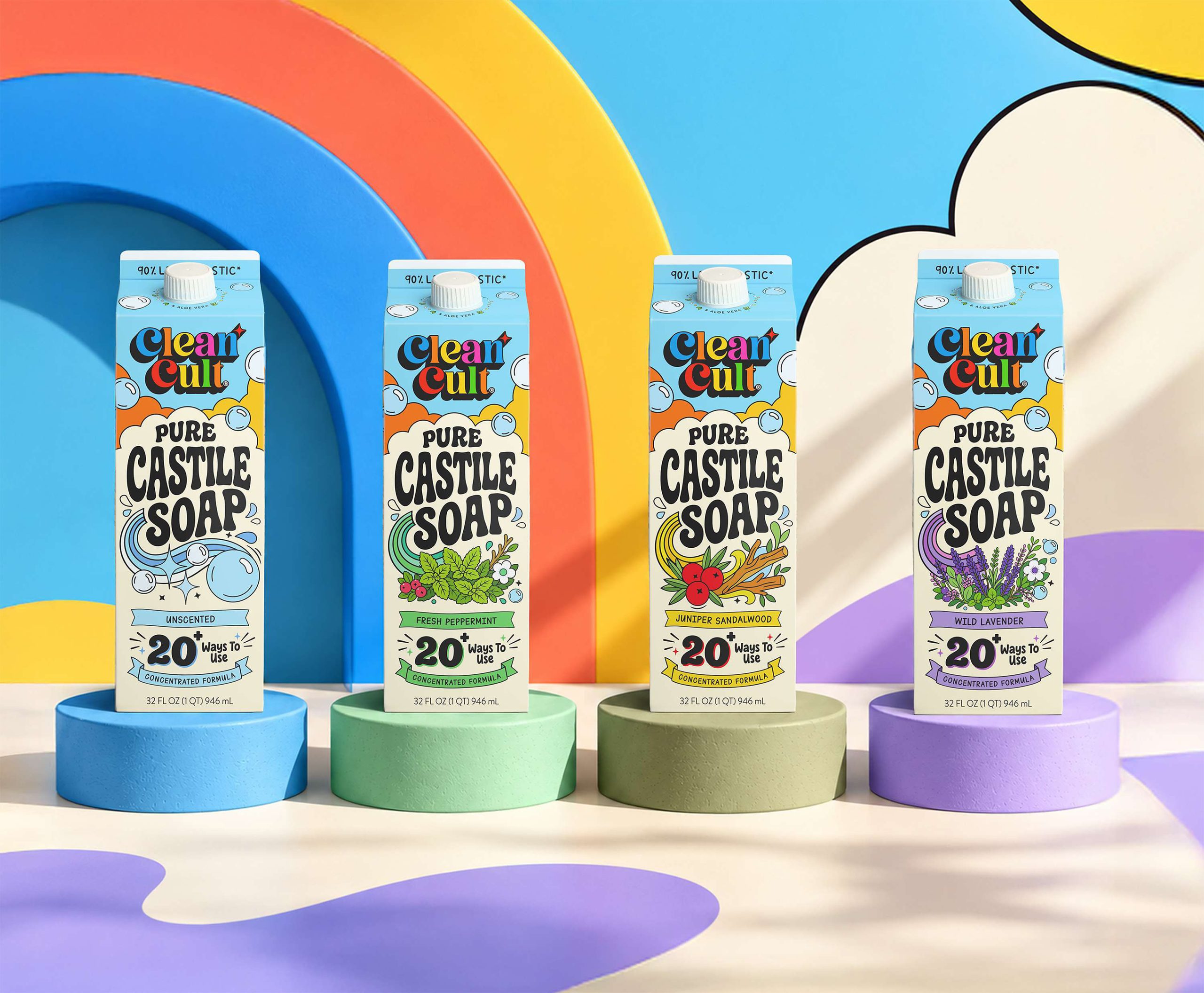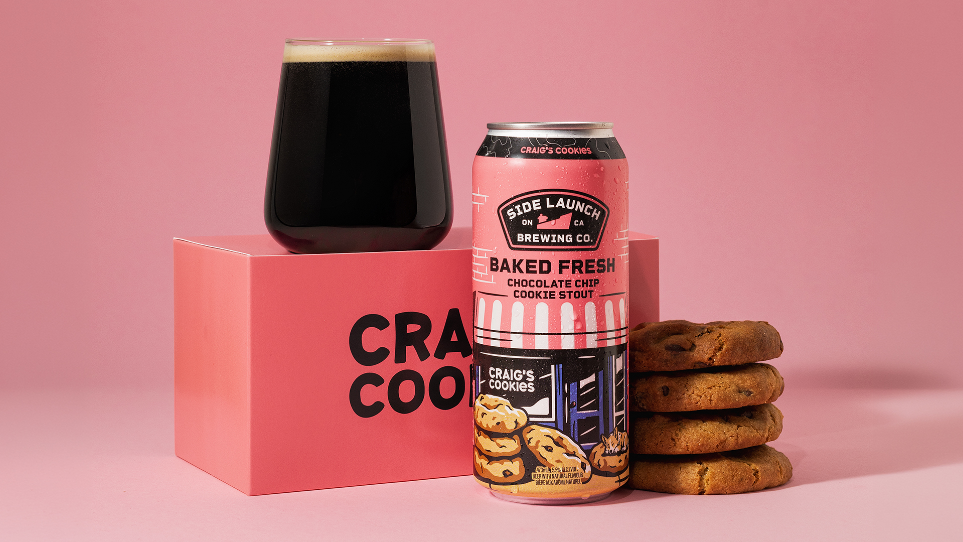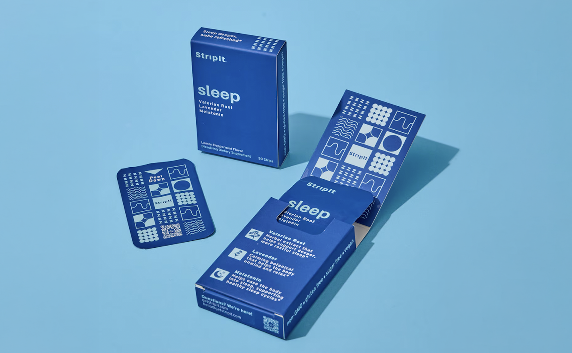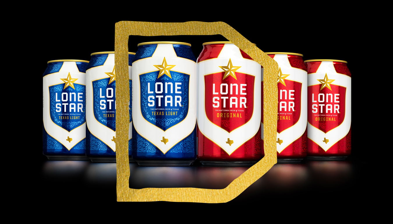
It’s happened to many a designer.
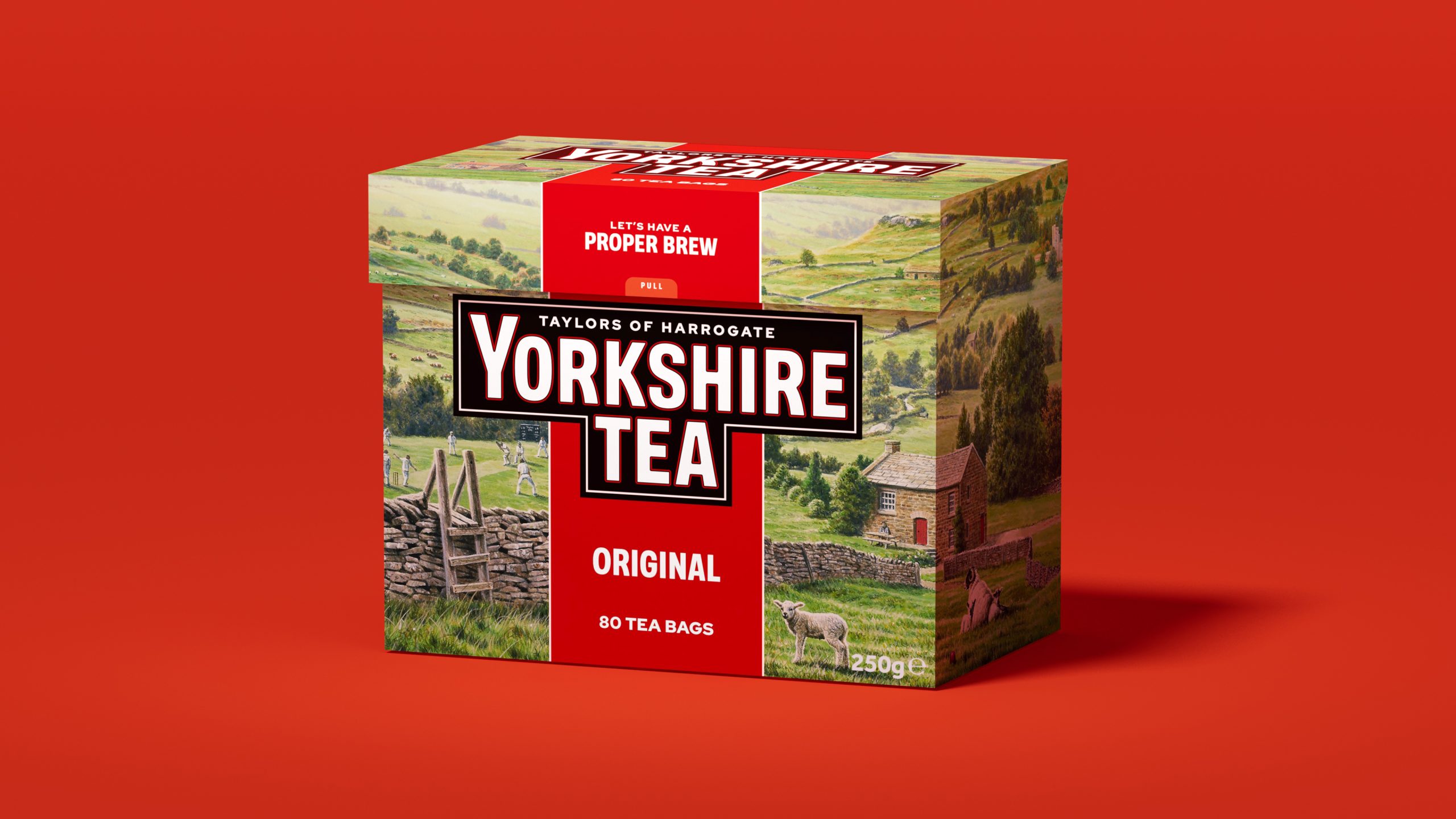
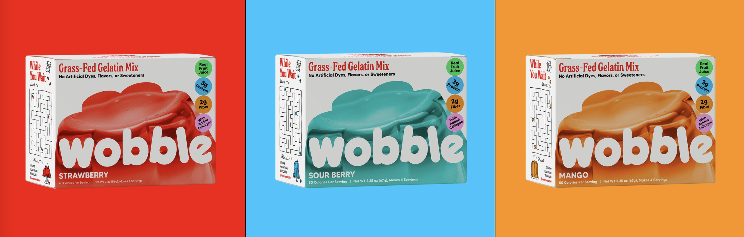
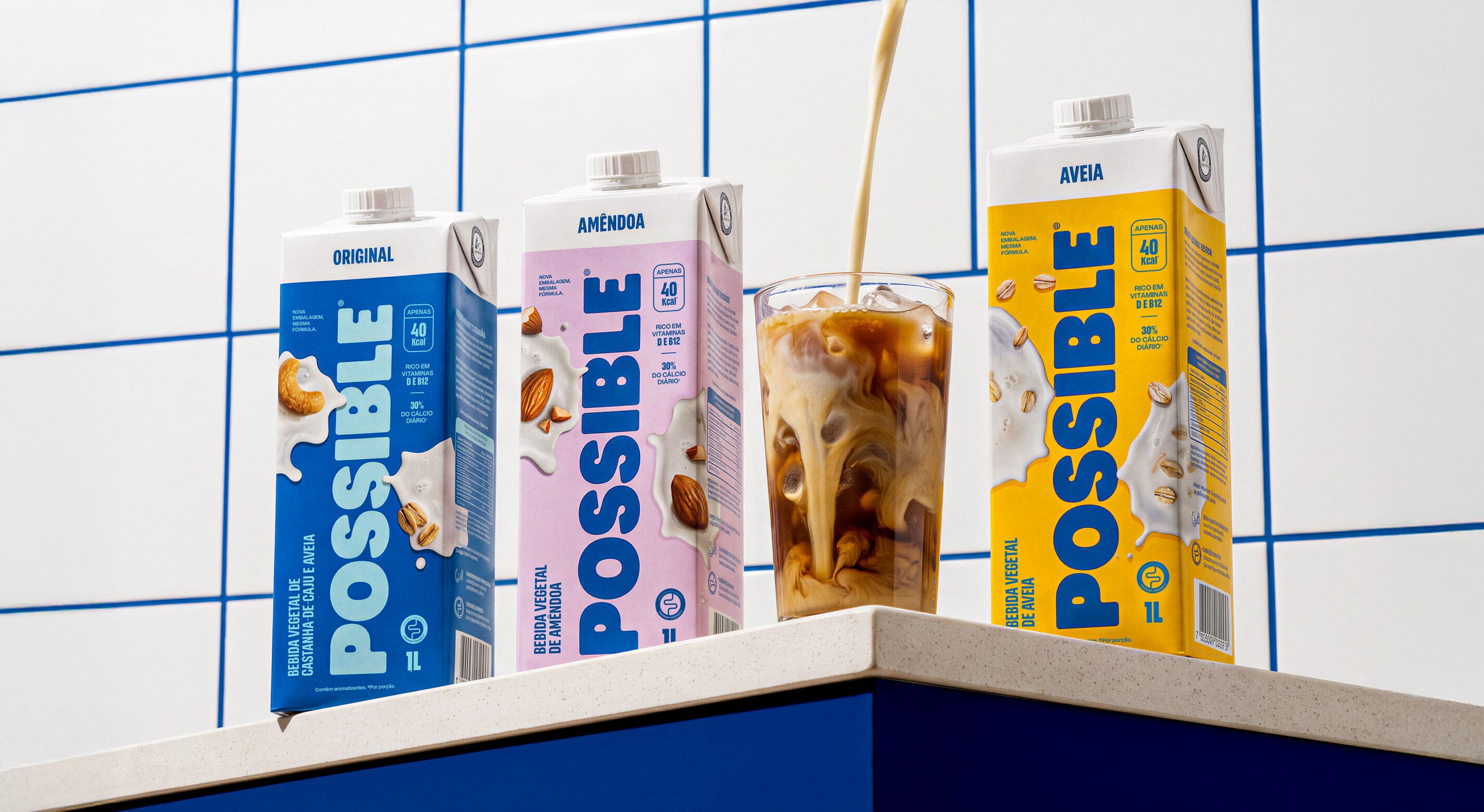
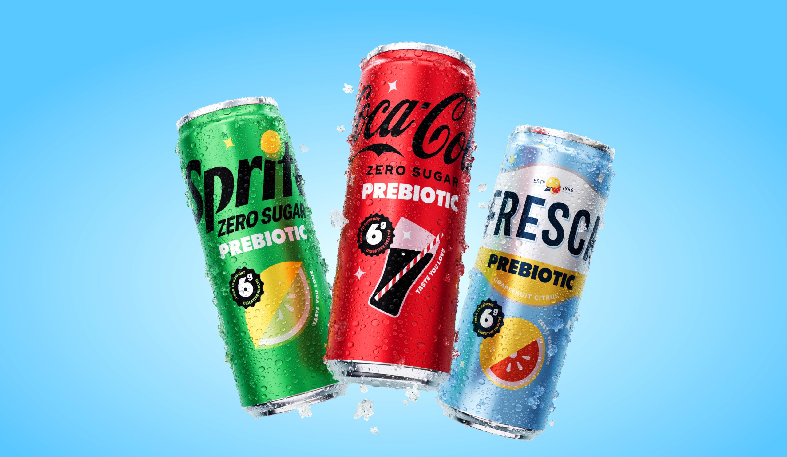
You dream up a beautifully designed package. Your render is flawless, the dieline is just right, and the colors are popping right off the screen—it’s even floating in space at just the right angle. Now, it’s time to see what it looks like when you hold it in your hands.
It’s a tale as old as time for packaging designers and marketers. Your beautiful design gets printed, and the thrill is gone. Just as plenty of start-up brands have had to learn the hard way, cutting corners and skipping a physical prototype can lead to post-print disappointment. The truth is, color-managed comps and prototypes are still the best way to closely analyze your design and best understand what the consumer’s experience will be of your brand.