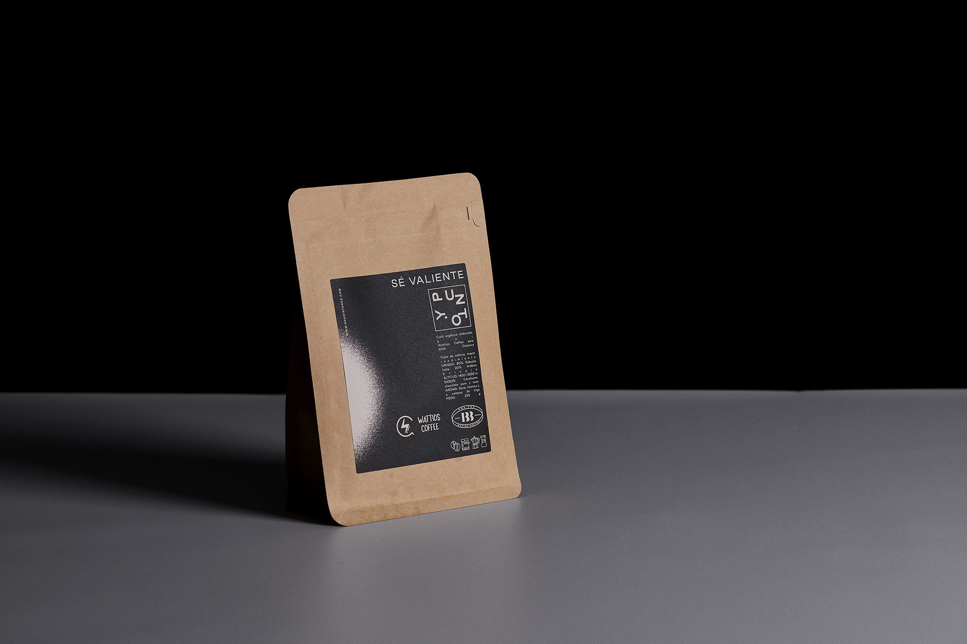
Designed by Alex Monzó from Brandsummit, Y Punto is a brand with packaging that’s as sleek as can be. The kraft paper paired with a black and white color palette creates a refined aesthetic representing the brand’s minimalistic attitude.

One more year, beer, coffee and sports come together in a new edition of KOA Distance, under the premise: Y Punto (Period). A concept that speaks of how the path is built by reaching one point after another, knowing that between the extremes, between black and white, there are many greys and is there, in the nuances of the ultra-distance routes, where the the voice that sets the pace of the race should be. A visual identity that is committed to contrast and to reflecting all the ups and downs experienced physically and mentally during this three-day triathlon: Don’t hesitate. Be brave. Period.